Research
Security News
Malicious npm Package Typosquats react-login-page to Deploy Keylogger
Socket researchers unpack a typosquatting package with malicious code that logs keystrokes and exfiltrates sensitive data to a remote server.
react-pannable
Advanced tools
Readme
Simulate pan gesture and scroll view for touch devices with React
Install react-pannable using npm.
npm install --save react-pannable
Some Pannable demos
Some Pad demos
Pannable provides a pan gesture simulation on recent mobile browsers for iOS and Android. It can also be used on mouse-base devices across on all evergreen browsers.
type Point = { x: number, y: number };
type PanEvent = {
  translation: Point,
  velocity: Point,
  target: HTMLElement,
};
| Property | Type | DefaultValue | Description |
|---|---|---|---|
| enabled | boolean | true | Indicate whether the gesture listener is enabled. If you change this property to false while the gesture is listening, the gesture transitions to cancel. |
| shouldStart | boolean,function | true | Whether to start gesture listening. : (evt: PanEvent) => void |
| onStart | function | () => {} | Callback invoked when the gesture starts listening.: (evt: PanEvent) => void |
| onMove | function | () => {} | Callback invoked when the gesture moves.: (evt: PanEvent) => void |
| onEnd | function | () => {} | Callback invoked when the gesture ended listening.: (evt: PanEvent) => void |
| onCancel | function | () => {} | Callback invoked when the gesture cancelled.: (evt: PanEvent) => void |
Pad provides a scrollable content component on which overflow scrollbars are not natively supported. It also provides paging scroll implementation and multiple content layout mode.
type Point = { x: number, y: number };
type Size = { width: number, height: number };
type Rect = { x: number, y: number, width: number, height: number };
type Align = 'auto' | 'center' | 'start' | 'end' | number;
type PadEvent = {
  contentOffset: Point,
  contentVelocity: Point,
  dragging: boolean,
  decelerating: boolean,
  size: Size,
  contentSize: Size,
};
| Property | Type | DefaultValue | Description |
|---|---|---|---|
| children | element,Component | null | Rendered content. Can be a react component class, a render function, or a rendered element.:(pad: Pad) => element |
| width | number | 0 | The width of the bounding view. |
| height | number | 0 | The height of the bounding view. |
| contentWidth | number | 0 | The width of the content view. |
| contentHeight | number | 0 | The height of the content view. |
| scrollEnabled | boolean | true | Determines whether scrolling is enabled. |
| pagingEnabled | boolean | false | Determines whether paging is enabled. |
| directionalLockEnabled | boolean | false | determines whether scrolling is disabled in a particular direction. |
| onScroll | function | () => {} | Callback invoked when the content view scrolls.:({evt: PadEvent}) => void |
Sets the offset from the content view’s origin.
Scrolls a specific area of the content so that it is visible.
GeneralContent automatically adjusts the width and height of content.
type Size = { width: number, height: number };
| Property | Type | DefaultValue | Description |
|---|---|---|---|
| width | number | -1 | The width of the content. If you set this property to -1, it shrinks the content's width. |
| height | number | -1 | The height of the content. If you set this property to -1, it shrinks the content's height. |
| onResize | function | () => {} | Callback invoked when the content resize.:(Size) => element |
GridContent provides grid layout of content.
type Size = { width: number, height: number };
type Rect = { x: number, y: number, width: number, height: number };
| Property | Type | DefaultValue | Description |
|---|---|---|---|
| rowCount | number | 0 | the number of rows. |
| columnCount | number | 0 | the number of columns. |
| rowHeight | number,function | 0 | the height of the specified row. |
| columnWidth | number,function | 0 | the width of the specified column. |
| rowHeightHash | function | ({ rowIndex }) => rowIndex | the hash of the row's height. |
| columnWidthHash | function | ({ columnIndex }) => columnIndex | the hash of the column's width. |
| cellKey | function | ({ columnIndex, rowIndex }) => rowIndex + '-' + columnIndex | the key of the specified cell. |
| renderCell | function | () => null | the renderer of the specified cell. |
| visibleRect | Rect | { x: 0, y: 0, width: 0, height: 0 } | the area of the visible content. |
| onResize | function | () => {} | Callback invoked when the content resize.:(Size) => element |
Returns the area of cell at the specified indexes.
FAQs
Unknown package
The npm package react-pannable receives a total of 96 weekly downloads. As such, react-pannable popularity was classified as not popular.
We found that react-pannable demonstrated a not healthy version release cadence and project activity because the last version was released a year ago. It has 1 open source maintainer collaborating on the project.
Did you know?

Socket for GitHub automatically highlights issues in each pull request and monitors the health of all your open source dependencies. Discover the contents of your packages and block harmful activity before you install or update your dependencies.

Research
Security News
Socket researchers unpack a typosquatting package with malicious code that logs keystrokes and exfiltrates sensitive data to a remote server.

Security News
The JavaScript community has launched the e18e initiative to improve ecosystem performance by cleaning up dependency trees, speeding up critical parts of the ecosystem, and documenting lighter alternatives to established tools.

Product
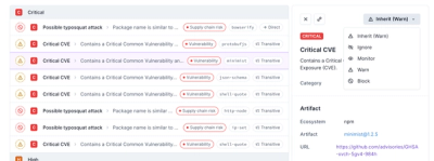
Socket now supports four distinct alert actions instead of the previous two, and alert triaging allows users to override the actions taken for all individual alerts.