react-range


See all the other examples and their source code!
Installation
yarn add react-range
Usage
import * as React from 'react';
import { Range } from 'react-range';
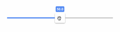
class SuperSimple extends React.Component {
state = { values: [50] };
render() {
return (
<Range
step={0.1}
min={0}
max={100}
values={this.state.values}
onChange={(values) => this.setState({ values })}
renderTrack={({ props, children }) => (
<div
{...props}
style={{
...props.style,
height: '6px',
width: '100%',
backgroundColor: '#ccc'
}}
>
{children}
</div>
)}
renderThumb={({ props }) => (
<div
{...props}
style={{
...props.style,
height: '42px',
width: '42px',
backgroundColor: '#999'
}}
/>
)}
/>
);
}
}
Features
- Range input supporting vertical and horizontal sliding
- Unopinionated styling, great for CSS in JS too
- No wrapping divs or additional markup, bring your own!
- Accessible, made for keyboards and screen readers
- Touchable, works on mobile devices
- Can handle negative and decimal values
- Stateless and controlled single component
- Typescript and Flow type definitions
- No dependencies, less than 5kB (gzipped)
- Coverage by e2e puppeteer tests
- RTL support
Keyboard support
tab and shift+tab to focus thumbsarrow up or arrow right or k to increase the thumb value by one steparrow down or arrow left or j to decrease the thumb value by one steppage up to increase the thumb value by ten stepspage down to decrease the thumb value by ten steps
<Range /> props
renderTrack
renderTrack: (params: {
  props: {
    style: React.CSSProperties;
    ref: React.RefObject<any>;
    onMouseDown: (e: React.MouseEvent) => void;
    onTouchStart: (e: React.TouchEvent) => void;
  };
  children: React.ReactNode;
  isDragged: boolean;
  disabled: boolean;
}) => React.ReactNode;
renderTrack prop to define your track (root) element. Your function gets four parameters and should return a React component:
props - this needs to be spread over the root track element, it connects mouse and touch events, adds a ref and some necessary stylingchildren - the rendered thumbs, thumb structure should be specified in a different prop - renderThumbisDragged - true if any thumb is being draggeddisabled - true if <Range disabled={true} /> is set
The track can be a single narrow div as in the Super simple example; however, it might be better to use at least two nested divs where the outer div is much thicker and has a transparent background and the inner div is narrow, has visible background and is centered. props should be then spread over the outer bigger div. Why to do this? It's nice to keep the onMouseDown and onTouchStart targets bigger since the thumb can be moved also by clicking on the track (in a single thumb scenario).
renderThumb
renderThumb: (params: {
  props: {
    key: number;
    style: React.CSSProperties;
    tabIndex?: number;
    'aria-valuemax': number;
    'aria-valuemin': number;
    'aria-valuenow': number;
    draggable: boolean;
    role: string;
    onKeyDown: (e: React.KeyboardEvent) => void;
    onKeyUp: (e: React.KeyboardEvent) => void;
  };
  value: number;
  index: number;
  isDragged: boolean;
}) => React.ReactNode;
renderThumb prop to define your thumb. Your function gets four parameters and should return a React component:
props - it has multiple props that you need to spread over your thumb elementvalue - a number, relative value based on min, max, step and the thumb's positionindex - the thumb index (order)isDragged - true if the thumb is dragged, great for styling purposes
renderMark (optional)
renderMark?: (params: {
  props: {
    key: string;
    style: React.CSSProperties;
    ref: React.RefObject<any>;
  };
  index: number;
}) => React.ReactNode;
renderMark is an optional prop so you can render an element at each step. See this example. Your function gets 2 parameters and should return a React component:
props - this needs to be spread over the root track element, it adds a ref, key and some necessary stylingindex - index of the mark, might be useful if you want to use different styles for even/odd marks
You can use any dimensions for your marks and react-range will automatically position them at the correct place.
values
values: number[];
An array of numbers. It controls the position of thumbs on the track. values.length equals to the number of rendered thumbs.
onChange
onChange: (values: number[]) => void;
Called when a thumb is moved, provides new values.
onFinalChange
onFinalChange: (values: number[]) => void;
Called when a change is finished (mouse/touch up, or keyup), provides current values. Use this event when you have to make for example ajax request with new values.
min (optional)
min: number;
The range start. Can be decimal or negative. Default is 0.
max (optional)
max: number;
The range end. Can be decimal or negative. Default is 100.
step (optional)
step: number;
The minimal distance between two values. Can be decimal. Default is 1.
allowOverlap (optional)
allowOverlap: boolean;
When there are multiple thumbs on a single track, should they be allowed to overlap? Default is false.
draggableTrack (optional)
draggableTrack: boolean;
When there are multiple thumbs on a single track, should it be possible to drag all thumbs at once? Default is false.
direction (optional)
direction: Direction;

enum Direction {
  Right = 'to right',
  Left = 'to left',
  Down = 'to bottom',
  Up = 'to top'
}
It sets the orientation (vertical vs horizontal) and the direction in which the value increases. You can get this enum by:
import { Direction } from 'react-range';
Default value is Direction.Right.
disabled (optional)
disabled: boolean;
If true, it ignores all touch and mouse events and makes the component not focusable. Default is false.
rtl (optional)
rtl: boolean;
If true, the slider will be optimized for RTL layouts. Default is false.
getTrackBackground
There is an additional helper function being exported from react-range. Your track is most likely a div with some background. What if you want to achieve a nice "progress bar" effect where the part before the thumb has different color than the part after? What if you want to have the same thing even with multiple thumbs (aka differently colored segments)? You don't need to glue together multiple divs in order to do that! You can use a single div and set background: linear-gradient(...). getTrackBackground function builds this verbose linear-gradient(...) for you!
getTrackBackground: (params: {
  min: number;
  max: number;
  values: number[];
  colors: string[];
  direction?: Direction;
  rtl?: boolean;
}) => string;
min, max, values and direction should be same as for the <Range /> component. colors is a list of colors. This needs to be true:
values.length + 1 === colors.length;
That's because one thumb (one value) splits the track into two segments, so you need two colors.
Motivation
There is a native input solution:
<input type="range" />
However, it has some serious shortcomings:
- vertical-oriented slider is not supported in all browsers
- supports only a single direction
- very limited styling options
- no support for multiple thumbs
There are also many React based solutions but most of them are too bloated, don't support styling through CSS in JS or have lacking performance.
react-range has two main goals:
- Small footprint - less then 4kB gzipped, single component.
- Bring your own styles and HTML markup -
react-range is a more low-level approach than other libraries. It doesn't come with any styling (except some positioning) or markup. It's up to the user to specify both! Think about react-range as a foundation for other styled input ranges.
End to end testing
This library is tightly coupled to many DOM APIs. It would be very hard to ensure 100% test coverage just with unit tests that would not involve a lot of mocking. Or we could re-architect the library to better abstract all DOM interfaces but that would mean more code and bigger footprint.
Instead of that, react-range adds thorough end to end tests powered by puppeteer.
All tests are automatically ran in Travis CI with headless chromium. This way, the public API is well tested, including pixel-perfect positioning. Also, the tests are pretty fast, reliable and very descriptive.
Do you want to run them in the dev mode (slows down operations, opens the browser)?
yarn ladle serve
yarn test:e2e:dev
CI mode (ladle started on the background, quick, headless)
yarn test:e2e
Browser support
- Chrome (latest, mac, windows, iOS, Android)
- Firefox (latest, mac, windows)
- Safari (latest, mac, iOS)
- Edge (latest, windows)
Contributing
This is how you can spin up the dev environment:
git clone https://github.com/tajo/react-range
cd react-range
yarn
yarn ladle serve
Shoutouts 🙏
Big big shoutout to Tom MacWright for donating the react-range npm handle! ❤️

Big thanks to BrowserStack for letting the maintainers use their service to debug browser issues.
And Netlify for free hosting.
Author
Vojtech Miksu 2019, miksu.cz, @vmiksu


