Product
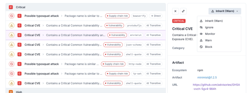
Introducing Enhanced Alert Actions and Triage Functionality
Socket now supports four distinct alert actions instead of the previous two, and alert triaging allows users to override the actions taken for all individual alerts.
react-responsive-carousel
Advanced tools
Package description
The react-responsive-carousel package is a flexible and responsive carousel component for React applications. It allows developers to create image sliders, carousels, and galleries with ease, providing a variety of customization options and features.
Basic Carousel
This code demonstrates a basic carousel with three images. Each image has an associated legend. The carousel is responsive and will adjust to the size of its container.
import { Carousel } from 'react-responsive-carousel';
import 'react-responsive-carousel/lib/styles/carousel.min.css';
function BasicCarousel() {
return (
<Carousel>
<div>
<img src="image1.jpg" alt="Image 1" />
<p className="legend">Legend 1</p>
</div>
<div>
<img src="image2.jpg" alt="Image 2" />
<p className="legend">Legend 2</p>
</div>
<div>
<img src="image3.jpg" alt="Image 3" />
<p className="legend">Legend 3</p>
</div>
</Carousel>
);
}Custom Controls
This code demonstrates a carousel with custom controls. The carousel will autoplay, loop infinitely, and respond to keyboard arrows and touch gestures. It also includes indicators and arrows for navigation.
import { Carousel } from 'react-responsive-carousel';
import 'react-responsive-carousel/lib/styles/carousel.min.css';

function CustomControlsCarousel() {
  return (
    <Carousel
      showArrows={true}
      showStatus={false}
      showIndicators={true}
      infiniteLoop={true}
      useKeyboardArrows={true}
      autoPlay={true}
      stopOnHover={true}
      swipeable={true}
      dynamicHeight={true}
      emulateTouch={true}
    >
      <div>
        <img src="image1.jpg" alt="Image 1" />
        <p className="legend">Legend 1</p>
      </div>
      <div>
        <img src="image2.jpg" alt="Image 2" />
        <p className="legend">Legend 2</p>
      </div>
      <div>
        <img src="image3.jpg" alt="Image 3" />
        <p className="legend">Legend 3</p>
      </div>
    </Carousel>
  );
}
Thumbnail Navigation
This code demonstrates a carousel with thumbnail navigation. Thumbnails of the images are displayed below the main carousel, allowing users to navigate to specific images by clicking on the thumbnails.
import { Carousel } from 'react-responsive-carousel';
import 'react-responsive-carousel/lib/styles/carousel.min.css';

function ThumbnailCarousel() {
  return (
    <Carousel showThumbs={true}>
      <div>
        <img src="image1.jpg" alt="Image 1" />
        <p className="legend">Legend 1</p>
      </div>
      <div>
        <img src="image2.jpg" alt="Image 2" />
        <p className="legend">Legend 2</p>
      </div>
      <div>
        <img src="image3.jpg" alt="Image 3" />
        <p className="legend">Legend 3</p>
      </div>
    </Carousel>
  );
}react-slick is a popular carousel component for React that is based on the slick-carousel library. It offers a wide range of features, including responsive design, autoplay, and custom navigation. Compared to react-responsive-carousel, react-slick provides more advanced customization options and a larger community of users.
Swiper is a modern touch slider that is highly customizable and supports a wide range of features, including vertical and horizontal sliders, parallax effects, and lazy loading. It is not limited to React and can be used with other frameworks as well. Swiper is known for its performance and flexibility, making it a strong alternative to react-responsive-carousel.
pure-react-carousel is a lightweight and flexible carousel component for React. It focuses on providing a simple and accessible API while maintaining high performance. Compared to react-responsive-carousel, pure-react-carousel offers a more minimalistic approach with fewer built-in features, but it allows for greater customization through its component-based architecture.
Changelog
Readme
Powerful, lightweight and fully customizable carousel component for React apps.
selectedItem prop to set from the app state, and onChange callback to get the new position)http://leandrowd.github.io/react-responsive-carousel/
Check it out these cool demos created using storybook. The source code for each example is available here
Customize it yourself:
npm install react-responsive-carousel --save
import React, { Component } from 'react';
import ReactDOM from 'react-dom';
import { Carousel } from 'react-responsive-carousel';

class DemoCarousel extends Component {
    render() {
        return (
            <Carousel>
                <div>
                    <img src="assets/1.jpeg" />
                    <p className="legend">Legend 1</p>
                </div>
                <div>
                    <img src="assets/2.jpeg" />
                    <p className="legend">Legend 2</p>
                </div>
                <div>
                    <img src="assets/3.jpeg" />
                    <p className="legend">Legend 3</p>
                </div>
            </Carousel>
        );
    }
});

ReactDOM.render(<DemoCarousel />, document.querySelector('.demo-carousel'));

// Don't forget to include the css in your page

// Using webpack
// import styles from 'react-responsive-carousel/lib/styles/carousel.min.css';

// Using html tag:
// <link rel="stylesheet" href="<NODE_MODULES_FOLDER>/react-responsive-carousel/lib/styles/carousel.min.css"/>
| Attributes | Type | Default | Description |
|---|---|---|---|
| showArrows | boolean | true | show prev and next arrows |
| showStatus | boolean | true | show index of the current item. i.e: (1/8) |
| showIndicators | boolean | true | show little dots at the bottom with links for changing the item |
| showThumbs | boolean | true | show thumbnails of the images |
| thumbWidth | number | undefined | optionally specify pixel width (as an integer) of a thumbnail (including any padding) to avoid calculating values (helps with server-side renders or page cache issues) |
| infiniteLoop | boolean | false | infinite loop sliding |
| selectedItem | number | 0 | selects an item though props / defines the initial selected item |
| axis | string | horizontal | changes orientation - accepts horizontal and vertical |
| verticalSwipe | string | standard | changes vertical swipe scroll direction - accepts standard and natural |
| onChange | function | - | Fired when changing positions |
| onClickItem | function | - | Fired when an item is clicked |
| onClickThumb | function | - | Fired when a thumb it clicked |
| width | string | - | Allows to set a fixed width |
| useKeyboardArrows | boolean | false | Adds support to next and prev through keyboard arrows |
| autoPlay | boolean | false | Auto play |
| stopOnHover | boolean | true | Stop auto play while mouse is over the carousel |
| interval | number | 5000 | Interval of auto play |
| transitionTime | number | 350 | Duration of slide transitions (in miliseconds) |
| swipeScrollTolerance | number | 5 | Allows scroll when the swipe movement occurs in a different direction than the carousel axis and within the tolerance - Increase for loose - Decrease for strict |
| swipeable | boolean | true | Enables swiping gestures |
| dynamicHeight | boolean | false | Adjusts the carousel height if required. -- Do not work with vertical axis -- |
| emulateTouch | boolean | false | Allows mouse to simulate swipe |
| statusFormatter | func | (current, total) => ${current} of ${total} | Allows custom formatting of the status indicator |
| centerMode | boolean | false | Enables centered view with partial prev/next slides. Only works with horizontal axis. |
| centerSlidePercentage | number | 80 | optionally specify percentage width (as an integer) of the slides in centerMode |
=======================
Check the contributing guide
=======================
When raising an issue, please add as much details as possible. Screenshots, video recordings, or anything else that can make it easier to reproduce the bug you are reporting.
=======================
git clone git@github.com:leandrowd/react-responsive-carousel.gitnpm installnpm startlocalhost:8000 - livereload will be enabled and tests will run on each changeThe fastest dev environment is on node 6. If you have
nvminstalled, just runnvm use 6. Tests in travis will run on node 4 and 6
npm testnpm run storybook=======================
npm run publish-to-npmnpm run publish-to-gh-pages=======================
https://github.com/leandrowd/demo-react-responsive-carousel-es6
http://react-responsive-carousel.js.org/storybook/
https://codesandbox.io/s/lp602ljjj7
=======================
FAQs
React Responsive Carousel
The npm package react-responsive-carousel receives a total of 440,075 weekly downloads. As such, react-responsive-carousel popularity was classified as popular.
We found that react-responsive-carousel demonstrated a not healthy version release cadence and project activity because the last version was released a year ago. It has 1 open source maintainer collaborating on the project.
Did you know?

Socket for GitHub automatically highlights issues in each pull request and monitors the health of all your open source dependencies. Discover the contents of your packages and block harmful activity before you install or update your dependencies.

Product
Socket now supports four distinct alert actions instead of the previous two, and alert triaging allows users to override the actions taken for all individual alerts.

Security News
Polyfill.io has been serving malware for months via its CDN, after the project's open source maintainer sold the service to a company based in China.

Security News
OpenSSF is warning open source maintainers to stay vigilant against reputation farming on GitHub, where users artificially inflate their status by manipulating interactions on closed issues and PRs.