Product
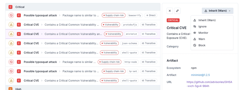
Introducing Enhanced Alert Actions and Triage Functionality
Socket now supports four distinct alert actions instead of the previous two, and alert triaging allows users to override the actions taken for all individual alerts.
react-search-autocomplete
Advanced tools
Readme
<ReactSearchAutocomplete>A <ReactSearchAutocomplete> is a fully customizable search box where the user can type text and filter the results. It relies on Fuse.js v6.4.4 for the fuzzy search. Check out their website to see the options (you can pass them to this component).
$ npm install react-search-autocomplete
The default export is <ReactSearchAutocomplete>.
To use it:
import { ReactSearchAutocomplete } from 'react-search-autocomplete'
import React from 'react'
import './App.css'
import { ReactSearchAutocomplete } from 'react-search-autocomplete'

function App() {
  const items = [
    {
      id: 0,
      name: 'Cobol'
    },
    {
      id: 1,
      name: 'JavaScript'
    },
    {
      id: 2,
      name: 'Basic'
    },
    {
      id: 3,
      name: 'PHP'
    },
    {
      id: 4,
      name: 'Java'
    }
  ]

  const handleOnSearch = (string, cached) => {
    // onSearch returns the string searched and if
    // the values are cached. If the values are cached
    // "cached" contains the cached values, if not, returns false
    console.log(string, cached)
  }

  const handleOnSelect = (item) => {
    // the item selected
    console.log(item)
  }

  const handleOnFocus = () => {
    console.log('Focused')
  }

  return (
    <div className="App">
      <header className="App-header">
        <div style={{ width: 400 }}>
          <ReactSearchAutocomplete
            items={items}
            onSearch={handleOnSearch}
            onSelect={handleOnSelect}
            onFocus={handleOnFocus}
            autoFocus
          />
        </div>
      </header>
    </div>
  )
}

export default App
<ReactSearchAutocomplete> Props://
// Props:
//
{
// The list of items that can be filtered, it can be an array of
// any type of object. By default the search will be done on the
// property "name", to change this behaviour, change the fuseOptions
// prop.
items,
// By default set to:
// {
// shouldSort: true,
// threshold: 0.6,
// location: 0,
// distance: 100,
// maxPatternLength: 32,
// minMatchCharLength: 1,
// keys: [
// "name",
// ]
// }
//
// To know more about fuse params, visit https://fusejs.io/
fuseOptions,
// Default value: true. If set to false, the items will
// not be stored in sessionStorage, and each time onSearch
// is called, cached will be false.
useCaching,
// Default value: 200. When the user is typing, before
// calling onSearch wait this amount of ms.
inputDebounce,
// The callback function called when the user is searching.
onSearch,
// The callback function called when the user selects an item
// from the filtered list.
onSelect,
// The callback function called when the user focuses the input.
onFocus,
// Default value: true. If set to false, the icon is hidden.
showIcon,
// Default value: 10. The max number of results to show at once.
maxResults,
// Default value: "". The placeholder of the search box.
placeholder,
// Default value: false. If set to true, automatically
// set focus on the input.
autoFocus,
// The styling prop allows you to customize the
// look of the searchbox
// Default values:
// {
// height: "44px",
// border: "1px solid #dfe1e5",
// borderRadius: "24px",
// backgroundColor: "white",
// boxShadow: "rgba(32, 33, 36, 0.28) 0px 1px 6px 0px",
// hoverBackgroundColor: "#eee",
// color: "#212121",
// fontSize: "16px",
// fontFamily: "Arial",
// iconColor: "grey",
// lineColor: "rgb(232, 234, 237)",
// placeholderColor: "grey",
// };
//
// For example, if you want to change the background
// color you can pass it in the props:
// styling={
// {
// backgroundColor: "black"
// }
// }
styling
}
MIT
FAQs
A search box for React
The npm package react-search-autocomplete receives a total of 9,663 weekly downloads. As such, react-search-autocomplete popularity was classified as popular.
We found that react-search-autocomplete demonstrated a not healthy version release cadence and project activity because the last version was released a year ago. It has 1 open source maintainer collaborating on the project.
Did you know?

Socket for GitHub automatically highlights issues in each pull request and monitors the health of all your open source dependencies. Discover the contents of your packages and block harmful activity before you install or update your dependencies.

Product
Socket now supports four distinct alert actions instead of the previous two, and alert triaging allows users to override the actions taken for all individual alerts.

Security News
Polyfill.io has been serving malware for months via its CDN, after the project's open source maintainer sold the service to a company based in China.

Security News
OpenSSF is warning open source maintainers to stay vigilant against reputation farming on GitHub, where users artificially inflate their status by manipulating interactions on closed issues and PRs.