Product
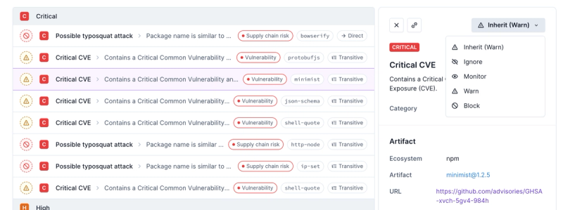
Introducing Enhanced Alert Actions and Triage Functionality
Socket now supports four distinct alert actions instead of the previous two, and alert triaging allows users to override the actions taken for all individual alerts.
react-swipeable-list
Advanced tools
Readme

Demo • Installation • Usage
A react component to render list with swipeable items. Items can have one or more actions on left (leading) and right (trailing) swipe and different behaviour depending on props.
Check working example page
npm install react-swipeable-list
# or via yarn
yarn add react-swipeable-list
import {
  LeadingActions,
  SwipeableList,
  SwipeableListItem,
  SwipeAction,
  TrailingActions,
} from 'react-swipeable-list';
import 'react-swipeable-list/dist/styles.css';

const leadingActions = () => (
  <LeadingActions>
    <SwipeAction onClick={() => console.info('swipe action triggered')}>
      Action name
    </SwipeAction>
  </LeadingActions>
);

const trailingActions = () => (
  <TrailingActions>
    <SwipeAction
      destructive={true}
      onClick={() => console.info('swipe action triggered')}
    >
      Delete
    </SwipeAction>
  </TrailingActions>
);

<SwipeableList>
  <SwipeableListItem
    leadingActions={leadingActions()}
    trailingActions={trailingActions()}
  >
    Item content
  </SwipeableListItem>
</SwipeableList>;
Type: boolean (optional, default: false)
Changes behaviour of IOS list type.
When true and swipe is done beyond threshold and released the action is triggered.

When set to false actions are only opened and they need to be clicked to trigger action.

Type: miliseconds (optional, default: 1000)
Time in miliseconds after which swipe action should be called for destructive swipe action (item deletion)
Type: object (optional, deafult: undefined)
Additional styles for list tag.
Type: ListType (ANDROID | IOS) (optional, deafult: ANDROID)
Changes behavior of swipeable items.
ANDROID
IOS
Type: string (optional, deafult: div)
HTML tag that is used to create this component.
Type: number (optional, default: 10)
How far in pixels scroll needs to be done to block swiping. After scrolling is started and goes beyond the threshold, swiping is blocked.
It can be set for the whole list or for every item. See scrollStartThreshold for SwipeableListItem. Value from the SwipeableListItem takes precedence.
Type: number (optional, default: 10)
How far in pixels swipe needs to be done to start swiping on list item. After a swipe is started and goes beyond the threshold, scrolling is blocked.
It can be set for the whole list or for every item. See swipeStartThreshold for SwipeableListItem. Value from the SwipeableListItem takes precedence.
Type: number (optional, default: 0.5)
How far swipe needs to be done to trigger attached action. 0.5 means that item needs to be swiped to half of its width, 0.25 - one-quarter of width.
It can be set for the whole list or for every item. See threshold for SwipeableListItem. Value from the SwipeableListItem takes precedence.
Type: boolean (optional, default: false)
If set to true all defined swipe actions are blocked.
Type: () => void
Fired after swipe has started (after drag gesture passes the swipeStartThreshold distance in pixels).
Type: () => void
Fired after swipe has ended.
Type: (progress: number) => void
Fired every time swipe progress changes. The reported progress value is always an integer in range 0 to 100 inclusive.
Type: number (default: 10)
How far in pixels scroll needs to be done to block swiping. After scrolling is started and goes beyond the threshold, swiping is blocked.
It can be set for the whole list or for every item. See scrollStartThreshold for SwipeableList. Value from the SwipeableListItem takes precedence.
Type: number (default: 10)
How far in pixels swipe needs to be done to start swiping on list item. After a swipe is started and goes beyond the threshold, scrolling is blocked.
It can be set for the whole list or for every item. See swipeStartThreshold for SwipeableList. Value from the SwipeableListItem takes precedence.
Type: number (default: 0.5)
How far swipe needs to be done to trigger action. 0.5 means that item needs to be swiped to half of its width, 0.25 - one-quarter of width.
It can be set for the whole list or for every item. See threshold for SwipeableList. Value from the SwipeableListItem takes precedence.
Type: boolean (optional, default: false)
If set to true then remove animation is played and callback is called after destructiveCallbackDelay.
Type: function (required)
Callback function that should be call after swipe action is triggered.
Type: string (optional, deafult: span)
HTML tag that is used to create this component.
FAQs
Swipeable list component for React
The npm package react-swipeable-list receives a total of 6,199 weekly downloads. As such, react-swipeable-list popularity was classified as popular.
We found that react-swipeable-list demonstrated a healthy version release cadence and project activity because the last version was released less than a year ago. It has 1 open source maintainer collaborating on the project.
Did you know?

Socket for GitHub automatically highlights issues in each pull request and monitors the health of all your open source dependencies. Discover the contents of your packages and block harmful activity before you install or update your dependencies.

Product
Socket now supports four distinct alert actions instead of the previous two, and alert triaging allows users to override the actions taken for all individual alerts.

Security News
Polyfill.io has been serving malware for months via its CDN, after the project's open source maintainer sold the service to a company based in China.

Security News
OpenSSF is warning open source maintainers to stay vigilant against reputation farming on GitHub, where users artificially inflate their status by manipulating interactions on closed issues and PRs.