Research
/Security News
Weaponizing Discord for Command and Control Across npm, PyPI, and RubyGems.org
Socket researchers uncover how threat actors weaponize Discord across the npm, PyPI, and RubyGems ecosystems to exfiltrate sensitive data.
react-weekly-day-picker
Advanced tools

This react component provides weekly view and day picker option like calendly.
This component makes use of moment.js.
To install this Component, run yarn add react-weekly-day-picker or npm install react-weekly-day-picker.
To use the component, In your react application just do
<ReactWeeklyDayPicker />
You can also provide additional configuration like
<ReactWeeklyDayPicker
  daysCount={7}  //How many days will be shown
  classNames={}  //Overrides classnames for custom classes (below example)
  startDay={new Date()} // First day as Date Object or 22 June 2016
  selectedDays={['22 June 2017', new Date()]} // Selected days list
  multipleDaySelect={true} //enables multiple day selection
  selectDay={function(day){}}
  unselectDay={function(day){}}
  onPrevClick={function(startDay, selectedDays){}} // called with the new startDay
  onNextClick={function(startDay, selectedDays){}} // called with the new startDay
  unselectable={false} // if true allows to unselect a date once it has been selected. Only works when multipleDaySelect={false}
  format={'YYYY-MM-DD'} //format of dates that handled in selectDay and unselectDay functions
  firstLineFormat={'ddd'} // format for the first line of the day button
  secondLineFormat={'MMM D'} // format for the second line of the day button
  firstLineMobileFormat={'dddd'} // format for the first line of the day button mobile
  secondLineMobileFormat={'MMMM D, Y'} // format for the second line of the day button mobile
  unavailables={{
    dates:['22 July 2017'],  //unavailable dates list
    relative:[0,1],  //unavailable dates list relative to today (0:today, 1:tomorrow, -1:yesterday)
    weekly: [0] //unavailable dates list for each week (0:Sunday, 1:Monday ...)
  }}
  mobilView={window.innerWidth < 1024}  // enables mobil view
  beforeToday={false}   // all dates before today set as unavailable (default:true)
  hiddens={{  // makes dates invisible
    dates: ['22 July 2017'], //absolute dates list
    relative: [2], // relative to today (0:today, 1:tomorrow, -1:yesterday)
    weekly: [1]  //each week (0:Sunday, 1:Monday ...)
  }}
  todayText={"today"}  // replacing today text (default : - TODAY -)
  unavailableText={"Unavailable"}  // replacing unavailable text (default: unavailable )
/>
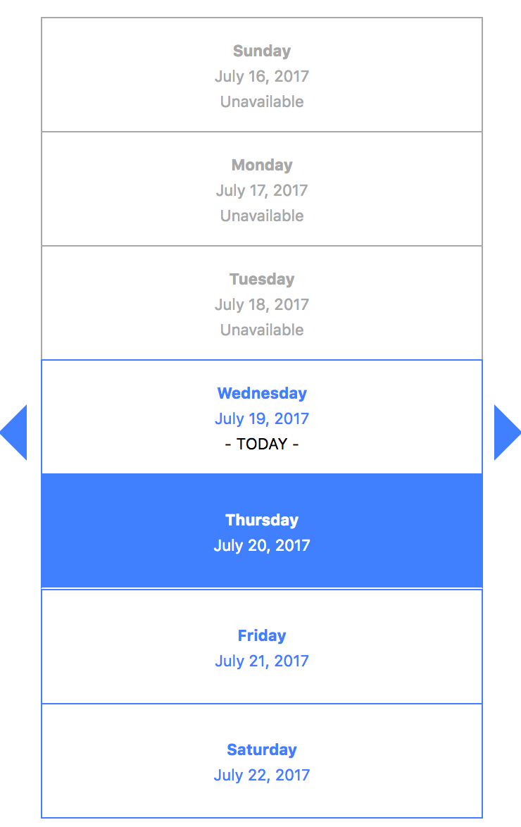
When mobilView props is true, mobilView enables:

classNames prop overrides existed css classes
render() {
  const classNames = {
    container : '',
    prevWeekArrow: '',
    nextWeekArrow: '',
    dayBox: '',
    dayCircleContainer: '',
    dayCicle: '',
    dayCircleTodayText: '',
    dayCircleUnavailable: '',
    dayCircleUnavailableText: '',
    dayCicleSelected: '',
  }
  return (
    <ReactWeeklyDayPicker
      classNames={classNames}
    />
  );
}
FAQs
React Weekly Day Picker
The npm package react-weekly-day-picker receives a total of 4,796 weekly downloads. As such, react-weekly-day-picker popularity was classified as popular.
We found that react-weekly-day-picker demonstrated a not healthy version release cadence and project activity because the last version was released a year ago. It has 1 open source maintainer collaborating on the project.
Did you know?

Socket for GitHub automatically highlights issues in each pull request and monitors the health of all your open source dependencies. Discover the contents of your packages and block harmful activity before you install or update your dependencies.

Research
/Security News
Socket researchers uncover how threat actors weaponize Discord across the npm, PyPI, and RubyGems ecosystems to exfiltrate sensitive data.

Security News
Socket now integrates with Bun 1.3’s Security Scanner API to block risky packages at install time and enforce your organization’s policies in local dev and CI.

Research
The Socket Threat Research Team is tracking weekly intrusions into the npm registry that follow a repeatable adversarial playbook used by North Korean state-sponsored actors.