This package features two custom dropdown menu components for ReactJS.
Online demo
| Single-selection | Multi-selection |
|---|
 |  |
| Single-selection searchable | Multi-selection searchable |
 |  |
Installation
npm install reactjs-dropdown-component --save
Make sure that you inserted the following link tag between the <head></head> tags inside /public/index.html of your react project. This is required for the FontAwesome component that the package depends on.
<link href="https://maxcdn.bootstrapcdn.com/font-awesome/4.7.0/css/font-awesome.min.css" rel="stylesheet" />
Usage
First, import the components:
import {DropdownMultiple, Dropdown} from 'reactjs-dropdown-component';
The structure of the state for the dropdown data should be as follows:
state = {
  location: [
    {
      id: 0,
      title: 'New York',
      selected: false,
      key: 'location'
    },
    {
      id: 1,
      title: 'Dublin',
      selected: false,
      key: 'location'
    },
    {
      id: 2,
      title: 'Istanbul',
      selected: false,
      key: 'location'
    }
  ],
  fruit: [
    {
      id: 0,
      title: 'Apple',
      selected: false,
      key: 'fruit'
    },
    {
      id: 1,
      title: 'Orange',
      selected: false,
      key: 'fruit'
    },
    {
      id: 2,
      title: 'Strawberry',
      selected: false,
      key: 'fruit'
    }
  ]
}
Then you need to include a function to control the state of the parent component.
This is for the single selection dropdown:
resetThenSet = (id, key) => {
  let temp = JSON.parse(JSON.stringify(this.state[key]));
  temp.forEach(item => item.selected = false);
  temp[id].selected = true;
  this.setState({
    [key]: temp
  });
}
And this is for the multi selection dropdown:
toggleItem = (id, key) => {
  let temp = JSON.parse(JSON.stringify(this.state[key]));
  temp[id].selected = !temp[id].selected;
  this.setState({
    [key]: temp
  });
}
Finally use the components as follows:
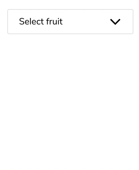
<Dropdown
title="Select fruit"
list={this.state.fruit}
resetThenSet={this.resetThenSet}
/>
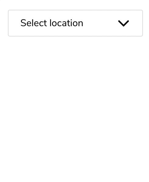
<DropdownMultiple
titleHelper="Location"
title="Select location"
list={this.state.location}
toggleItem={this.toggleItem}
/>
Note that when multiple options are selected in DropdownMultiple, titleHelper value gets an s letter appended. If you want to use a custom plural title, define titleHelperPlural as well.
<DropdownMultiple
  titleHelper="Sted"
  titleHelperPlural="Steder"
  title="Velg sted"
  list={this.state.location}
  toggleItem={this.toggleItem}
/>
Search functionality
Using searchable prop enables the search bar.
Pass an array of strings corresponding to place holder and not found message respectively.
<Dropdown
  searchable={["Search for fruit", "No matching fruit"]}
  title="Select fruit"
  list={this.state.fruit}
  resetThenSet={this.resetThenSet}
/>
Custom Styling
Refer to the following styling file for overriding the default styles. You can create your own styling file with the same class names in order to do your custom styling.


