RangeSlider
A highly optimized and fully customizable pure TS component for value range selection.
The component is not re-rendered while user moves the thumb.
Even if there is a label, only the label component is re-rendered when values are changed.
RangeSlider uses React Native's Animated library to transform thumbs / label / selected rail.
These optimizations help to achieve as much native look & feel as possible using only the JS layer.
Version 1
The version 1 was using native Android and iOS views.
That gives native look & feel in favor of flexibility.
You can find the version 1 here.
Installation
- npm:
npm install --save rn-range-slider
- yarn:
yarn add rn-range-slider
Usage
RangeSlider uses react hooks, so this component doesn't work with React Native versions below 0.59.0
You can find basic implementation of needed components (Thumb, Rail, RailSelected, Label, Notch) here.
...

import RangeSlider from 'rn-range-slider';

...

const renderThumb = useCallback(() => <Thumb/>, []);
const renderRail = useCallback(() => <Rail/>, []);
const renderRailSelected = useCallback(() => <RailSelected/>, []);
const renderLabel = useCallback(value => <Label text={value}/>, []);
const renderNotch = useCallback(() => <Notch/>, []);
const handleValueChange = useCallback((low, high) => {
  setLow(low);
  setHigh(high);
}, []);

...

<Slider
  style={styles.slider}
  min={0}
  max={100}
  step={1}
  floatingLabel
  renderThumb={renderThumb}
  renderRail={renderRail}
  renderRailSelected={renderRailSelected}
  renderLabel={renderLabel}
  renderNotch={renderNotch}
  onValueChanged={handleValueChange}
/>

...
Properties
min | Minimum value of slider | number | required |
max | Maximum value of slider | number | required |
minRange | Minimum range of thumbs allowed to be selected by the user.
Note: it is still possible to set values closer to each other than minRange programmatically.
If disableRange is set to true, maximum value allowed for user will be max - minRange. | number | 0 |
step | Step of slider | number | 1 |
low | Low value of slider | number | Initially min value will be set if not provided |
high | High value of slider | number | Initially max value will be set if not provided |
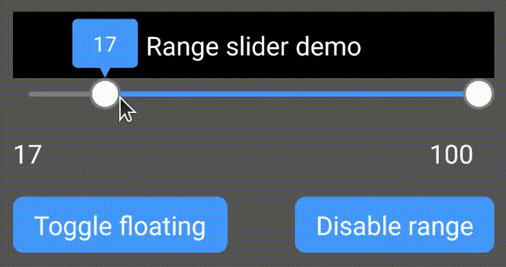
floatingLabel | If set to true, labels will not take space in component tree. Instead they will be rendered over the content above the slider (like a small popup). | boolean | false |
disableRange | Slider works as an ordinary slider with 1 control if true | boolean | false |
disabled | Any user interactions will be ignored if true | boolean | false |
allowLabelOverflow | If set to true, labels are allowed to be drawn outside of slider component's bounds.
Otherwise label's edges will never get out of component's edges. | boolean | false |
renderThumb | Should render the thumb. The name is the name of the thumb. This may be helpful if there is a need to render different thumbs for high and low values. | (name: 'high' | 'low') => Node | required |
renderRail | Should render the "rail" for thumbs.
Rendered component should have flex: 1 style so it won't fill up the whole space. | () => Node | required |
renderRailSelected | Should render the selected part of "rail" for thumbs.
Rendered component should not have flex: 1 style so it fills up the whole space. | () => Node | required |
renderLabel | Should render label above thumbs.
If no function is passed, no label will be drawn. | (value: number) => Node | undefined |
renderNotch | Should render the notch below the label (above the thumbs).
Classic notch is a small triangle below the label.
If allowLabelOverflow is not set to true, the notch will continue moving with thumb even if the label has already reached the edge of the component and can't move further. | () => Node | undefined |
onValueChanged | Will be called when a value was changed.
If disableRange is set to true, the second argument should be ignored.
fromUser will be true if the value was changed by user's interaction. | (low: number, high: number, fromUser: boolean) => void | undefined |
onSliderTouchStart | Will be called when user starts interaction with slider.
If disableRange is set to true, the second argument should be ignored. | (low: number, high: number) => void | undefined |
onSliderTouchEnd | Will be called when user ends interaction with slider.
If disableRange is set to true, the second argument should be ignored. | (low: number, high: number) => void | undefined |
All the other props (e.g. style) will be passed to root container component.
A special section about permanent labels.
The label of active thumb is a hint for a user. It's not showing selected values permanently.
It's a bad UI and UX to have a data for user in a moving label.
If you need to show current selected values to the user, add Text components to some static place in the screen and set the text based on selected low and high values.
I didn't and won't add that functionality to this component.
Any issues about this will be closed immediately.


