Sanity Inline Icon Manager

A Sanity plugin for selecting, managing, and customizing icons. Based on sanity-plugin-icon-manager, but can be configured to use the inline svg by default for a better support for SSR.
Powered by Iconify
⚡️ Features
- Sanity v3 plugin
- Customizable icons
- SVG code stored in Sanity
- Media preview component for your entry
- Download or copy to clipboard your icon
- Presence and Change Indicator preserved
- Custom Diff View
- Provide your own color palette for monochrome icons
- Basic API Hosting
- Search filter 'Collection'
- Collections tab
- Icon Inline Renderer component
- Limit Collections option
🔌 Installation
npm install sanity-plugin-inline-icon-manager
🧑💻 Usage
Add it as a plugin in sanity.config.ts (or .js):
import { defineConfig } from 'sanity'
import { IconManager } from 'sanity-plugin-icon-manager'
export default defineConfig({
plugins: [
IconManager({
}),
],
})
The plugin introduces one new object type called: icon.manager. You can define a new field with this type inside your documents.
import { defineField, defineType } from 'sanity'
const SampleDocument = defineType({
type: 'document',
name: 'sampleDocument',
title: 'Sample Document',
fields: [
defineField({
type: 'icon.manager',
name: 'icon',
title: 'Icon',
}),
],
})
export default SampleDocument
❗ IMPORTANT NOTE:
If you are using Next.js framework and are using the IconInlineRenderer. It's important to add this into your next.config.js file so to avoid the warnings and errors that isomorphic dompurify brings to have a better support for SSR pages
const webpack = require('webpack')
const nextConfig = {
webpack: (config, { isServer, nextRuntime }) => {
config.externals = [...config.externals, 'canvas', 'jsdom']
return config
},
}
🎬 How to render the icon on your website
You can use the exported IconInlineRenderer component to render the icon as an inline SVG. This way it supports SSR pages as it just parses the inline SVG string and renders it.
{
icon: 'bi:check2-circle',
metadata: {
flip: 'horizontal',
size: {
width: 20,
height: 20,
},
rotate: 0,
color: {
hex: '#6aceeb'
},
}
}
------------------------------------------------------------------------------------
import { IconInlineRenderer} from "sanity-plugin-inline-icon-manager/renderer";
const MyComponent = (props) => {
const {icon, metadata } = props
return (
<IconInlineRenderer
_type="icon.manager"
icon={icon}
metadata={metadata}
className="some-custom-classname"
/>
)
}
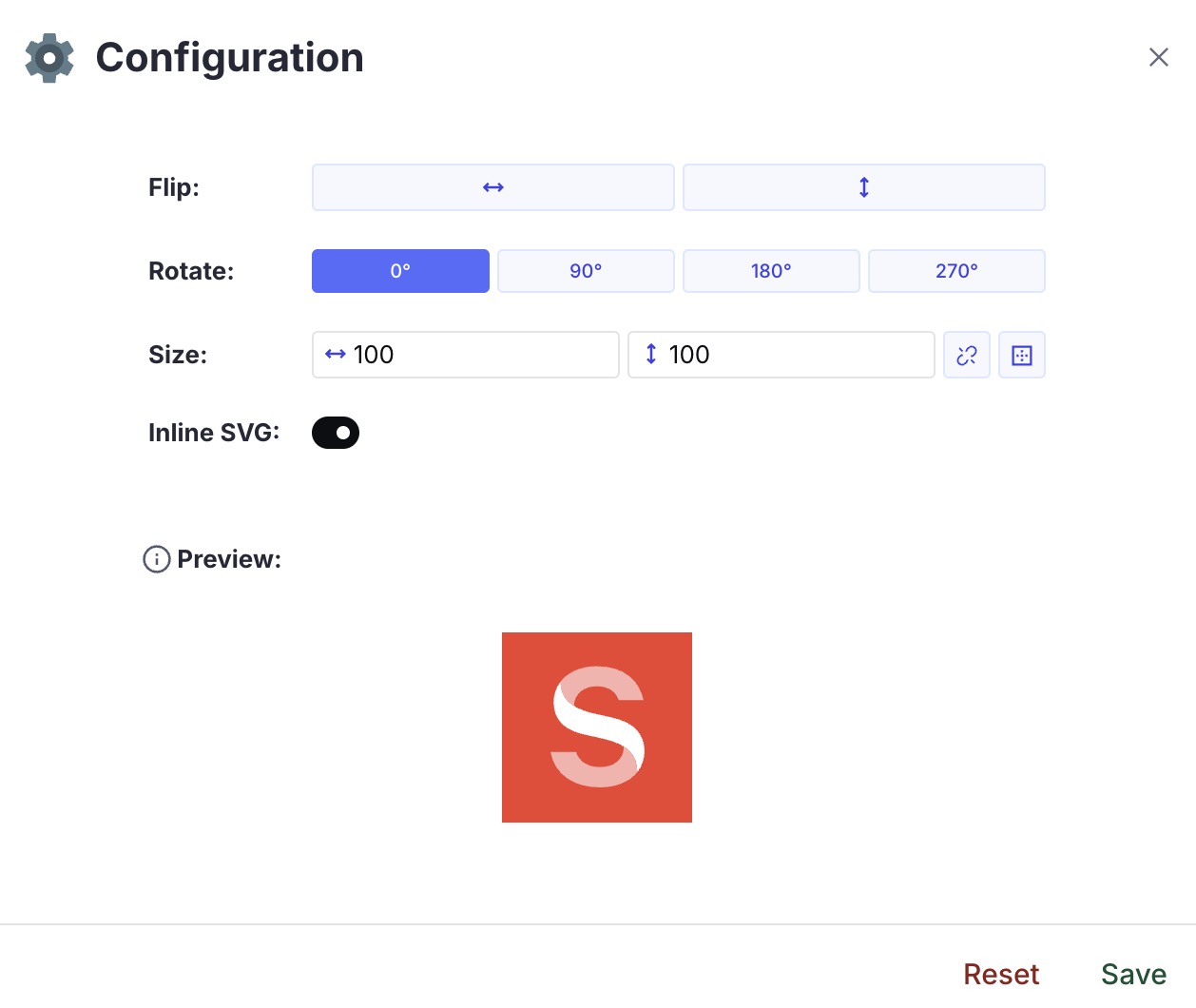
⚙️ Plugin Configuration
This is the main configuration of the plugin. The available options are:
{
availableCollections?: string[]
customEndpoint?: string
customPalette?: [
{
hex: string,
title?: string
},
]
storeInlineSvg?: string
}
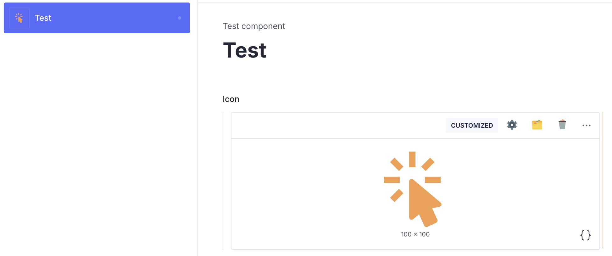
👀 Document List Preview
The plugin provides a component that you can use as a media preview of your icon within your document list.
You can pass a second argument (a true boolean value) to the function if you want to see always the original icon.
import {defineField, defineType} from 'sanity'
import {mediaPreview} from 'sanity-plugin-icon-manager'
const SampleDocument = defineType({
type: 'document',
name: 'sampleDocument',
title: 'Sample Document',
preview: {
select: {
icon: 'icon'
},
prepare({icon, ...rest}) {
return {
media: mediaPreview(icon)
}
}
}
fields: [
defineField({
type: 'icon.manager',
name: 'icon',
title: 'Icon',
}),
],
})
export default SampleDocument
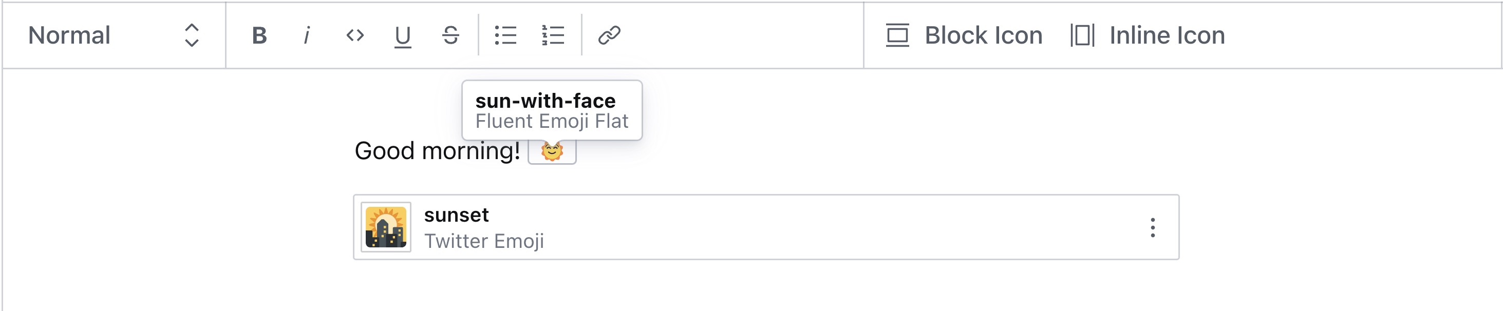
🧩 Add Icons to Portable Text
You can easily use the plugin inside your Portable Text, both for inline or block components. The preview will shows the rendered icon and its related name.
import { defineField, defineType } from 'sanity'
const SampleDocument = defineType({
type: 'document',
name: 'sampleDocument',
title: 'Sample Document',
fields: [
defineField({
name: 'body',
type: 'array',
title: 'Body',
of: [
{
type: 'block',
of: [{ type: 'icon.manager', title: 'Inline Icon' }],
},
{
type: 'icon.manager',
title: 'Block Icon',
},
],
}),
],
})
export default SampleDocument
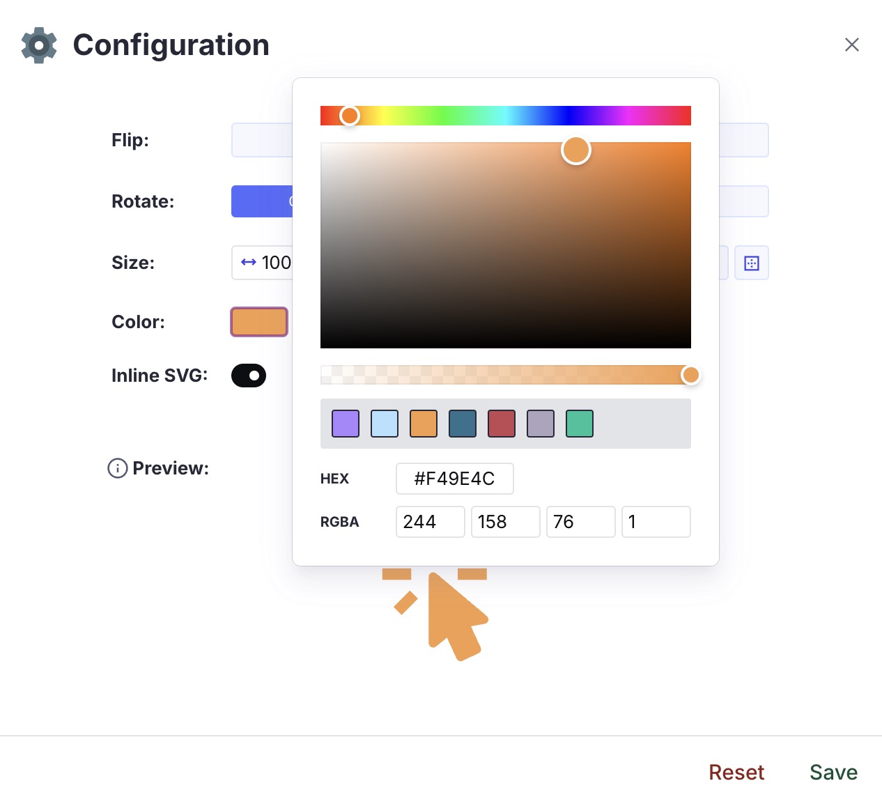
🎨 Custom Color Palette
You can pass a list of custom colors to fill your monochrome icons with your brand identity.
You need to provide a list of valid hex colors (with an optional title).
As a result, you will have access to these colors within the color picker when customizing a monochrome icon.
import { defineConfig } from 'sanity'
import { IconManager } from 'sanity-plugin-icon-manager'
export default defineConfig({
plugins: [
IconManager({
customPalette: [
{
hex: '#AB87FF',
title: 'Tropical Indigo',
},
{
hex: '#B4E1FF',
title: 'Uranian Blue',
},
{
hex: '#F49E4C',
title: 'Sandy brown',
},
{
hex: '#2D728F',
title: 'Cerulean',
},
{
hex: '#C14953',
title: 'Bittersweet shimmer',
},
{
hex: '#AEA4BF',
title: 'Rose quartz',
},
{
hex: '#02C39A',
title: 'Mint',
},
],
}),
],
})
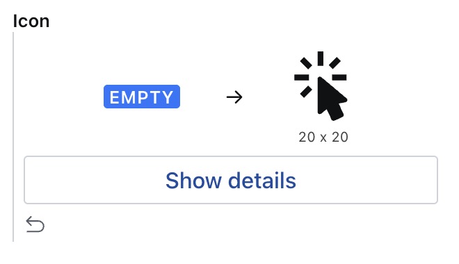
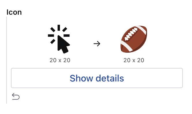
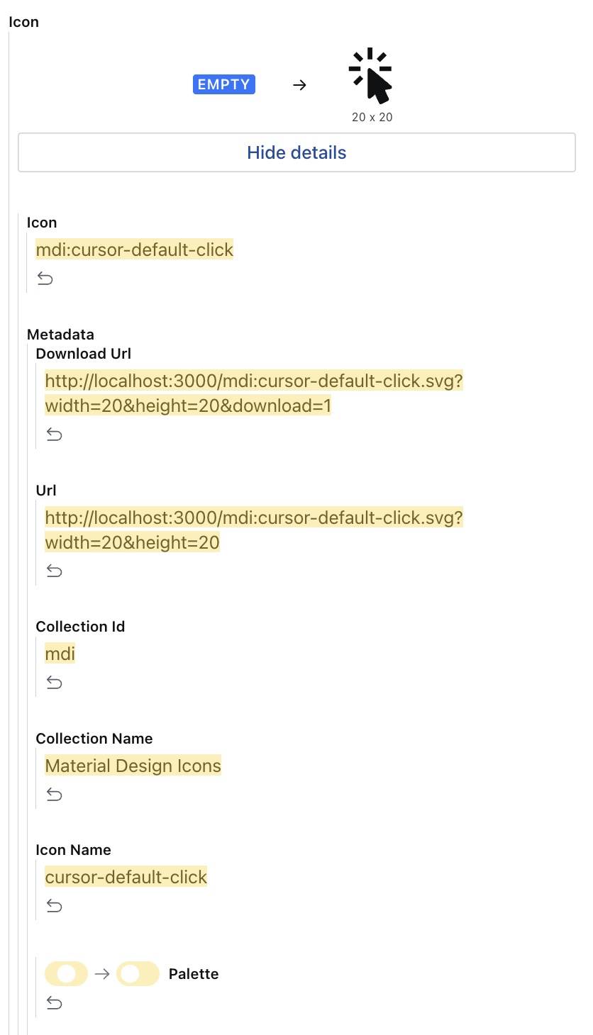
🎭 Custom Diff View
The plugin includes a custom diff component that allows you to view differences in a more human-readable way.
You can have three different custom diff views:
Icon Added
Icon Changed
Icon Removed
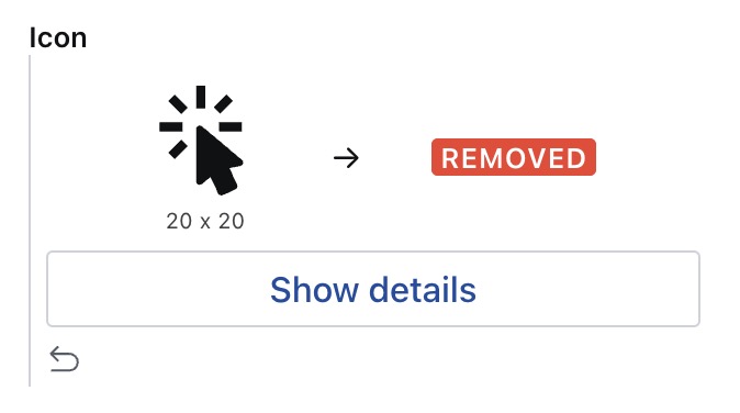
In any of the above cases you can always see the list of all the changes clicking on the Show details CTA.
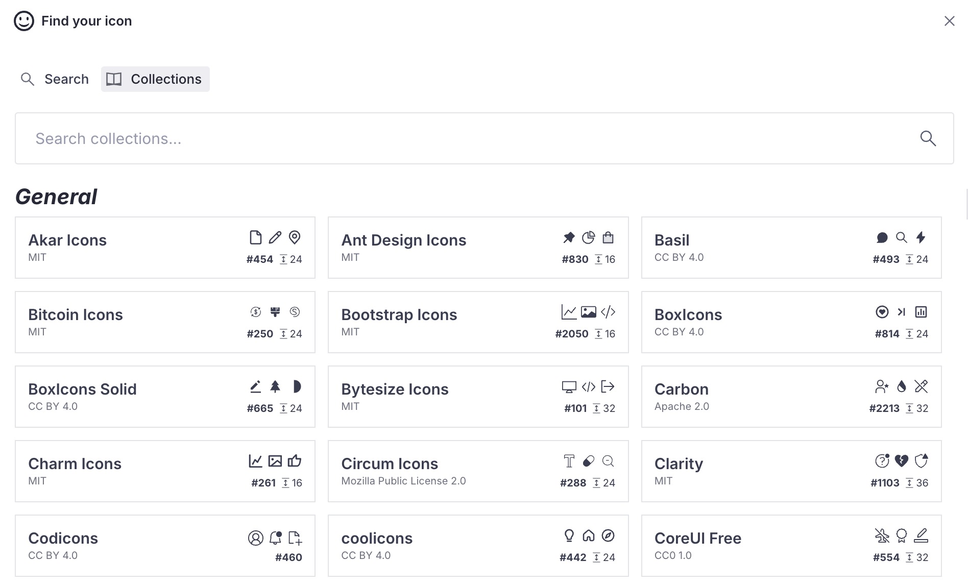
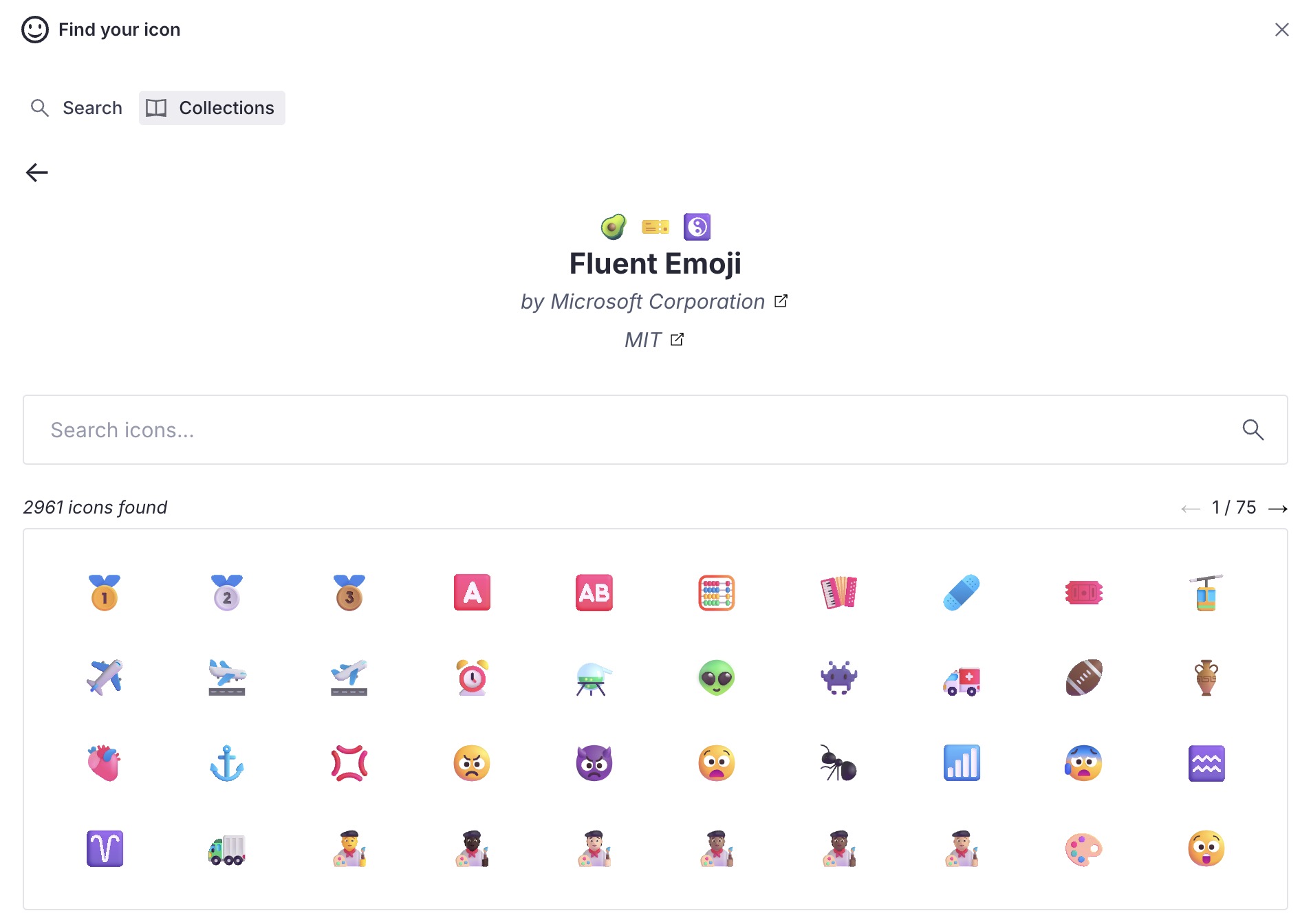
🗂️ Collections Tab
Starting from v.1.2.0, you can browse icons through all available collections.
The search dialog now offers a 'Tabs view' where you can choose to search for your icons as before or via the new 'Collections' tab. Here, you can scroll through all the available collections, select one, and choose an icon from the available options within the selected collection.
🌎 Basic Hosting
The Iconify project allows you to host the API on your server. You can learn more about it in their official documentation.
This plugin offers a basic customization through the customEndpoint option. If you pass a valid URL, hosting a custom Iconify implementation, the plugin will use it as the base path for all the interactions (searching and rendering).
import { defineConfig } from 'sanity'
import { IconManager } from 'sanity-plugin-icon-manager'
export default defineConfig({
plugins: [
IconManager({
customEndpoint: 'https://my.iconify.project.com',
}),
],
})
🗃️ Data model
  {
    _type: 'icon.manager',
    icon: string
    metadata: {
      iconName: string
      collectionId: string
      collectionName: string
      url: string
      downloadUrl: string
      inlineSvg: string
      hFlip: boolean
      vFlip: boolean
      flip: 'horizontal' | 'vertical' | 'horizontal,vertical'
      rotate: 0 | 1 | 2 | 3
      size: {
        width: number
        height: number
      }
      color: {
        hex: string
        rgba: {
          r: number
          g: number
          b: number
          a: number
        }
      }
      palette: boolean
      author: {
        name: string
        url: string
      },
      license: {
        name: string
        url: string
      }
    }
  }
📝 License
MIT © Evelan De
🧪 Develop & test
This plugin uses @sanity/plugin-kit
with default configuration for build & watch scripts.
See Testing a plugin in Sanity Studio
on how to run this plugin with hotreload in the studio.
Release new version
Run "CI & Release" workflow.
Make sure to select the main branch and check "Release new version".
Semantic release will only release on configured branches, so it is safe to run release on any branch.


