Product
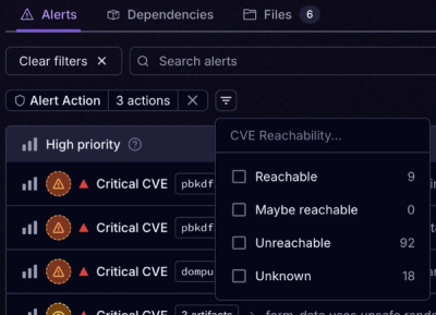
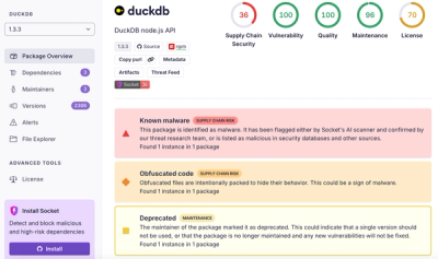
Introducing Tier 1 Reachability: Precision CVE Triage for Enterprise Teams
Socket’s new Tier 1 Reachability filters out up to 80% of irrelevant CVEs, so security teams can focus on the vulnerabilities that matter.
sassqwatch
Advanced tools
This lightweight script offers a way to do various checks against CSS media queries in JavaScript and offers the ability to replace images based on the result.
Best used with Browserify.
npm install sassqwatch
var sassqwatch = require('sassqwatch');
Requiring SassQwatch sets up the link to your Sass breakpoints then returns an object with some helpful methods that you can use in your modules.
SassQwatch looks at the font-family property of the head element in your CSS to check for the current breakpoint. It needs to know the order of your breakpoints, so list them on title. Then set up your media queries with appropriate names:
title {
  font-family: 'mq-tiny, mq-small, mq-medium, mq-large';
}
head {
  font-family: 'mq-tiny';

  @media (min-width: 480px) {
    font-family: 'mq-small';
  }
  @media (min-width: 600px) {
    font-family: 'mq-medium';
  }
  @media (min-width: 768px) {
    font-family: 'mq-large';
  }
}
Ideally you would use a nifty sass mixin to set all of this up.
Not using Browserify? No sweat! Just include sassqwatch.js or sassqwatch.min.js in your project:
<script src="sassqwatch.min.js"></script>
<script src="app.js"></script>
Then just require the sassqwatch module in your js files.
sample app.js
// get a reference to the sassqwatch module
var sassqwatch = require('sassqwatch');

// then use the methods like you would in a browserify module

// example: call the responsiveImages module with some custom options
sassqwatch.responsiveImages({
  selector: '.responsive'
});
Easy peasy.
callback (function): the callback function to call when the media query changes
The callback is provided the name of the new media query and the name of the previous media query.
sassqwatch.onChange(function (newMediaQuery, oldMediaQuery) {
  console.log('Media query switched to ' + newMediaQuery + ' from ' + oldMediaQuery);
});
breakpoint (string): the name of the media query to check against
callback (function): the callback function to call
fireOnce (boolean): setting this to true will cause the callback to only be fired the first time the condition is met. (Default: false)
A convenience method that functions similarly to a min-width media query in CSS. The callback is fired on the specified breakpoint as well as any breakpoint that is above it. The callback is provided the name of the current media query.
sassqwatch.min('mq-medium', function (newMediaQuery) {
  console.log('now min mq-medium');
}, true);
breakpoint (string): the name of the media query to check against
callback (function): the callback function to call
fireOnce (boolean): setting this to true will cause the callback to only be fired the first time the condition is met. (Default: false)
A convenience method that functions similarly to a max-width media query in CSS. The callback is fired on the specified breakpoint as well as any breakpoint that is below it. The callback is provided the name of the current media query.
sassqwatch.max('mq-medium', function (newMediaQuery) {
  console.log('now max mq-medium');
}, true);
breakpoint (string): the name of the media query to check against
callback (function): the callback function to call
fireOnce (boolean): setting this to true will cause the callback to only be fired the first time the condition is met. (Default: false)
A convenience method that fires a callback only on a specified breakpoint. The callback is provided the name of the previous media query.
sassqwatch.min('mq-medium', function (oldMediaQuery) {
  console.log('now on mq-medium');
}, true);
type (string): "min", "max", or "only"
breakpoint (string): the name of the media query to check against
callback (function): the callback function to call
Fires a callback when the current breakpoint is min, max, or only the specified breakpoint. If checking for "min" or "max" then the callback receives the name of the new media query. If checking for "only" the callback receives the name of the old media query.
sassqwatch.query('min', 'mq-medium', function (newMediaQuery) {
  console.log('now min mq-medium');
});
sassqwatch.query('only', 'mq-xxlarge', function (oldMediaQuery) {
  console.log('now on mq-xxlarge');
});
Manually returns the current media query.
var thisBreakpoint = sassqwatch.fetchMediaQuery();
index (number): the index of the media query to return
Returns a string of the name of the requested media query from the ordered array of media queries.
var i = something.length;
var breakpoint;

for (i; i > 0; i--) {
  breakpoint = sassqwatch.fetchMqName(i);
  // breakpoint = 'mq-xxlarge' (etc)
}
breakpoint (string): the name of the media query to return
Returns an integer of the index of the requested media query from the ordered array of media queries.
sassqwatch.onChange(function (newMediaQuery, oldMediaQuery) {
  var breakpointIndex = sassqwatch.fetchMqIndex(newMediaQuery);
});
breakpoint (string): the media query to check against.
Returns true if the current media query is below a specified media query, and false otherwise.
if ( sassqwatch.isBelow('mq-large') ) {
  console.log('Media query is below mq-large.');
}
breakpoint (string): the media query to check against.
Returns true if the current media query is above a specified media query, and false otherwise.
if ( sassqwatch.isAbove('mq-tiny') ) {
  console.log('Media query is above mq-tiny.');
}
breakpoint (string): the media query to check against.
Returns true if the current media query matches a specified media query, and false otherwise.
if ( sassqwatch.matches('mq-tiny') ) {
  console.log('Media query is mq-tiny.');
}
Replaces images automagically across specified breakpoints for selected elements. Use data attributes to provide the image sources. To use the module out of the box, add the class sassqwatch to the elements in your html.
var sassqwatch = require('sassqwatch');

// call it out of the box
sassqwatch.responsiveImages();

// or pass in some options
sassqwatch.responsiveImages({
  selector: '.my-custom-selector'
});
<img class="sassqwatch" src="default-image.jpg" data-mq-mini="mini-image-src.jpg" data-mq-large="large-image-src.jpg" />
You can also use this with background images.
<div class="sassqwatch" style="background-image: url(default-image.jpg)" data-mq-mini="mini-image-src.jpg" data-mq-large="large-image-src.jpg"></div>
Note: Make sure that the names of your data attributes match the names of the media queries that you set up on title in your Sass/CSS.
SassQwatch can even handle "retina" images on every media query for screens with a high pixel density. Just add a new media query data attribute with "2x" at the end and SassQwatch will do the rest.
<img class="sassqwatch" src="default-image.jpg" data-mq-mini="mini-image-src.jpg" data-mq-mini-2x="large-image-src@2x.jpg" />
selector: A custom selector for responsiveImages to bind to instead of the default .sassqwatch.
sassqwatch.responsiveImages({
  selector: '.responsive'
});
Sassqwatch is copyright (c) 2015 40Digits and is licensed under the terms of the MIT License.
Example images are CC-by-SA by Jyrki Salmi.
FAQs
The Sass Query Watcher.
We found that sassqwatch demonstrated a not healthy version release cadence and project activity because the last version was released a year ago. It has 1 open source maintainer collaborating on the project.
Did you know?

Socket for GitHub automatically highlights issues in each pull request and monitors the health of all your open source dependencies. Discover the contents of your packages and block harmful activity before you install or update your dependencies.

Product
Socket’s new Tier 1 Reachability filters out up to 80% of irrelevant CVEs, so security teams can focus on the vulnerabilities that matter.

Research
/Security News
Ongoing npm supply chain attack spreads to DuckDB: multiple packages compromised with the same wallet-drainer malware.

Security News
The MCP Steering Committee has launched the official MCP Registry in preview, a central hub for discovering and publishing MCP servers.