Skeleton Loader Webcomponent
Skeleton Loader is a very lightweight (less than 5kb gzip) webcomponent to make beautiful, animated loading skeletons in any web app - pure html/css/js or Angular/React.
Spinners and loaders have traditionally been the way to tell users
that content is going to take a while to load. While this approach is
great, it’s quickly becoming obsolete in modern development. Skeleton
screens are becoming the perfect replacement for traditional loaders
because they focus on progress rather than wait times, hence reducing
loading-time frustration...
-- #Smashing Magazine - Implementing Skeleton Screens In React
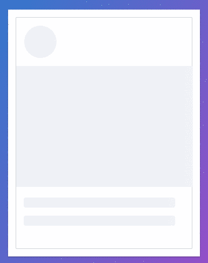
Demos
Skeleton Loader Home Page
Install
You can get it on NPM installing skeleton-webcomponent-loader as a project dependency or via UNPKG
npm i skeleton-webcomponent-loader
Script tag via UNPKG (global npm delivery network)
<script  type="module"  src="https://unpkg.com/skeleton-webcomponent-loader@1.0.5/dist/skeleton-webcomponent/skeleton-webcomponent.esm.js"></script>
<script  type="nomodule"  src="https://unpkg.com/skeleton-webcomponent-loader@1.0.5/dist/skeleton-webcomponent/skeleton-webcomponent.js"></script>
Script tag via npm
<script  type="module"  src="./node_modules/skeleton-webcomponent-loader/dist/skeleton-webcomponent/skeleton-webcomponent.esm.js"></script>
<script  type="nomodule"  src="./node_modules/skeleton-webcomponent-loader/dist/skeleton-webcomponent/skeleton-webcomponent.js"></script>
ESM import (Webpack/Browsers which support ES modules/Angular/React)
import {defineCustomElements as initSkeleton} from  './node_modules/skeleton-webcomponent-loader/loader/index.js';
initSkeleton();
Angular
In app.module.ts or any module which uses skeleton in order to provide ability to use webcomponents:
@NgModule({
  //whatever you have on app module goes here...
  schemas: [CUSTOM_ELEMENTS_SCHEMA]
})
export class AppModule {}
And in main.ts: or you can add it via stript tags in index.html as described before
import { defineCustomElements as initSkeleton } from  'skeleton-webcomponent-loader/loader';
initSkeleton();
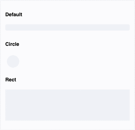
How to use?
Pass properties and see it in action
Properties
animation | animation | Animation type | `"false" | "progress" |
count | count | Number of rows of current skeleton type | number | 1 |
customStyles | custom-styles | Custom css styles (background/margins/width/height etc.) | `string | { [key: string]: string; }` |
height | height | Height of the skeleton ex. 100px, 100%, auto etc. | string | null |
showWarnings | show-warnings | Whether to show warnings for the wrong animation type/custom styles | boolean | true |
variant | variant | Variant of the skeleton - circle or row | `"circle" | "rect" |
width | width | Width of the skeleton ex. 100px, 100%, auto etc. | string | null |
CSS Custom Properties
--skeleton-background | Skeleton background: Default: #eff1f6 |
--skeleton-border-radius | Skeleton border-radius: Default: 4px for the row, 50% for the circle |
--skeleton-height | Skeleton height: Default: 20px for the row, 40px for the circle |
--skeleton-margin-bottom | Skeleton margin-bottom: Default: 10px for the row, 5px for the circle |
--skeleton-width | Skeleton width: Default: 100% for the row, 40px for the circle |
Inspired by ngx-skeleton-loader