

Storybook-Addon-Material-UI
https://github.com/sm-react/storybook-addon-material-ui
Addon for storybook wich wrap material-ui components into MuiThemeProvider. This helps and simplifies development of material-ui based components.
Features
- Wrapped in the theme provider. Just start to develop with base light theme.
- Injected TapEvent Plugin. Test on mobile devices.
- Switching themes. See how it looks in one click.
- Creating your castom theme. By code or in visual editor.
- Dynamic visual themes editing. Discover the all avalibale theme properties.
- Save made changes. (soon)
Getting Started
First, install the addon
npm i storybook-addon-material-ui --save-dev
Add this line to your addons.js file (create this file inside your storybook config directory if needed).
import 'storybook-addon-material-ui';
Now, write your stories with material-ui addon. By default your stories will be provided with Light Base Theme and Dark Base Theme
import React from 'react';
import { storiesOf, addDecorator } from '@kadira/storybook';
import {muiTheme} from 'storybook-addon-material-ui';
import CardExampleControlled from '../CardExampleControlled.jsx';
import RaisedButtonExampleSimple from '../RaisedButtonExampleSimple.jsx';
import DatePickerExampleSimple from '../DatePickerExampleSimple.jsx';
storiesOf('Material-UI', module)
.addDecorator(muiTheme())
.add('Card Example Controlled', () => (
<CardExampleControlled />
))
.add('Raised Button Example Simple', () => (
<RaisedButtonExampleSimple />
))
.add('Date Picker Example Simple', () => (
<DatePickerExampleSimple />
));
Note : You can switch between the loaded themes. Out of the box, you have two base themes, but you can simply add your custom themes like this:
import React from 'react';
import { storiesOf, addDecorator } from '@kadira/storybook';
import {muiTheme} from 'storybook-addon-material-ui';
import CardExampleControlled from '../CardExampleControlled.jsx';
import RaisedButtonExampleSimple from '../RaisedButtonExampleSimple.jsx';
import DatePickerExampleSimple from '../DatePickerExampleSimple.jsx';
const newTheme = {
themeName: 'Grey Theme',
palette: {
primary1Color: '#00bcd4',
alternateTextColor: '#4a4a4a',
canvasColor: '#616161',
textColor: '#bdbdbd',
secondaryTextColor: 'rgba(255, 255, 255, 0.54)',
disabledColor: '#757575',
accent1Color: '#607d8b',
},
};
storiesOf('Material-UI', module)
.addDecorator(muiTheme([newTheme]))
.add('Card Example Controlled', () => (
<CardExampleControlled />
))
.add('Raised Button Example Simple', () => (
<RaisedButtonExampleSimple />
))
.add('Date Picker Example Simple', () => (
<DatePickerExampleSimple />
));
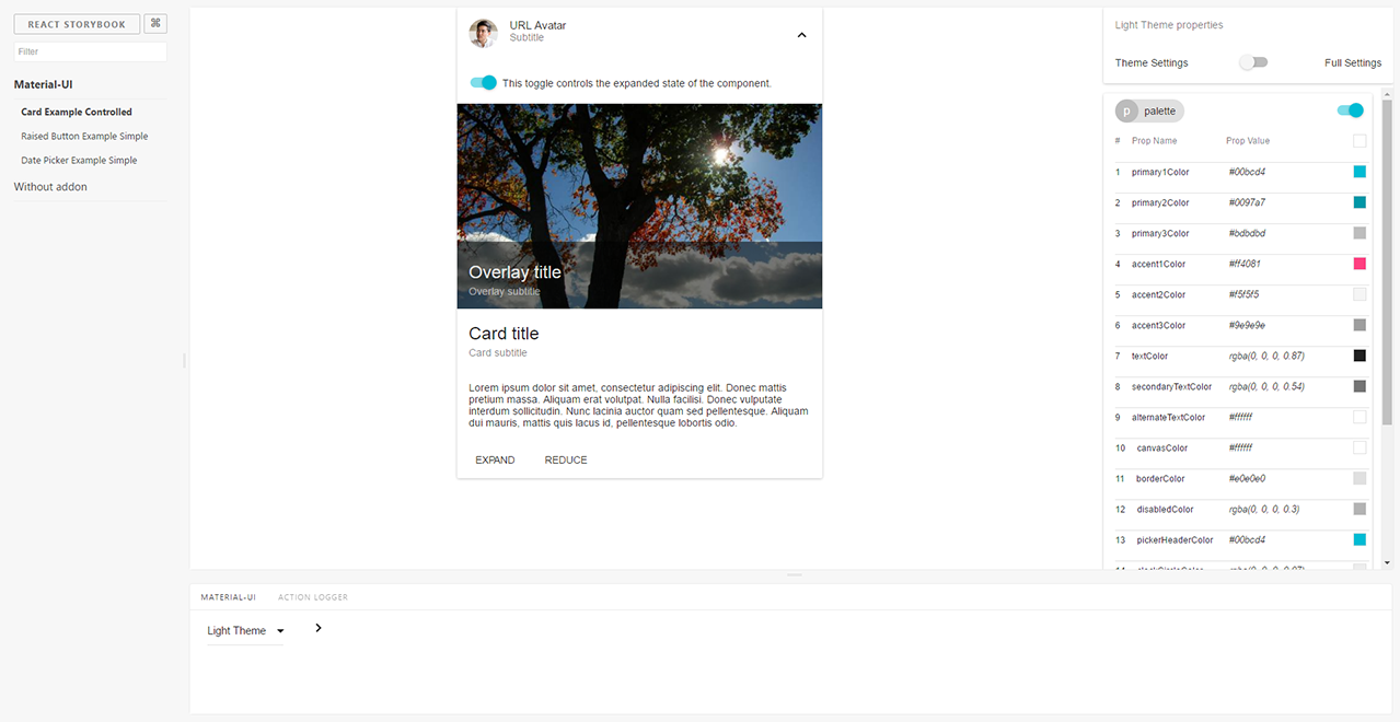
Usage
Select MATERIAL-UI panel. You can select the theme you need to see and you will have all theme settings in the right sidebar. You can edit it manually or via picker tool (click the icon to the right of the input)
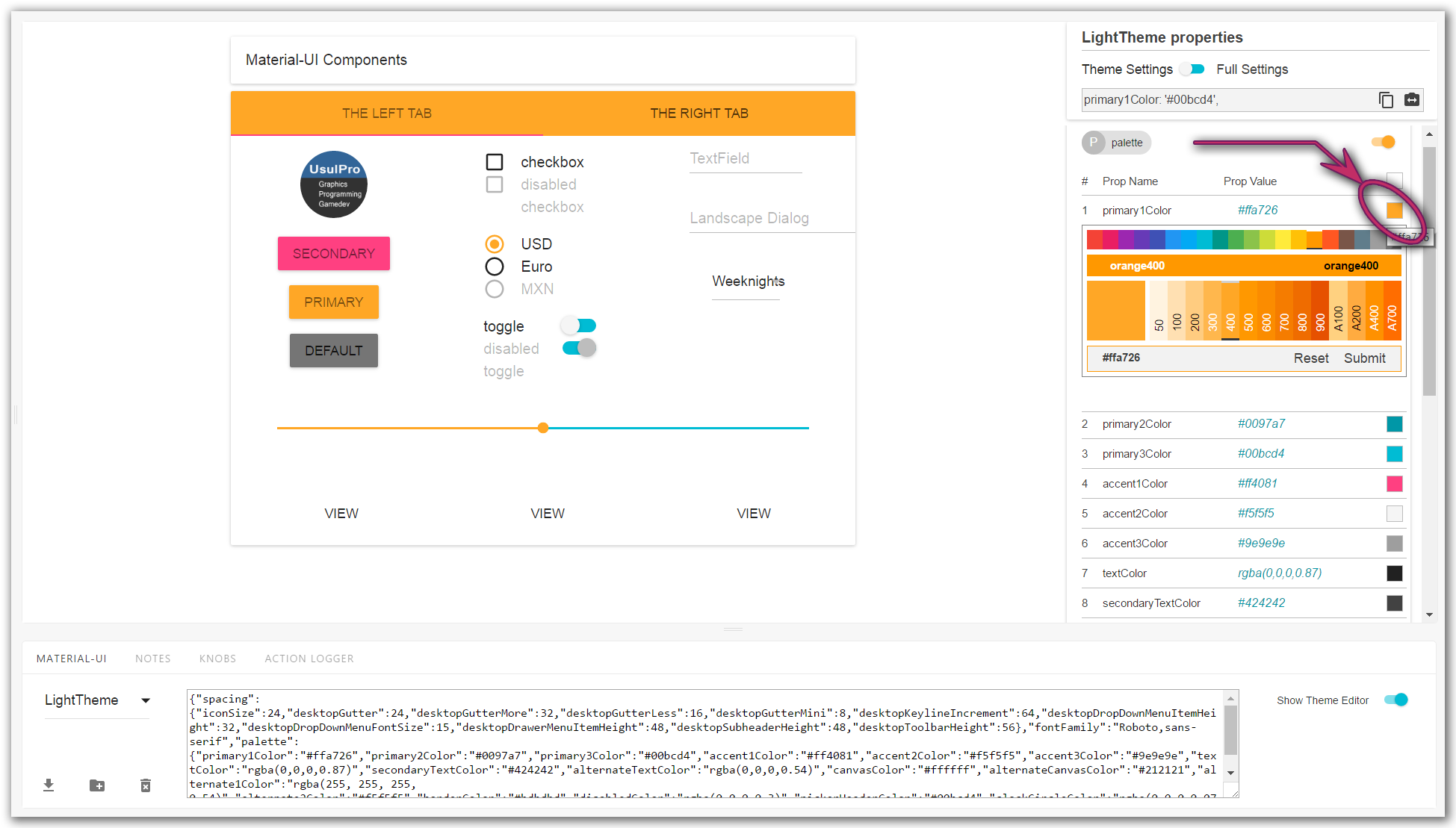
By default you see only assigned fields of selected theme. You can switch to Full settings and all available settings will appear. As you override one of them it will appear in Theme setting.
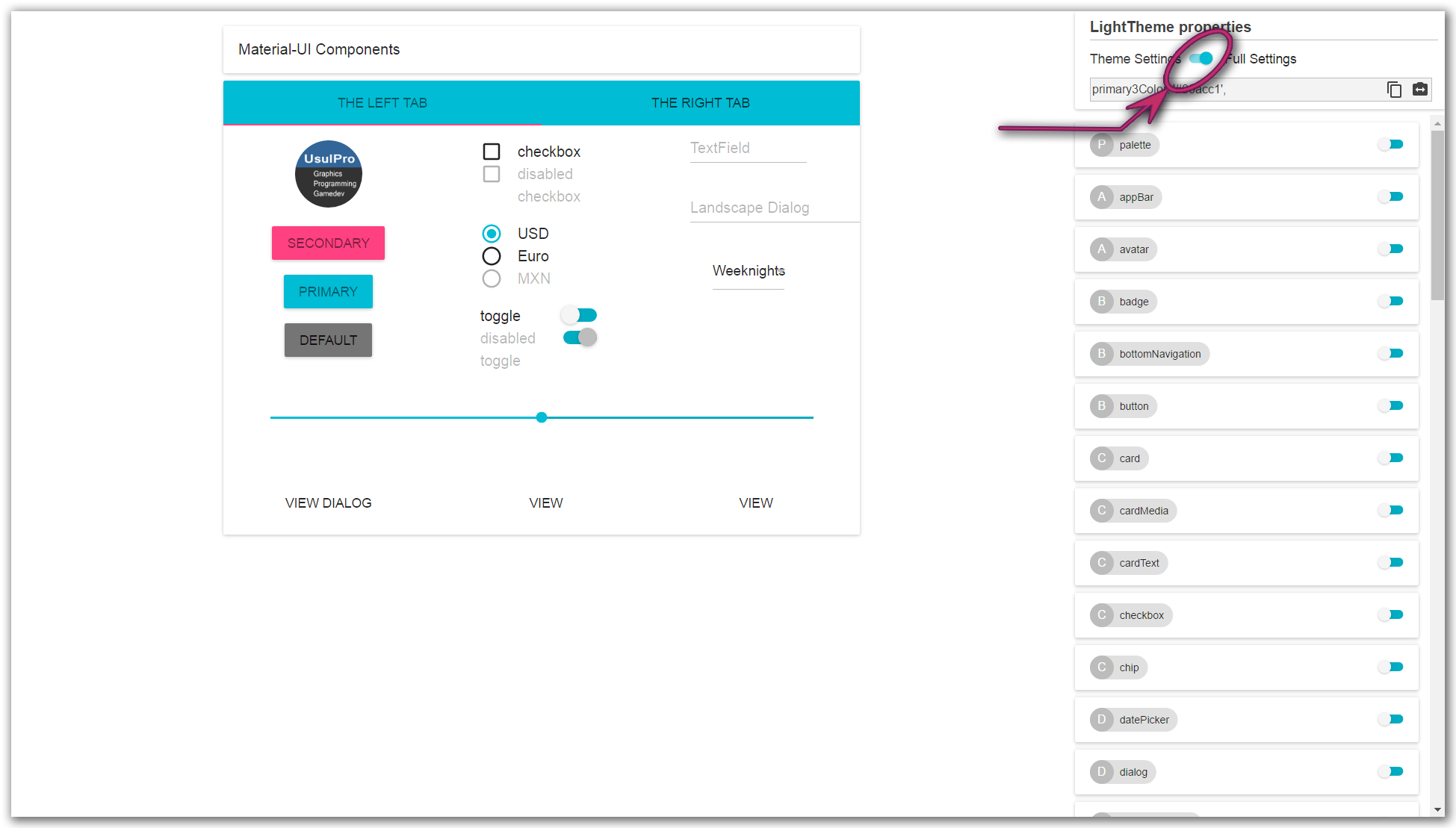
See details in sreenshorts
Demo
(will be soon)


