Product
Introducing Enhanced Alert Actions and Triage Functionality
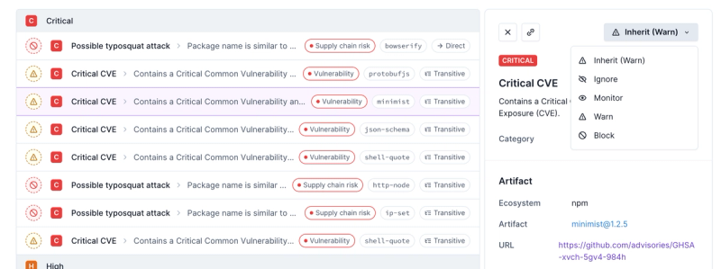
Socket now supports four distinct alert actions instead of the previous two, and alert triaging allows users to override the actions taken for all individual alerts.
storybook-color-picker
Advanced tools
Changelog
v2.0.1
29.06.2021.
Added
Readme
A Storybook addon. It allows you to quickly find and copy to clipboard any color from your custom color palette.
Add one or multiple color palettes and set the default palette globaly, for component or single story.

Created with TypeScript, React and Storybook.
To migrate from v1 to v2 adjust parameters in preview.js to match the pattern shown in Usage section below.
$ npm i storybook-color-picker
In your .storybook folder find main.js file and add this addon like below.
  module.exports = {
    ...
    "addons": [
      ...
      "storybook-color-picker"
    ]
  };
In your .storybook folder find preview.js file and add your color palette to parameters like below.
Scroll down to find out how your color palette must look like.
import yourFirstColorPalette from './yourFirstColorPalette.json';
import yourSecondColorPalette from './yourSecondColorPalette.json';

export const parameters = {
  ...
  colorPalettes: {
    default: 'Your first palette name', // Name of default palette for all components and its stories. Optional (fallback to first palette from the palettes array).
    palettes: [
      {
        name: 'Your first palette name', // string
        palette: yourFirstColorPalette, // Palette as an Object or an Array. See bellow.
      },
      {
        name: 'Your second palette name',
        palette: yourSecondColorPalette,
      },
    ]
  }
};
type ColorPaletteAsObject = Record<string, Record<string, string> | string>;
Example:
  {
    "light": {
      " 500": "#aaa",
      " 100": "#eee",
      " 400": "#bbb",
      " 200": "#ddd",
      " 300": "#ccc"
    },
    "dark": {
      "0100": "#888",
      "0500": "#000",
      "0400": "#222",
      "0200": "#666",
      "0300": "#444"
    }
  }
Usefull tip: add white spaces or zeros before numerical keys to prevent auto sorting
  type ColorPaletteAsArray = {
    label: string,
    values: [
      {
        label: string,
        value: string, // valid hex value
      }
    ],
  };
Example:
  [
    {
      "label": "light",
      "values": [
        {
          "label": "100",
          "value": "#fff"
        },
        {
          "label": "200",
          "value": "#aaa"
        }
      ]
    },
    {
      "label": "dark",
      "values": [
        {
          "label": "100",
          "value": "#222"
        },
        {
          "label": "200",
          "value": "#000000"
        }
      ]
    }
  ]
This will apply for all component's stories.
In MyComponent.stories.js add:
export default {
  ...
  parameters: {
    defaultColorPalette: 'Your second palette name',
  }
};
This will apply for specific story.
In MyComponent.stories.js add:
export const Primary = Template.bind({});

Primary.parameters = {
  defaultColorPalette: 'Your first palette name',
}
The following list increases by specificity.
default set on parameters in preview.jsdefaultColorPalette set on component parametersdefaultColorPalette set on story MyComponent.parametersFAQs
Choose a color from custom color palette and set it on component's control and/or copy it to clipboard.
The npm package storybook-color-picker receives a total of 2,056 weekly downloads. As such, storybook-color-picker popularity was classified as popular.
We found that storybook-color-picker demonstrated a healthy version release cadence and project activity because the last version was released less than a year ago. It has 1 open source maintainer collaborating on the project.
Did you know?

Socket for GitHub automatically highlights issues in each pull request and monitors the health of all your open source dependencies. Discover the contents of your packages and block harmful activity before you install or update your dependencies.

Product
Socket now supports four distinct alert actions instead of the previous two, and alert triaging allows users to override the actions taken for all individual alerts.

Security News
Polyfill.io has been serving malware for months via its CDN, after the project's open source maintainer sold the service to a company based in China.

Security News
OpenSSF is warning open source maintainers to stay vigilant against reputation farming on GitHub, where users artificially inflate their status by manipulating interactions on closed issues and PRs.