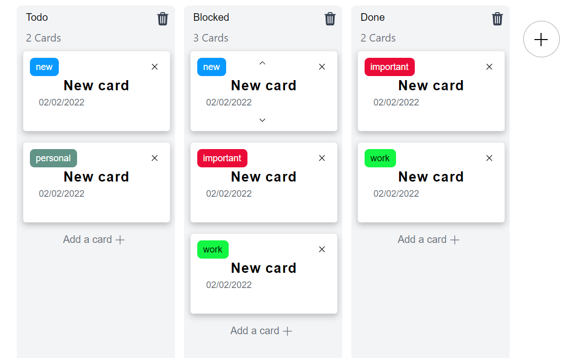
Svelte Kanban


A simple Svelte Kanban made in pure CSS
## Installation
npm i svelte-kanban
Usage
<script>
    import Kanban from 'svelte-kanban';
</script>

<div style="width:100%; height:100%;">
    <Kanban/>
</div>
Props
Full list of props/bindable variables for this component:
| name | default | description |
|---|
lang | 'en' | String to specify the language of the kanban, only french and english supported atm (en/fr). |
colsList | ['Todo','Done'] | Array of string to define the default columns. |
catsList | [{'new',color:'white', bgColor:"#0A99FF"},{label:'important',color:'white',bgColor:"#EA0B38"},{label:'task',color:'black',bgColor:"#00F5DC"},{label:'personal',color:'white',bgColor:"#629387"},{label:'work',color:'black',bgColor:"#13F644"}] | Array of objects (label:string, color:string, bgColor:string)defining the categories available for the cards. |
maxColumns (unavailable yet) | 5 | Max number of columns the user can display on the kanban. |
minimalist (unavailable yet) | false | Boolean, if set to true, the card will be minimalist version with only a title and a delete button. |
Styling props (* : available atm)
| name | default | description |
|---|
theme* | 'light' | string: specify the theme you want to used light/dark |
primary | null | string : if you want to specify the primary background color (behind the kanbans columns / card background) |
secondary | null | string : if you want to specify the secondary background color (kanbans columns) |
third | null | string : if you want to specify the secondary background color (no usage atm) |
fontPrimary | null | string : if you want to specify the primary font color (col title, card title) |
fontSecondary | null | string : if you want to specify the secondary font color (cards count, new task, date text) |
Events
Kanban.svelte dispatches the following events:
| name | detail | description |
|---|
columnRemove | { position:number, name:string } | Triggers when a column is removed. |
columnAdd | { position: number } | Triggers when a column is moved. |
columnMoved | { old_pos:number, new_pos:number } | Triggers when a column is added. |
cardDragStart | {card:number, col:number, event:Event} | Triggers when a card start being dragged. col = position of the column, card = position of the card in the column, event: mousedown event props |
cardDragMove | {card:number, col:number, event:Event} | Triggers every time the card is moving (ie on every mousemove) |
cardDragEnd | {card:number, col:number, event:Event} | Triggers when the dragging of the card ended. |
cardDragSuccess | {old_col:number, old_pos:number, new_col:number, new_pos:number} | Triggers when the drop of the card is a success (ie : the card has been moved to another column). |
cardDragFailed | {col:number, card:number} | Triggers when the drop of the card is a fail (ie : the card has not been moved and stayed in the origin column). |
cardAdd | {col:number} | Triggers when a card is added to a column. |
cardPropModify | { card:number, col:number, prop:string, value:string} | Triggers when a prop of a card is in edit mode. |
cardPropSaved | { card:number, col:number, prop:string, value:string} | Triggers when a prop of a card is saved. |
moveCardUp | {col:number, old_pos:number, new_pos:number} | Triggers when a card is moved down inside a column. |
moveCardDown | {col:number, old_pos:number, new_pos:number} | Triggers when a card is moved up inside a column. |
Examples
on:columnAdd={(e) => console.log('columnAdd', e)}on:cardAdd={(e) => console.log('cardAdd', e}.on:moveCardUp={yourFunctionHere}
<Kanban
  on:columnAdd={(e) => alert(`You ${e.detail.type}ed '${e.detail.option.label}'`)}
  on:cardDragStart={(e) => alert(`You are moving the card at the '${e.detail.option.label}' position on the column n° ${}`)}
/>
Dev Mode
git clone https://github.com/V-Py/svelte-kanban
cd svelte-kanban
npm install
npm run dev


