Product
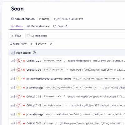
Unify Your Security Stack with Socket Basics
A single platform for static analysis, secrets detection, container scanning, and CVE checks—built on trusted open source tools, ready to run out of the box.
tl-opcr-modal-component-library
Advanced tools
This README provides documentation for a custom React Modal component. This component is designed to be flexible and reusable, offering customizable styles and content. It can be used in various parts of a React application to display modal dialogs. Insta
This README provides documentation for a custom React Modal component. This component is designed to be flexible and reusable, offering customizable styles and content. It can be used in various parts of a React application to display modal dialogs. Installation
To use the Modal component, simply copy the Modal.js file into your project's component directory. Ensure that you have React and PropTypes installed in your project.
Here's a basic example of how to use the Modal component in your React application:
jsx
import React, { useState } from 'react'; import Modal from './Modal'; // Adjust the import path based on your file structure
const YourComponent = () => { const [isModalVisible, setIsModalVisible] = useState(false); const handleClose = () => setIsModalVisible(false);
const modalConfig = {
isVisible: isModalVisible,
title: "Modal Title",
text: "Modal content goes here",
onClose: handleClose,
styles: {
// Custom styles here
}
};
return (
<div>
<button onClick={() => setIsModalVisible(true)}>Open Modal</button>
<Modal config={modalConfig}>
{/* Additional content can go here */}
</Modal>
</div>
);
};
The Modal component accepts the following props:
config: An object containing the modal configuration:
    isVisible: Boolean to control the visibility of the modal.
    title: String for the modal title.
    text: String for the modal content.
    styles: Object for custom styling.
    onClose: Function to handle the close event.
children: React nodes for additional content to be rendered inside the modal.
The Modal component allows for custom styling via the styles object in the config prop. The styles object can contain styles for different parts of the modal, such as the overlay, modal container, title, text, and close button.
React
PropTypes
FAQs
This README provides documentation for a custom React Modal component. This component is designed to be flexible and reusable, offering customizable styles and content. It can be used in various parts of a React application to display modal dialogs. Insta
The npm package tl-opcr-modal-component-library receives a total of 0 weekly downloads. As such, tl-opcr-modal-component-library popularity was classified as not popular.
We found that tl-opcr-modal-component-library demonstrated a not healthy version release cadence and project activity because the last version was released a year ago. It has 1 open source maintainer collaborating on the project.
Did you know?

Socket for GitHub automatically highlights issues in each pull request and monitors the health of all your open source dependencies. Discover the contents of your packages and block harmful activity before you install or update your dependencies.

Product
A single platform for static analysis, secrets detection, container scanning, and CVE checks—built on trusted open source tools, ready to run out of the box.

Product
Socket is launching experimental protection for the Hugging Face ecosystem, scanning for malware and malicious payload injections inside model files to prevent silent AI supply chain attacks.

Research
/Security News
The Socket Threat Research Team uncovered a coordinated campaign that floods the Chrome Web Store with 131 rebranded clones of a WhatsApp Web automation extension to spam Brazilian users.