Product
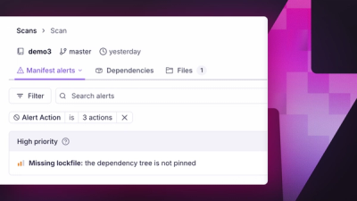
Introducing Manifest Alerts
Socket now detects supply chain risks in project manifests, starting with missing lockfiles that can make dependency installs non-reproducible.
By André Staltz, Trevor Norris - Jun 16, 2026
vue-height-collapsible
Advanced tools
Collapsible component with CSS transition for elements with variable and dynamic height.


Vue HeightCollapsible

| Codesandbox simple Vue |  | View | Edit |
| Codesandbox multiple Vue | | View | Edit |
| Codesandbox simple Vue 3 | | View | Edit |
:warning: ️You need to add style (transition) in your own stylesheet to add animation. Here is an example.
<style>
[data-height-collapsible] {
transition: height 280ms cubic-bezier(0.4, 0, 0.2, 1);
}
</style>
Alternatively you can add it using the transition prop.
npm install vue-height-collapsible
// or yarn install vue-height-collapsible
import HeightCollapsible from "vue-height-collapsible";
import HeightCollapsible from "vue-height-collapsible/vue3";
The source file could be copied. It is only this file.
vue-height-collapsible.vue
<template>
  <div class="my-component">
    <button @click="isOpen = !isOpen">Toggle</button>
    <HeightCollapsible :isOpen="isOpen">
      <p>Paragraph of text.</p>
      <p>Another paragraph is also OK.</p>
    </HeightCollapsible>
  </div>
</template>

<script>
import HeightCollapsible from 'vue-height-collapsible'

export default {
  name: 'MyComponent',
  components: {
    HeightCollapsible,
  },
  data() {
    return {
      isOpen: true,
    }
  },
}
</script>
<template>
  <div class="my-component">
    <button
      @click="isOpen = !isOpen"
      :aria-expanded="isOpen"
      aria-controls="my-collapsible-1"
    >
      <span>Toggle {{ collapseState }}</span>
    </button>
    <HeightCollapsible
      :isOpen="isOpen"
      @update="onUpdate"
      v-slot="{ state }"
      id="my-collapsible-1"
    >
      <p>I know the collapse state: {{ state }}</p>
      <p>Paragraph of text.</p>
      <p>Another paragraph is also OK.</p>
      <p>Images and any other content are ok too.</p>
    </HeightCollapsible>
  </div>
</template>

<script>
import HeightCollapsible from 'vue-height-collapsible'

export default {
  name: 'MyComponent',
  components: {
    HeightCollapsible,
  },
  data() {
    return {
      isOpen: true,
      collapseState: '',
    }
  },
  methods: {
    onUpdate({ state }) {
      this.collapseState = state
    },
  },
}
</script>
| Prop | Type | Default |
|---|---|---|
| isOpen | boolean | true |
| transition | string | |
| tag | string | div |
| overflowOnExpanded | boolean | false |
isOpen : booleanExpands or collapses content.
transition : stringYou can also specify a CSS transition inline by using the transition prop.
<HeightCollapsible transition="height 300ms ease-in-out" :isOpen="isOpen">
  <p>Paragraph of text</p>
</HeightCollapsible>
tag : stringYou can specify the HTML element type for the collapse component. By default the element type is a div element.
<HeightCollapsible tag="article" :isOpen="isOpen">
  <p>Paragraph of text</p>
</HeightCollapsible>
overflowOnExpanded : booleanIf added, then overflow: hidden inline style will not be added when the state is expanded.
https://www.npmjs.com/package/vue-height-collapsible
To see all the available CDN files go to https://unpkg.com/browse/vue-height-collapsible/
https://github.com/kunukn/react-collapse
The compiler in this repository works for Vue 2 version.
This library was created using https://github.com/team-innovation/vue-sfc-rollup
FAQs
Collapsible library based on CSS transition for Vue
The npm package vue-height-collapsible receives a total of 1,887 weekly downloads. As such, vue-height-collapsible popularity was classified as popular.
We found that vue-height-collapsible demonstrated a not healthy version release cadence and project activity because the last version was released a year ago. It has 1 open source maintainer collaborating on the project.
Did you know?

Socket for GitHub automatically highlights issues in each pull request and monitors the health of all your open source dependencies. Discover the contents of your packages and block harmful activity before you install or update your dependencies.
Product
Socket now detects supply chain risks in project manifests, starting with missing lockfiles that can make dependency installs non-reproducible.

Research
/Security News
The trojanized extensions use TinyGo-compiled WebAssembly and Solana transaction memos to resolve command-and-control infrastructure.

Security News
Anthropic says the directive cited national security concerns over a narrow jailbreak, but offered no specific technical details.