Product
Introducing Rust Support in Socket
Socket now supports Rust and Cargo, offering package search for all users and experimental SBOM generation for enterprise projects.
vue-simple-accordion
Advanced tools
A simple, easily configurable accordion for Vue 2.x
To view a demo online: https://tkhquang.github.io/vue-simple-accordion
npm install --save vue-simple-accordion
or
yarn add vue-simple-accordion
import {
  VsaList,
  VsaItem,
  VsaHeading,
  VsaContent,
  VsaIcon
} from 'vue-simple-accordion';
import 'vue-simple-accordion/dist/vue-simple-accordion.css';

export default {
  // ...
  components: {
    VsaList,
    VsaItem,
    VsaHeading,
    VsaContent,
    VsaIcon
  }
  // ...
}
or
import VueSimpleAccordion from 'vue-simple-accordion';
import 'vue-simple-accordion/dist/vue-simple-accordion.css';

Vue.use(VueSimpleAccordion, {
  // ... Options go here
});
<vsa-list>
  <!-- Here you can use v-for to loop through items  -->
  <vsa-item>
    <vsa-heading>
      This is the heading
    </vsa-heading>

    <vsa-content>
      This is the content
    </vsa-content>
  </vsa-item>
</vsa-list>
With the default options, the html will be generated as:
<dl
  id="vsa-list-{list_id}"
  class="vsa-list"
  data-vsa-list="{list_id}"
>
  <div
    id="vsa-item-{item_id}"
    class="vsa-item vsa-item--is-active"
    data-vsa-list="{list_id}"
    data-vsa-item="{item_id}",
    data-vsa-active="true"
  >
    <dt
      class="vsa-item__heading"
      {data_attrs}
    >
      <button
        class="vsa-item__trigger"
        type="button"
        aria-expanded="true"
        aria-controls="vsa-panel-{item_id}"
        {data_attrs}
      >
        <span
          class="vsa-item__trigger__content"
          {data_attrs}
        >
          This is the heading
        </span>
        <span
          class="vsa-item__trigger__icon vsa-item__trigger__icon--is-active"
          {data_attrs}
        >
        </span>
      </button>
    </dt>
    <dd
      id="vsa-panel-{item_id}"
      class="vsa-item__content"
      role="region"
      aria-labelledby="vsa-item-{item_id}"
      {data_attrs}
    >
      This is the content
    </dd>
  </div>
</dl>
All user options or component props if not set (or are undefined) will automatically fallback to these default values:
{
  tags: {
    list: "dl",
    list__item: "div",
    item__heading: "dt",
    heading__content: "span",
    heading__icon: "span",
    item__content: "dd"
  },
  roles: {
    presentation: false,
    heading: false,
    region: true
  },
  transition: "vsa-collapse",
  initActive: false,
  forceActive: undefined,
  autoCollapse: true,
  onHeadingClick: () => {},
  navigation: true
}
| Props | Type | Description |
|---|---|---|
| tags | Object | Define the html tags for the current list (check the default options for details) |
| roles | Object | Define the html roles for the current list (check the default options for details) |
| transition | String | Name of the entering/leaving transition effects for items |
| initActive | Boolean | Expand the list by default or not |
| forceActive | Boolean | When set, this will force the whole list to be expanded or collapsed |
| autoCollapse | Boolean | When an item is active (expanded), the other items of the list will automatically collapse |
| navigation | Boolean | Enable ↑ ↓ Home End navigation while focusing on a heading |
| Props | Type | Description |
|---|---|---|
| transition | String | Name of the entering/leaving transition effects for the curren item |
| initActive | Boolean | Expand the current item by default or not |
| forceActive | Boolean | When set, this will force the current item to be expanded or collapsed |
| level | String | Number | Identify aria-level while using heading: true |
| onHeadingClick | Function | A function will be called automatically when the trigger button is clicked with the arguments contain data of the list and that item |
Priotiry: Item > List > Default
If you import the css, these CSS variables are available in .vsa-list:
--vsa-max-width: 720px;
--vsa-min-width: 300px;
--vsa-text-color: rgba(55, 55, 55, 1);
--vsa-highlight-color: rgba(85, 119, 170, 1);
--vsa-bg-color: rgba(255, 255, 255, 1);
--vsa-border-color: rgba(0, 0, 0, 0.2);
--vsa-border-width: 1px;
--vsa-border-style: solid;
--vsa-heading-padding: 1rem 1rem;
--vsa-content-padding: 1rem 1rem;
--vsa-default-icon-size: 1;
In case you don't like the default CSS styling from the library, don't import the css and style your own with the class names as in this structure.
FAQs
A simple, easily configurable accordion for Vue 2.x
The npm package vue-simple-accordion receives a total of 798 weekly downloads. As such, vue-simple-accordion popularity was classified as not popular.
We found that vue-simple-accordion demonstrated a not healthy version release cadence and project activity because the last version was released a year ago. It has 1 open source maintainer collaborating on the project.
Did you know?

Socket for GitHub automatically highlights issues in each pull request and monitors the health of all your open source dependencies. Discover the contents of your packages and block harmful activity before you install or update your dependencies.

Product
Socket now supports Rust and Cargo, offering package search for all users and experimental SBOM generation for enterprise projects.

Product
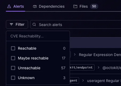
Socket’s precomputed reachability slashes false positives by flagging up to 80% of vulnerabilities as irrelevant, with no setup and instant results.

Product
Socket is launching experimental protection for Chrome extensions, scanning for malware and risky permissions to prevent silent supply chain attacks.