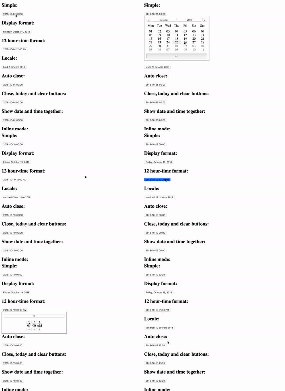
Vue Datetime Picker

Fast, powerful and easy to use component datetime picker for VueJS. The component includes localization, highlight and disable date, 12/24-hour time, inline mode, etc.
Demo
See demo here

Requirements
Usage
npm install vue-vanilla-datetime-picker --save
import DateTimePicker from 'vue-vanilla-datetime-picker';

Vue.component('date-time-picker', DateTimePicker);
@import "node_modules/vue-vanilla-datetime-picker/dist/DateTimePicker"
Props:
| Name | Required | Type | Default | Description |
|---|
| v-model, value | * | String, Date, DateTime (luxon) | | Value |
| value-format | | String | yyyy-LL-dd HH:mm:ss | Value format |
| max-date | | String, Date, DateTime (luxon) | null | Max date |
| min-date | | String, Date, DateTime (luxon) | null | Min date |
| constraints-format | | String | yyyy-LL-dd | Constraints format |
| locale | | String | en | Set locale. |
| inline | | Boolean | false | Enable inline mode. |
| disabled | | Boolean | false | Disable datetime picker. |
| format | | String | yyyy-LL-dd HH:mm | Display format. |
| time-picker | | Boolean | true | Show time picker. |
| hour-time | | Number | 24 | Hour in 12/24-hour time. Values: '12', '24'. |
| no-toggle-time-picker | | Boolean | false | No toggle time picker button. |
| only-time-picker | | Boolean | false | Show only time picker. |
| start-from-sunday | | Boolean | false | Set Sunday as first day of week. |
| minute-step | | Number | 1 | Set step for minute. |
| seconds-picker | | Boolean | false | Show second picker. |
| initial-view | | String | days | Initial view: 'days', 'months', 'years' |
| initial-view-date | | String, Date, DateTime (luxon) | days | Initial date view |
| main-button-class | | String | | Class for main button. |
| disabled-dates | | Array | [] | Array of disabled dates. |
| highlighted | | Array | [] | Array of highlighted dates. Example: [{ date: '2018-09-17', class: 'highlighted' }] |
| auto-close | | Boolean | false | Close date picker after select date. |
| clear-button | | Boolean | false | Show "Clear" button. |
| close-button | | Boolean | false | Show "Close" button. |
| today-button | | Boolean | false | Show "Today" button. |
| value-type | | String | Auto | Set value type. Types: 'Auto', 'String', 'Date', 'Luxon'. |
| empty-value | | Any | '' | Set empty value for clear button. |
Slots:
| Name | Description |
|---|
| choose-date | For main button if date not selected. |
| formatted-datetime | For main button if date selected. |
| date | For date button. |
| time | For time button. |
| months-prev | For previous month button. |
| months-next | For next month button. |
| years-prev | For previous year button. |
| years-next | For next year button. |
| decades-prev | For previous decade button. |
| decades-prev | For next decade button. |
| hours-up | For hours up button. |
| hours-down | For hours down button. |
| minutes-up | For minutes up button. |
| minutes-down | For minutes down button. |
| seconds-up | For seconds up button. |
| seconds-down | For seconds down button. |
| meridiems-up | For meridiems up button. |
| meridiems-down | For meridiems down button. |
| clear | For clear button. |
| close | For close button. |
| today | For today button. |
Events:
| Name |
|---|
| close |
| open |
| change-month |
| change-year |
| change-decade |
Methods:
| Name | Description |
|---|
| open | Open datetime picker |
| close | Close datetime picker |
What about RTL support?
If you need an RTL version of component for your project, recommend use PostCSS plugin which is called postcss-rtl.
Development
npm install
Compiles and hot-reloads for development
npm run serve
Compiles and minifies for production
npm run build-lib


