Vuetify Date Range Picker
The missing date range picker for Vuetify JS you have been looking for. 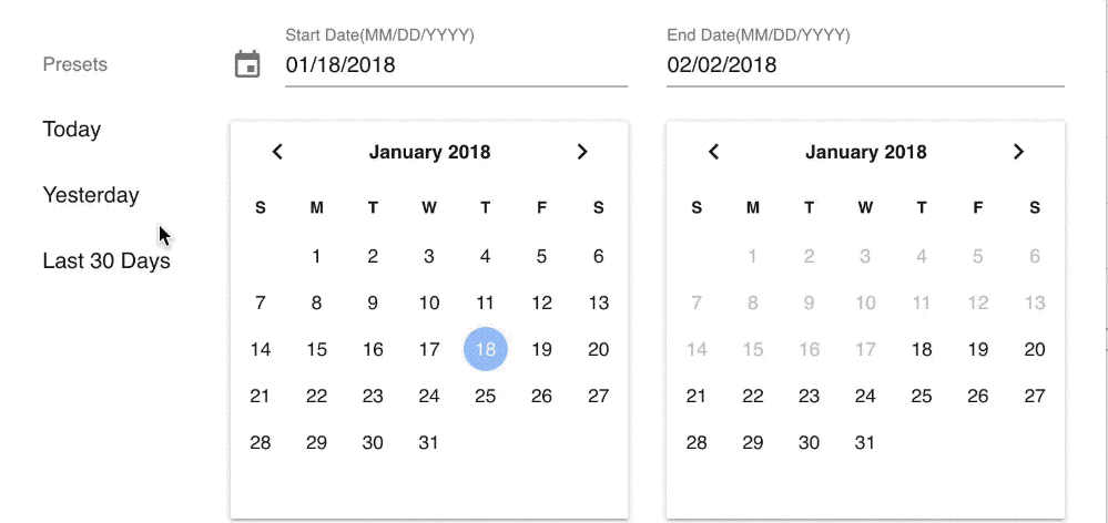
Heads Up
This is absolutely fresh and new for me. Help make this component better by creating issues and if you like it, ⭐️ it. 🙌
Demo

Requirements
You must have...
Features
- Preset Selection
- Automatically highlight preset based on chosen date.
- Custom format
- Material Design (Obviously!)
- Light & Dark Themes
- Custom Prev & Next buttons
Installation
npm install vuetify-daterange-picker
OR
yarn add vuetify-daterange-picker
The latest version(2.x) is compatible with Vuetify JS 1.x+. If you use vuetify JS you can use the version 1.2.0 or lower.
Usage
<template>
    <v-daterange :options="dateRangeOptions" @input="onDateRangeChange"></v-daterange>
</template>

<script>
// If you want to register this as a global component then
// in main.js
import VDateRange from 'vuetify-daterange-picker';
import 'vuetify-daterange-picker/dist/vuetify-daterange-picker.css';

Vue.use(VDateRange);
</script>

<script>
// If you want to use in one of your components.
import DateRange from 'vuetify-daterange-picker';
import 'vuetify-daterange-picker/dist/vuetify-daterange-picker.css';

export default {
  components: { DateRange.name: DateRange },
  ...
};
</script>
Props
options : Object
Options is an object that helps set up the component.
startDate: String. In YYYY-MM-DD format. Prefill value for start date picker.endDate: String. In YYYY-MM-DD format. Prefill value for end date picker.minDate: String. The minimum date a user can select in YYYY-MM-DD format.maxDate: String. The maximum date a user can select in YYYY-MM-DD format. If not provided, it defaults to TODAY.format: String. The format in which you want the user to see the dates in the inputs. E.g. MM/DD/YYYY.presets: Array. An array of preset values like Today, Yesterday etc. It's an array of object that looks like this.
presets: [
{
label: 'Today',
range: [
'2018-01-01',
'2018-02-01',
],
},
];
no-presets : Boolean
If you do not want a presets list you can use this boolean and you'll only see the pickers with input.
dark : Boolean
Switches the list of presets and the datepickers into dark mode.
next-icon : String
Name of the Material Icon that you want to use as custom icon for next buttons in datepickers.
prev-icon : String
Name of the Material Icon that you want to use as custom icon for prev buttons in datepickers.
labels : Object
An object containing the labels that should be displayed for the calendar input fields. Default :
{
  start: 'Start Date',
  end: 'End Date',
  preset: 'Presets'
}
locale : String
Sets the locale. Accepts a string with a BCP 47 language tag. Default : en-us
Maps to the date picker's locale property. See Vuetify's documentation.
first-day-of-week : Number
Sets the first day of the week, starting with 0 for Sunday. Default : 0
Maps to the date picker's firstDayOfWeek property. See Vuetify's documentation.
Events
input: Array. An array with start date and end date, triggered after every date selection.
Thanks


