Product
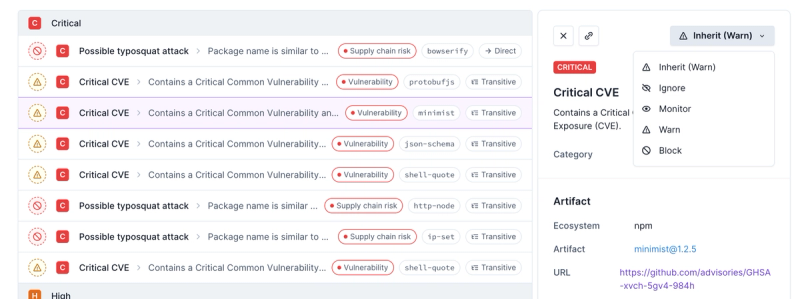
Introducing Enhanced Alert Actions and Triage Functionality
Socket now supports four distinct alert actions instead of the previous two, and alert triaging allows users to override the actions taken for all individual alerts.
web-social-share
Advanced tools
Readme
Web Social Share is a Web Component to share urls and content on social networks.
The component will present a dialog which will contains the different sharing options you selected.
The idea behind this web component was to add a "social share" feature to Progressive Web Apps (pwa).
Nowadays, the Web Share API is supported by most recent mobile OS. Even though, it may remain interesting to use such a component for the desktop version of web apps.
$ npm install web-social-share
This Web Component is developed with Stencil.
The Stencil documentation provide examples of Javascript and framework integration for Angular, React, Vue and Ember.
The Web Social Share Component could be use like following:
<web-social-share [show]="true" [share]="options" (closed)="close()"></web-social-share>
Both show and share are mandatory.
Trigger the display or closing of the action sheet presenting the social-share options you have selected.
show is a boolean parameter
The following share options are supported:
For details about them you could have a look to the interface WebSocialShareInput located under folder src/types/web-social-share/.
share is a parameter of type WebSocialShareInput
For example, if you would like to allow your users to share a website thru Facebook and Twitter, you could define basic options like following:
const share = {
    config: [{
          facebook: {
            socialShareUrl: 'https://peterpeterparker.io'
          }
        },{
          twitter: {
            socialShareUrl: 'https://peterpeterparker.io'
          }
    }]
};
If you would like to display the action default name, you could extend your configuration using the attribute displayNames like the following:
const share = {
    displayNames: true,
    config: [{
          facebook: {
            socialShareUrl: 'https://peterpeterparker.io'
          }
        },{
          twitter: {
            socialShareUrl: 'https://peterpeterparker.io'
          }
    }]
};
Worth to notice, you could also provide your own custom brand name, for example in case you would translate the word Email, for example:
const share = {
    displayNames: true,
    config: [{
          email: {
            brandName: 'E-Mail-Adresse',
            socialShareTo: 'me@outlook.com',
            socialShareBody: 'https://peterpeterparker.io'
          }
    }]
};
For an example of Vanilla JS use, you could have a look to the index.html demo located in this repo under folder src.
Slots has to be used to inject the icons for your actions in the component.
The available slots are: facebook, twitter, pinterest, linkedin, reddit, email, copy and whatsapp.
<web-social-share show="false">
    <i class="fab fa-reddit" slot="reddit" style="color: #cee3f8;"></ion-icon>
</web-social-share>

const share = [{
    reddit: {
      socialShareUrl: 'https://peterpeterparker.io',
      socialSharePopupWidth: 300,
      socialSharePopupHeight: 500
    }
  }
}];
Note that currently you may have to add the
style="display: block"on the slotted elements, notably if you would use<ion-icon/>, for them to be shown.
The style of your icons is up to you and have to be applied on the icons provided as slots.
For example:
<web-social-share show="false">
    <i class="fab fa-twitter" slot="twitter" style="color: #00aced; width: 1.4rem;"></i>
</web-social-share>
The following CSS variables are exposed by the component:
| CSS4 variable | Default | Note |
|---|---|---|
| --web-social-share-backdrop-opacity | 0.25 | Backdrop opacity |
| --web-social-share-backdrop-background | black | Backdrop background |
| --web-social-share-height | 80px | Action sheet height |
| --web-social-share-height-small-device | 140px | Action sheet height on device smaller than 540px |
| --web-social-share-target-width | 4rem | An action container width |
| --web-social-share-target-height | 3rem | An action container height |
| --web-social-share-button-width | 100% | An action inner button width |
| --web-social-share-button-height | 100% | An action inner button height |
| --web-social-share-target-icon-container-height | 2rem | An action icon container height |
| --web-social-share-button-font-size | The font-size of an action button | |
| --web-social-share-brand-font-size | 0.6rem | The font-size of an action brand name |
| --web-social-share-brand-color | inherit | The color of an action brand name |
| --web-social-share-brand-margin | 2px 0 | A margin for the brand name |
| --web-social-share-zindex | 1000 | The base zIndex of the component |
| --web-social-share-action-sheet-group-box-shadow | 0 0 8px 4px rgba(0,0,0,0.1) | A shadow around the action container |
| --web-social-share-action-sheet-group-background | #fafafa | The background of the action container |
| --web-social-share-action-sheet-group-border-radius | 8px 8px 0 0 | A border radius around the action container. Applied only if the windows is more than 540px |
This component is a dumb component. It don't proceed detection or fallback to anything in case one of the share options would not be supported by the device or browser where the component is used.
For example, the share options "Copy (to clipboard)" use the Web Api Clipboard.writeText() which might not be supported. Anyway the action will be displayed and if used by the user, nothing will happen.
When I develop web apps I generally develop a mixed solution between Web Share API and this component. If the Web Share API is supported, and maybe sometimes in combination to detecting desktop or mobile, I use the browser API. But if not supported, I fallback on this component.
If interested to implement such a solution, check out the blog post I published about it
A showcase is available at https://websocialshare.com
The above showcase is the www folder of this project deployed in Firebase. If you clone the repository you could run it locally using npm run start.
I didn't wanted to reinvent the wheel when it comes to the sharing actions themselves. Therefore I forked the features of angular-socialshare. Kudos to 45kb :+1:
MIT © David Dal Busco
FAQs
A Web Component to share urls and text on social networks
The npm package web-social-share receives a total of 1,472 weekly downloads. As such, web-social-share popularity was classified as popular.
We found that web-social-share demonstrated a healthy version release cadence and project activity because the last version was released less than a year ago. It has 1 open source maintainer collaborating on the project.
Did you know?

Socket for GitHub automatically highlights issues in each pull request and monitors the health of all your open source dependencies. Discover the contents of your packages and block harmful activity before you install or update your dependencies.

Product
Socket now supports four distinct alert actions instead of the previous two, and alert triaging allows users to override the actions taken for all individual alerts.

Security News
Polyfill.io has been serving malware for months via its CDN, after the project's open source maintainer sold the service to a company based in China.

Security News
OpenSSF is warning open source maintainers to stay vigilant against reputation farming on GitHub, where users artificially inflate their status by manipulating interactions on closed issues and PRs.