Install
npm install wss3-forge
npx wss3-forge init
@fluentui/react-icons is a runtime dependency and installs automatically. The init command copies the Forge skill into .claude/skills/forge/ so Claude Code can invoke it via /forge. Safe on existing projects, it asks before overwriting.
Quick start
import { ForgeProvider, Card, Heading, Text, Button, VStack } from 'wss3-forge'
import 'wss3-forge/styles/animations.css'
import 'wss3-forge/styles/motion.css'

export default function App() {
  return (
    <ForgeProvider mode="dark">
      <Card padding="lg">
        <VStack gap="md">
          <Heading level={2}>Welcome</Heading>
          <Text color="secondary">
            Forge ships components, motion, and a token system out of the box.
          </Text>
          <Button variant="primary">Get started</Button>
        </VStack>
      </Card>
    </ForgeProvider>
  )
}
ForgeProvider is required. Without it, CSS variables are missing and components render unstyled.
Works with Vite, Next.js (app or pages router), Remix, and any React 18+ setup.
Features
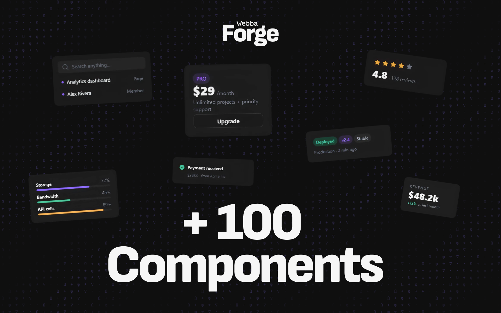
- 100+ components across layout, forms, navigation, data display, feedback, overlays, charts, media, and utilities. One import path:
'wss3-forge'.
- First-class motion.
Motion, AnimatePresence, Stagger, Marquee, RevealOnScroll, Parallax, Magnetic, Tilt, Starfield, plus 17 hooks (useMotionValue, useScrollMotion, useReducedMotion, and more). Respects prefers-reduced-motion everywhere.
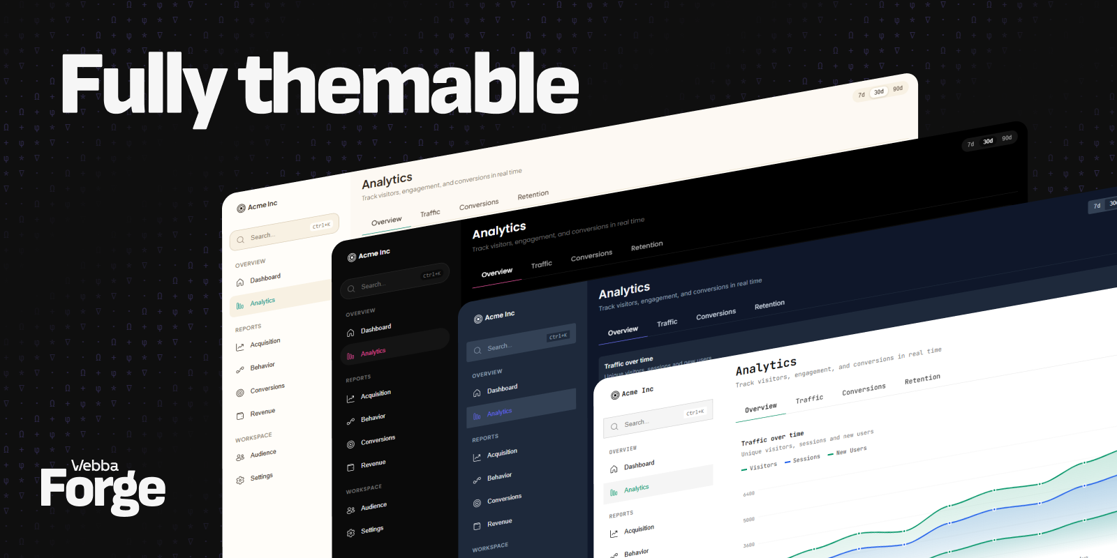
- Token-based theming. Every color, radius, spacing, shadow, duration, and easing is a CSS variable. Override the whole theme by passing flat tokens to
ForgeProvider. Built-in dark and light modes.
- TypeScript-first. 134 exports with full type definitions. Generic props, narrow unions, no
any.
- Accessibility. ARIA roles, keyboard handlers, focus traps, and
aria-* plumbing on Modal, Tabs, Tooltip, Popover, Combobox, Slider, NumberInput, Sheet, Avatar, ProgressBar.
- Forge-only icons. Fluent UI 2 (
{Name}{Size}{Style}). One icon library, one stroke weight, one convention.
- AI skill packs. The
/forge skill teaches Claude Code and Cursor the full component API, design rules, and layout patterns. See skills/forge.
- Built for production. Zero runtime dependencies beyond peer (
react, react-dom) and @fluentui/react-icons. ESM and CJS bundles.
What is inside
| Layout | Container, Grid, VStack, HStack, Box, Flex, Page, PageSection, AspectRatio, Show, Hide |
| Buttons | Button, IconButton, FloatButton, ButtonGroup, CopyButton, BackToTop |
| Typography | Heading, Text, Label, Link, Kbd, InlineCode, CodeBlock, Highlight, TextTruncate |
| Forms | Input, Textarea, Select, SearchInput, Checkbox, Switch, Radio, Slider, DatePicker, DateRangePicker, TimePicker, ColorPicker, Combobox, Cascader, MentionInput, NumberInput, OTPInput, PhoneInput, PasswordInput, TagInput, FileUpload, Rating, Form, FormGroup |
| Cards | Card, ImageCard, HorizontalCard, ActionCard, StatCard, KpiCard, ProgressCard, InfoCard, EmptyState, PageHeader, PricingCard |
| Navigation | Navbar, AppSidebar, BottomNav, Breadcrumbs, Pagination, Stepper, Toolbar, Tabs, Pills, SegmentedControl, NavigationProvider |
| Overlays | Modal, ConfirmDialog, AlertDialog, Sheet, BottomSheet, SidePanel, Drawer, Popover, HoverCard, Tooltip, InfoTooltip, Dropdown, ContextMenu, CommandBar, Tour |
| Feedback | Banner, Alert, Notification, Toast (useToast), ProgressBar, ProgressRing, Spinner, Skeleton, SplashScreen |
| Data | Table, SimpleTable, VirtualList, Accordion, Calendar, Countdown, Descriptions, SimpleTable, TimeAgo, Timeline, TreeView |
| Charts | LineChart, MultiLineChart, BarChart, StackedBar, DonutChart, AreaChart, StackedAreaChart, Sparkline, ChartLegend |
| Media | ImageGallery, Carousel, VideoPlayer, AudioPlayer |
| Badges & Avatars | Badge, StatusBadge, PriorityBadge, CountBadge, Avatar, AvatarStack, AvatarGroup, AvatarCard, AvatarList |
| Motion (50+ primitives) | Motion, AnimatePresence, MotionConfig, Stagger, RevealOnScroll, Parallax, Magnetic, Tilt, Spotlight, GradientText, Typewriter, Marquee, Starfield, ConstellationGrid, ParticleField, MeshGradient, NetworkGraph, Confetti, FlipCard, ScratchCard, HoloEffect |
| Hooks | useTheme, useToast, useNotification, useIsMobile, useBreakpoint, useDraggableScroll, useClickOutside, useDebounce, useThrottle, useLocalStorage, useKeyboardShortcut, useMotionValue, useScrollMotion, useReducedMotion, useMagneticAttraction, useTilt, useInView, useScrollReveal |
The full reference lives in skills/forge/components.md.
Theming
Forge exposes its design as CSS variables, all overridable through ForgeProvider.
<ForgeProvider
  mode="light"
  theme={{
    brandPrimary: '#0066FF',
    radiusMd: 12,
    fontFamily: 'Inter, system-ui, sans-serif'
  }}
>
  <App />
</ForgeProvider>
Tokens you can override:
- Colors brandPrimary, brandSecondary, bgPrimary, bgSecondary, bgTertiary, bgElevated, bgHover, bgActive, textPrimary, textSecondary, textMuted, borderColor, borderSubtle, success, warning, error, info
- Radius radiusXs, radiusSm, radiusMd, radiusLg, radiusXl, radius2xl, radiusFull
- Spacing spacingNone, spacingXs, spacingSm, spacingMd, spacingLg, spacingXl, spacing2xl, spacing3xl, spacing4xl
- Shadows shadowSm, shadowMd, shadowLg, shadowXl
- Motion durationFast, durationBase, durationSlow, easingGentle, easingDecelerate, easingAccelerate
Full token list: skills/forge/tokens.md.
Motion
Forge ships a complete motion system as primitives, hooks, and tokens. Every motion component reads prefers-reduced-motion and collapses to instant transitions when the user requests it.
import { Motion, RevealOnScroll, Stagger } from 'wss3-forge'

<RevealOnScroll>
  <Motion
    initial={{ opacity: 0, y: 24 }}
    animate={{ opacity: 1, y: 0 }}
    transition={{ duration: 'slow', easing: 'gentle' }}
  >
    <Heading>Hello</Heading>
  </Motion>
</RevealOnScroll>

<Stagger delay={80}>
  {items.map(item => <Card key={item.id}>{item.title}</Card>)}
</Stagger>

Motion guides and live demos: forge.webba-creative.com/motion.
AI skills
Forge ships skill packs that teach Claude Code and Cursor how to use the library correctly. After running npx wss3-forge init, the /forge skill loads automatically when AI edits a .tsx file.
The skill includes:
- SKILL.md rules, anti-patterns, mobile gotchas, component quick reference
- components.md every component, every prop, every default
- tokens.md the full token list with values
- theming.md ForgeProvider, dark and light modes, custom themes
- motion.md primitives, hooks, tokens, common compositions
- patterns.md ready-to-use layouts (dashboard, form, auth, modal, settings)
- a11y.md accessibility checklist per component
- anti-patterns.md what not to do, with the correct alternative
For project-level rules, the package also ships AGENTS.md (18 rules) and DESIGN.md (the reasoning behind the rules).
CLI
npx wss3-forge init
npx wss3-forge upgrade
npx wss3-forge doctor
Browser support
Last two versions of Chrome, Firefox, Safari, and Edge. Forge uses color-mix, CSS variables, aspect-ratio, @container, and backdrop-filter. No IE11.
Documentation
License
MIT (c) Webba Creative