Security News
Bun 1.2.19 Adds Isolated Installs for Better Monorepo Support
Bun 1.2.19 introduces isolated installs for smoother monorepo workflows, along with performance boosts, new tooling, and key compatibility fixes.
yet-another-react-lightbox
Advanced tools
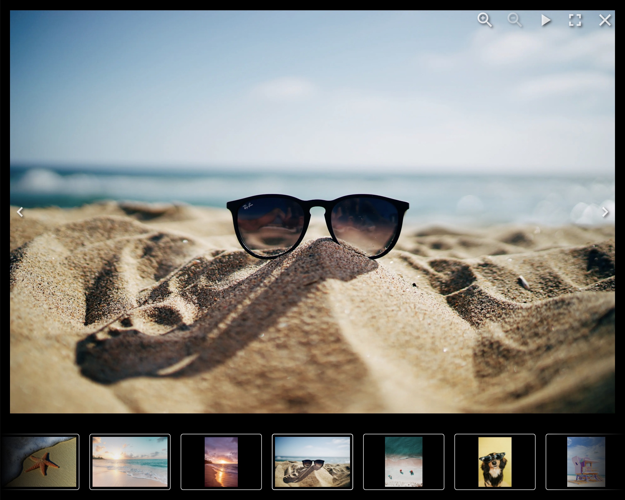
Modern React lightbox component. Performant, easy to use, customizable and extendable.

https://yet-another-react-lightbox.com/documentation
https://yet-another-react-lightbox.com/examples
https://github.com/igordanchenko/yet-another-react-lightbox/releases
npm install yet-another-react-lightbox
import * as React from "react";
import Lightbox from "yet-another-react-lightbox";
import "yet-another-react-lightbox/styles.css";

export default function App() {
  const [open, setOpen] = React.useState(false);

  return (
    <>
      <button type="button" onClick={() => setOpen(true)}>
        Open Lightbox
      </button>

      <Lightbox
        open={open}
        close={() => setOpen(false)}
        slides={[
          { src: "/image1.jpg" },
          { src: "/image2.jpg" },
          { src: "/image3.jpg" },
        ]}
      />
    </>
  );
}
Unlike many other lightbox libraries, Yet Another React Lightbox is not limited
to just two images per slide ("thumbnail" and "original" / "full size").
Instead, we favor responsive images with automatic resolution switching and
recommend you provide multiple files of different resolutions for each image
slide. Yet Another React Lightbox automatically populates srcset / sizes
attributes and lets the user's browser decide which image is more appropriate
for its viewport size.
import * as React from "react";
import Lightbox from "yet-another-react-lightbox";
import "yet-another-react-lightbox/styles.css";

export default function App() {
  const [open, setOpen] = React.useState(false);

  return (
    <>
      <button type="button" onClick={() => setOpen(true)}>
        Open Lightbox
      </button>

      <Lightbox
        open={open}
        close={() => setOpen(false)}
        slides={[
          {
            src: "/image1x3840.jpg",
            alt: "image 1",
            width: 3840,
            height: 2560,
            srcSet: [
              { src: "/image1x320.jpg", width: 320, height: 213 },
              { src: "/image1x640.jpg", width: 640, height: 427 },
              { src: "/image1x1200.jpg", width: 1200, height: 800 },
              { src: "/image1x2048.jpg", width: 2048, height: 1365 },
              { src: "/image1x3840.jpg", width: 3840, height: 2560 },
            ],
          },
          // ...
        ]}
      />
    </>
  );
}
You can also integrate 3rd-party image components (e.g., Next.js Image or Gatsby Image) via a custom render function. See examples on the documentation website.
Yet Another React Lightbox allows you to add optional features to your project based on your requirements via plugins.
The following plugins are bundled in the package:
MIT © 2022 Igor Danchenko
FAQs
Modern React lightbox component
The npm package yet-another-react-lightbox receives a total of 137,272 weekly downloads. As such, yet-another-react-lightbox popularity was classified as popular.
We found that yet-another-react-lightbox demonstrated a healthy version release cadence and project activity because the last version was released less than a year ago. It has 0 open source maintainers collaborating on the project.
Did you know?

Socket for GitHub automatically highlights issues in each pull request and monitors the health of all your open source dependencies. Discover the contents of your packages and block harmful activity before you install or update your dependencies.

Security News
Bun 1.2.19 introduces isolated installs for smoother monorepo workflows, along with performance boosts, new tooling, and key compatibility fixes.

Security News
Popular npm packages like eslint-config-prettier were compromised after a phishing attack stole a maintainer’s token, spreading malicious updates.

Security News
/Research
A phishing attack targeted developers using a typosquatted npm domain (npnjs.com) to steal credentials via fake login pages - watch out for similar scams.