React Edit Text



This is an easy-to-use editable text component for React. Simply click on the textbox to edit!
Made with ❤️ by Brian Min
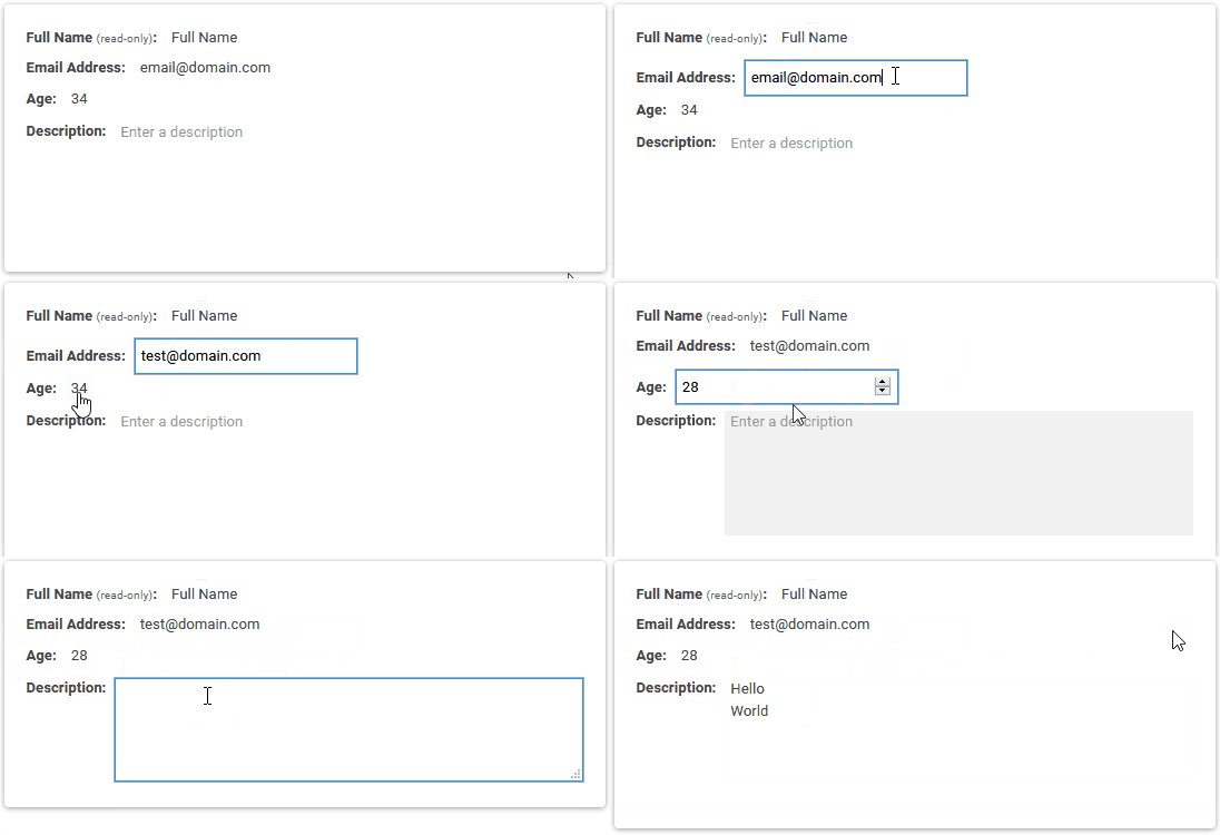
Demo
Please visit https://brianmin.com/react-edit-text/ for a live demo and various examples.
Install
npm install react-edit-text --save
Type definitions
npm install @types/react-edit-text --save-dev
Usage
Make sure to import the CSS stylesheet before using the component.
import React from 'react';

import { EditText, EditTextarea } from 'react-edit-text';
import 'react-edit-text/dist/index.css';

export default function Example() {
  return (
    <div>
      <EditText showEditButton />
      <EditTextarea />
    </div>
  );
}
Props
Shared props
| id | string | No | | HTML DOM id attribute |
| name | string | No | | HTML input name attribute |
| className | string | No | | HTML class attribute for the display component |
| inputClassName | string | No | | HTML class attribute for the input component |
| value | string | No | | Value of the component |
| defaultValue | string | No | | Default value of the component |
| placeholder | string | No | '' | Placeholder value |
| formatDisplayText | function | No | (x) => x | Callback function applied on the value to display the formatted value |
| onSave | function | No | | Callback function triggered when input is saved |
| onChange | function | No | | Callback function triggered when input is changed |
| onEditMode | function | No | | Callback function triggered when component is clicked |
| onBlur | function | No | | Callback function triggered when input is blurred |
| style | object | No | | Sets CSS style of input and view component |
| readonly | bool | No | false | Disables the input and only displays the view component |
EditText props
| type | string | No | 'text' | HTML DOM input text type |
| inline | bool | No | false | Sets inline display |
| showEditButton | bool | No | false | Displays an edit button that can be pressed to enable edit mode |
| editButtonContent | node | No |  | Sets the content for the edit button. This can be any valid element |
| editButtonProps | object | No | {} | Sets the props passed to the edit button. This can be any valid DOM attribute |
EditTextarea props
| rows | number | 'auto' | No | 3 | Number of visible rows |
Contributing
Contributions are very much appreciated and welcome.
Please refer to the contributing guidelines for more details.
License
MIT © Brian Min