Streamlit Keywords


A Streamlit custom component that provides enhanced functionality over the standard streamlit.multiselect. Users can enter free-form text which will appear as separate keyword chips.
Author: Tyler House (@tahouse)
Demo
Features
- 🏷️ Keyword Entry: Input multiple keywords as chips/tags.
- 📝 Free-Form Text: Users can enter free-form text, which will be tokenized into individual keywords.
- 🎨 Customizable: Customize the label, placeholder text, and set a maximum number of keywords.
- 🔢 Keyword Limit: Optionally limit the maximum number of keywords.
- 🎨 Theme Integration: Automatic integration with Streamlit's theming (dark/light modes).
- 🖥️ Seamless Integration: Integrates seamlessly with Streamlit apps.
- 🗑️ Keyword Removal: Easily remove keywords by clicking the remove icon.
Installation
pip install streamlit-keywords
Usage
import streamlit as st
from streamlit_keywords import keywords_input
keywords = keywords_input(
value=["example", "keywords"],
label="Enter Keywords",
text="Type a keyword and press Enter",
max_keywords=5,
key="unique_keywords_input"
)
st.write("Entered keywords:", keywords)
Examples
Here are some usage patterns to help you integrate streamlit_keywords into your Streamlit app. See examples/example.py for more usage examples.
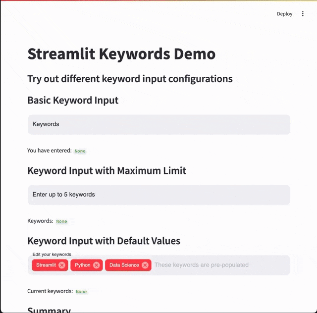
Basic Keyword Input
import streamlit as st
from streamlit_keywords import keywords_input

st.title("Keyword Input Example")

keywords = keywords_input(
    label="Keywords",
    text="Add keywords and press Enter",
    key="basic_keyword_input"
)

st.write("You have entered:", keywords)
Keyword Input with Maximum Limit
import streamlit as st
from streamlit_keywords import keywords_input

keywords = keywords_input(
    label="Enter up to 5 keywords",
    max_keywords=5,
    key="keyword_input_max5"
)

st.write("Keywords:", keywords)

if keywords and len(keywords) >= 5:
    st.warning("You have reached the maximum number of keywords.")
Keyword Input with Default Values
import streamlit as st
from streamlit_keywords import keywords_input

initial_keywords = ["Streamlit", "Python", "Data Science"]

keywords = keywords_input(
    value=initial_keywords,
    label="Edit your keywords",
    key="keyword_input_with_defaults"
)

st.write("Current keywords:", keywords)
Component API
keywords_input()
Display a Streamlit component for entering keywords.
Signature:
def keywords_input(
    value: list = [],
    label: str = "Keywords Input",
    text: str = "Type a keyword and press Enter",
    max_keywords: Optional[int] = None,
    key: Optional[str] = None,
) -> List[str]:
Parameters:
-
value (List[str], optional):
Initial list of keywords. Defaults to [].
-
label (str, optional):
Label for the input component. Defaults to "Keywords Input".
-
text (str, optional):
Instructions or placeholder text displayed in the input field. Defaults to "Type a keyword and press Enter".
-
max_keywords (Optional[int], optional):
Maximum number of keywords allowed. If None, there is no limit. Defaults to None.
-
key (str, optional):
An optional string to use as the unique key for the widget. It's recommended to assign a unique key to prevent the component from remounting on script reruns. Defaults to None.
Returns:
List[str]:
A list of entered keywords.
Development
This repository uses the Streamlit Component template system. If you want to modify or develop the component, follow these steps.
Prerequisites
- Python: Version 3.7 or newer.
- Node.js and npm: Required for frontend development.
Backend Development
Install Python Dependencies
Clone the repository and install the development dependencies.
git clone https://github.com/tahouse/streamlit-keywords.git
cd streamlit-keywords
pip install -e ".[devel]"
Frontend Development
The frontend of this component is built using React and TypeScript, leveraging Material-UI components.
Install Node Dependencies
Navigate to the streamlit_keywords/frontend directory and install the dependencies as specified in package.json.
cd streamlit_keywords/frontend
npm install
package.json dependencies:
{
  "dependencies": {
    "@emotion/react": "^11.13.3",
    "@emotion/styled": "^11.13.0",
    "@mui/icons-material": "^6.1.6",
    "@mui/material": "^6.1.6",
    "react": "^17.0.2",
    "react-dom": "^17.0.2",
    "streamlit-component-lib": "^2.0.0"
  },
  "devDependencies": {
    "@babel/plugin-proposal-private-property-in-object": "^7.21.11",
    "@types/node": "^22.0.0",
    "@types/react": "^17.0.2",
    "@types/react-dom": "^17.0.2",
    "node": "^22.0.0",
    "react-scripts": "^5.0.1",
    "typescript": "^4.2.0"
  }
}
Running in Development Mode
To run the component in development mode with live reloading:
-
Start the frontend development server:
npm start
This will start the React development server.
-
Set the _RELEASE flag:
Ensure that _RELEASE = False is set in your __init__.py. This tells the component to use the local development server.
-
Run your Streamlit app:
In a separate terminal, navigate back to the root directory and run your Streamlit app.
cd ../../
streamlit run your_app.py
Building for Production
When you're ready to build the component for production:
-
Build the frontend:
npm run build
This will generate the production-ready frontend assets.
-
Update _RELEASE flag:
Set _RELEASE = True in __init__.py.
_RELEASE = True
-
Your component is now ready:
The component is now ready for use in production environments.
License
This project is licensed under the Apache License 2.0 - see the LICENSE file for details.
Acknowledgemnts
This project draws inspiration from multiple sources:
-
Streamlit Multiselect: The standard Streamlit library's multiselect component served as initial inspiration, though this project extends functionality to allow free text entry.
-
streamlit-tags: Special thanks to Gagan Bhatia (@gagan3012) for streamlit-tags, which was what I initially used in my application. This project addresses mobile usability limitations in streamlit-tags where the enter button functioned only as a tab key.
-
Material UI: This component is built using Material UI's Autocomplete component, which provided the foundation for the user interface.
The decision to build streamlit-keywords came from a need for a modern, mobile-friendly keyword input component with up-to-date dependencies, improved mobile user experience, and theming that closely matches Streamlit's native multiselect component.


