
Security News
Oracle Drags Its Feet in the JavaScript Trademark Dispute
Oracle seeks to dismiss fraud claims in the JavaScript trademark dispute, delaying the case and avoiding questions about its right to the name.
By Sarah Gooding - Feb 07, 2025
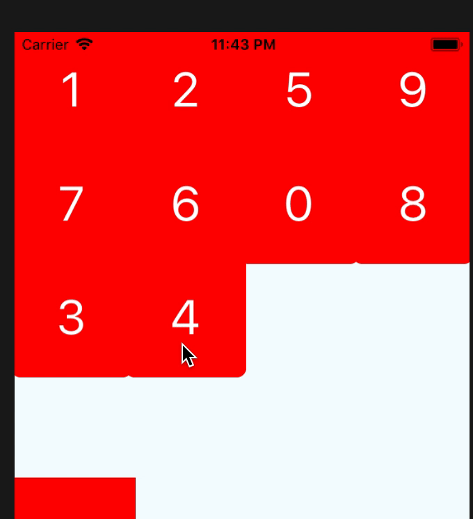
github.com/shisme/react-native-draggable-grid
-blue.svg)

npm install react-native-draggable-grid --save
import React from 'react';
import {
  View,
  StyleSheet,
  Text,
} from 'react-native';
import { DraggableGrid } from 'react-native-draggable-grid';

interface MyTestProps {

}

interface MyTestState {
  data:{key:string, name:string}[];
}

export class MyTest extends React.Component<MyTestProps, MyTestState>{

  constructor(props:MyTestProps) {
    super(props);
    this.state = {
      data:[
        {name:'1',key:'one'},
        {name:'2',key:'two'},
        {name:'3',key:'three'},
        {name:'4',key:'four'},
        {name:'5',key:'five'},
        {name:'6',key:'six'},
        {name:'7',key:'seven'},
        {name:'8',key:'eight'},
        {name:'9',key:'night'},
        {name:'0',key:'zero'},
      ],
    };
  }

  public render_item(item:{name:string, key:string}) {
    return (
      <View
        style={styles.item}
        key={item.key}
      >
        <Text style={styles.item_text}>{item.name}</Text>
      </View>
    );
  }

  render() {
    return (
      <View style={styles.wrapper}>
        <DraggableGrid
          numColumns={4}
          renderItem={this.render_item}
          data={this.state.data}
          onDragRelease={(data) => {
            this.setState({data});// need reset the props data sort after drag release
          }}
        />
      </View>
    );
  }
}

const styles = StyleSheet.create({
  button:{
    width:150,
    height:100,
    backgroundColor:'blue',
  },
  wrapper:{
    paddingTop:100,
    width:'100%',
    height:'100%',
    justifyContent:'center',
  },
  item:{
    width:100,
    height:100,
    borderRadius:8,
    backgroundColor:'red',
    justifyContent:'center',
    alignItems:'center',
  },
  item_text:{
    fontSize:40,
    color:'#FFFFFF',
  },
});
| parameter | type | required | description |
|---|---|---|---|
| numColumns | number | yes | how many items should be render on one row |
| data | array | yes | data's item must have unique key,item's render will depend on the key |
| renderItem | (item, order:number) => ReactElement | yes | Takes an item from data and renders it into the list |
| itemHeight | number | no | if not set this, it will the same as itemWidth |
| dragStartAnimation | object | no | custom drag start animation |
| style | object | no | grid styles |
| parameter | type | required | description |
|---|---|---|---|
| onItemPress | (item) => void | no | Function will execute when item on press |
| onDragStart | (startDragItem) => void | no | Function will execute when item start drag |
| onDragRelease | (data) => void | no | Function will execute when item release, and will return the new ordered data |
| onResetSort | (data) => void | no | Function will execute when dragged item change sort |
| onDragging | (gestureState: PanResponderGestureState) => void | no | Function will execute when dragging item |
| onDragItemActive | (item) => void | no | Function will execute when any item active |
| parameter | type | required | description |
|---|---|---|---|
| disabledDrag | boolean | no | It will disable drag for the item |
| disabledReSorted | boolean | no | It will disable resort the item |
if you set disabledResorted be true, it will look like that
If you want to use your custom animation, you can do like this
 render() {
    return (
      <View style={styles.wrapper}>
        <DraggableGrid
          numColumns={4}
          renderItem={this.render_item}
          data={this.state.data}
          onDragStart={this.onDragStart}
          dragStartAnimation={{
            transform:[
              {scale:this.state.animatedValue}
            ],
          }}
        />
      </View>
    );
  }

  private onDragStart = () => {
    this.state.animatedValue.setValue(1);
    Animated.timing(this.state.animatedValue, {
      toValue:3,
      duration:400,
    }).start();
  }
if you want resort item yourself,you only need change the data's sort, and the draggable-grid will auto resort by your data.
the data's key must unique
FAQs
Unknown package
Did you know?

Socket for GitHub automatically highlights issues in each pull request and monitors the health of all your open source dependencies. Discover the contents of your packages and block harmful activity before you install or update your dependencies.
Security News
Oracle seeks to dismiss fraud claims in the JavaScript trademark dispute, delaying the case and avoiding questions about its right to the name.

Security News
The Linux Foundation is warning open source developers that compliance with global sanctions is mandatory, highlighting legal risks and restrictions on contributions.

Security News
Maven Central now validates Sigstore signatures, making it easier for developers to verify the provenance of Java packages.