


ng2-dropdown-multiselect
Simple multiselect dropdown plugin for Angular 2.
Dependencies
The module relies on ngx-bootstrap for dropdown functionality.
Icon fonts can be interchanged, by default ng2-dropdown-multiselect uses input[type="checkbox"].
Installation
To include in your project install via NPM with:
npm install --save ng2-dropdown-multiselect
You will then need to include the module to your app.module.ts:
import { DropdownMultiselectModule } from 'ng2-dropdown-multiselect';
@NgModule({
imports: [
DropdownMultiselectModule
]
})
Finally, include the component in your component HTML as per the next section.
HTML Component Markup
Once the module is installed, you will need to add HTML markup to include the dropdown in a component.
The minimum requirement is an [(ngModel)] attribute
<dropdown-multiselect
    [(ngModel)]="dropdownModel">
</dropdown-multiselect>
The [(ngModel)] attribute expects an array of objects to represent the dropdown options, this array should include the following properties:
| Property | Type | Required | Description |
|---|
| id | any | Yes | A unique key for this option. |
| label | string | Yes | A user friendly description. |
| selected | boolean | No | Whether the option is selected by default. |
| color | string | No | A hex color value, if provided a color tile will appear to the left of the label |
To aid in development, ng2-dropdown-multiselect exposes a TypeScript interface for the object properties, this can be referenced as a type in your component by importing it:
import { IDropdownItem } from 'ng2-dropdown-multiselect';
Which can then be used as the type of the model object:
public dropdownModel: IDropdownItem[];
ngOnInit() {
this.dropdownModel = [
{
id: 1,
label: 'Today',
selected: false,
color: '#336699'
}
];
}
You can then reference the component's model property in the [(ngModel)] attribute:
<dropdown-multiselect
    [(ngModel)]="dropdownModel">
</dropdown-multiselect>
It is possible to configure ng2-dropdown-multiselect by providing a configuration object to
the [dropdownConfig] attribute (see the next section for more details on this object):
<dropdown-multiselect
    [(ngModel)]="dropdownModel"
    [dropdownConfig]="dropdownOptions">
</dropdown-multiselect>
Configuration
ng2-dropdown-multiselect exposes an interface to provide an indication of valid configuration properties,
this can be references as a type for your configuration object by importing it:
import { IMultiselectConfig } from 'ng2-dropdown-multiselect';
Which can then be used as the configuration object type in your component:
public dropdownConfiguration: IMultiselectConfig;
Current list of configuration options, types and default values
| Property | Type | Default | Description |
|---|
| defaultButtonText | string | 'Selected' | Displayed when the maxInline threshold is exceeded or 0 options are selected. |
| allSelected | boolean | false | Select all options when the component is rendered. |
| maxInline | number | 3 | The max number of selected options that will display in the button. |
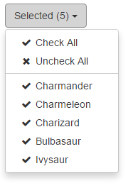
| showCheckAll | boolean | false | Display a 'Check All' option at the top of the dropdown. |
| showUncheckAll | boolean | false | Display a 'Uncheck All' option at the top of the dropdown. |
| buttonClasses | string[] | ['btn', 'btn-default'] | Array of classes added to the control button. |
| checkClasses | string[] | [ ] | Array of classes added to the of checked options and "Check All" - will hide input[type="checkbox"]. |
| uncheckClasses | string[] | [ ] | Array of classes added to the of "Uncheck All". |
| scrollingHeight | number | 200 | Height at which the dropdown will start to scroll. |
Additional Attributes
ngx-bootstrap has removed the option to close on outside click for the time being, therefore as a temporary measure I have added [autoClose] as an extra attribute on the dropdown, default to false which will then only close on button close. Hopefully the guys over at ngx-bootstrap will fix this sooner rather than later as this is less-than-ideal for a dropdown multiselect.


