

Security News
Next.js moves to scheduled security releases
Vercel is formalizing a monthly release program for Next.js. The change follows React2Shell and a sharp rise in AI-assisted vulnerability discovery.
By Sarah Gooding - Jul 16, 2026
@soybeanjs/ui
Advanced tools
SoybeanUI is built on top of SoybeanHeadless, providing a collection of styled components for Vue 3.
English | 中文



An elegant, modern, accessible UI component library with shadcn-like design for Vue 3, built on top of @soybeanjs/headless.
@soybeanjs/ui provides ready-to-use styled components powered by UnoCSS and @soybeanjs/cva class-variance recipes. Each component is an S-prefixed wrapper around the corresponding @soybeanjs/headless primitive, following the style injection pattern: styled wrappers compute classes and inject them via provide{Name}Ui, which headless components read through useUiContext().
// Style injection — one-way data flow
const ui = computed(() => accordionVariants({ size: props.size }, props.ui, { root: props.class }));
provideAccordionUi(ui); // headless reads this via useAccordionUi()
pnpm add @soybeanjs/ui
Import the pre-built UnoCSS stylesheet in your main entry file (e.g., main.ts):
import '@soybeanjs/ui/styles.css';
Use unplugin-vue-components with the built-in resolver for auto-importing:
// vite.config.ts
import Components from 'unplugin-vue-components/vite';
import UiResolver from '@soybeanjs/ui/resolver';

export default defineConfig({
  plugins: [
    Components({
      resolvers: [UiResolver()]
    })
  ]
});
// nuxt.config.ts
export default defineNuxtConfig({
  modules: ['@soybeanjs/ui/nuxt']
});
<script setup>
import { SButton, SDialog } from '@soybeanjs/ui';
</script>

<template>
  <SDialog>
    <SButton>Open Dialog</SButton>
  </SDialog>
</template>
@soybeanjs/headless primitives with full WAI-ARIA support.ConfigProvider.ui prop, or swap the entire style layer.ConfigProvider.unplugin-vue-components.| Color | Token | Usage |
|---|---|---|
| Primary | primary | Primary actions, active states |
| Destructive | destructive | Delete, error, danger actions |
| Success | success | Confirm, positive status |
| Warning | warning | Caution, pending status |
| Info | info | Information, hints |
| Carbon | carbon | Neutral backgrounds, surfaces |
| Secondary | secondary | Secondary actions, muted elements |
| Accent | accent | Highlights, badges |
| Size | Base (rem) | Pixel equivalent |
|---|---|---|
xs | 0.75 | 12px |
sm | 0.875 | 14px |
md | 1 | 16px (default) |
lg | 1.125 | 18px |
xl | 1.25 | 20px |
2xl | 1.5 | 24px |
<script setup>
import { SConfigProvider, SButton } from '@soybeanjs/ui';
</script>

<template>
  <SConfigProvider :theme="{ color: 'primary', size: 'md' }">
    <SButton>Click me</SButton>
  </SConfigProvider>
</template>
@soybeanjs/ui inherits locale support from @soybeanjs/headless via ConfigProvider:
| Code | Language |
|---|---|
zh-CN | Simplified Chinese |
zh-TW | Traditional Chinese |
en | English |
ar | Arabic |
ja | Japanese |
ko | Korean |
de | German |
fr | French |
es | Spanish |
pt-BR | Portuguese (Brazil) |
ru | Russian |
tr | Turkish |
id | Indonesian |
<template>
  <SConfigProvider :locale="zhCN">
    <App />
  </SConfigProvider>
</template>
packages/ui/src/
├── components/    # 86 styled component dirs (SButton, SDialog, SSelect…)
├── styles/        # UnoCSS style recipes and layer definitions
├── theme/         # Theme tokens, color scales, and size mappings
├── constants/     # Component and theme constants
├── nuxt/          # Nuxt module entry
├── resolver/      # unplugin-vue-components resolver
└── index.ts       # Main barrel export
import { SButton, SAccordion } from '@soybeanjs/ui'; // all components
import '@soybeanjs/ui/styles.css'; // pre-built UnoCSS stylesheet
// Also: @soybeanjs/ui/nuxt · @soybeanjs/ui/resolver
@soybeanjs/ui ships 86 S-prefixed styled components, each wrapping a @soybeanjs/headless primitive:
| Category | Components |
|---|---|
| Layout | SAccordion, SCard, SDialog, SDrawer, SPopover, STooltip |
| Form | SButton, SCheckbox, SInput, SSelect, SSwitch, STextarea |
| Navigation | SBreadcrumb, SPagination, SStepper, STabs |
| Data | STable, SDataList, STree |
| Feedback | SAlert, SBadge, SToast, SProgress |
| Typography | SHeading, SText, SCode, SKbd |
| Date & Time | SCalendar, SDatePicker, STimePicker |
| Media | SAvatar, SCarousel, SImage |
Override individual slot classes via the ui prop:
<template>
  <SAccordion :ui="{ trigger: 'bg-blue-100 hover:bg-blue-200 rounded-lg' }">
    <SAccordionItem value="item-1">
      <SAccordionTrigger>Custom styled trigger</SAccordionTrigger>
      <SAccordionContent>Content here</SAccordionContent>
    </SAccordionItem>
  </SAccordion>
</template>
For full documentation, playground examples, and component API references, visit the SoybeanUI docs site.
FAQs
SoybeanUI is built on top of SoybeanHeadless, providing a collection of styled components for Vue 3.
We found that @soybeanjs/ui demonstrated a healthy version release cadence and project activity because the last version was released less than a year ago. It has 1 open source maintainer collaborating on the project.
Did you know?

Socket for GitHub automatically highlights issues in each pull request and monitors the health of all your open source dependencies. Discover the contents of your packages and block harmful activity before you install or update your dependencies.
Security News
Vercel is formalizing a monthly release program for Next.js. The change follows React2Shell and a sharp rise in AI-assisted vulnerability discovery.

Research
/Security News
11 malicious NuGet tools pose as game cheats to deploy Windows payloads, track hosts, and use Google Sheets for telemetry and control.
Research
/Security News
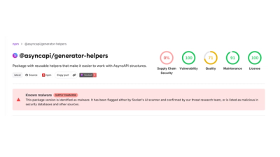
4 compromised asyncapi packages deliver miasma botnet loader on macOS, Linux and Windows.