Research
/Security News
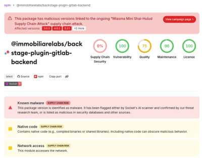
Miasma Mini Shai-Hulud Hits ImmobiliareLabs npm Packages
Miasma Mini Shai-Hulud hits @immobiliarelabs Backstage plugins, targeting GitLab and LDAP auth packages on npm.
By Socket Research Team - Jun 26, 2026
@01.works/console
Advanced tools
Usable shared branding utilities for 01.works.
pnpm add @01.works/console
For a GitHub install before or outside npm publishing:
pnpm add github:01-office/console
import { showBranding } from "@01.works/console";

showBranding();
The package does not run automatically. The shared showBranding() export is a
once-guarded no-op by default; create an explicit bundled branding printer when
you want the styled developer-console message to appear. Repeated calls from the
same printer instance produce only one message.
showBranding() is SSR-safe: it does not access window and has no import-time
side effects.
showBranding(options?: BrandingOptions): voidDefault shared branding printer. It is once-guarded and SSR-safe, but does not
log bundled branding unless you create a configured printer with
createBrandingBanner.
Pass a console-compatible target when the message should use a specific logger:
showBranding({ console: customConsole });
type BrandingOptions = {
  console?: BrandingConsole;
};

type BrandingConsole = Pick<Console, "group" | "groupEnd" | "info">;
type BrandingPrinter = (options?: BrandingOptions) => void;
To include bundled brand banners from the core API, create an opt-in banner
printer. Each enabled brand logs with console.info: the caption, an ASCII-art
wordmark, then the URL right-aligned on the line below the art. Banners are
rendered in monospace (via %c, no color), and no console groups are used.
import { createBrandingBanner } from "@01.works/console";

const show = createBrandingBanner({
  includeWorks: true,
  includeSoftware: true,
});
show({ console: customConsole });
type BrandingBannerConfig = {
  includeWorks?: boolean;
  includeSoftware?: boolean;
};
The package is a lightweight wrapper for styled browser-console output. The bundled 01.works and 01.software banners above are built on these primitives.
import { badge, log, segment } from "@01.works/console";

log(badge("API", { background: "#0af", color: "#fff" }), " request sent");
log(segment("hello", "color: hotpink; font-weight: 600"));
segment(text, style?) — styled text. style is a CSS object (camelCase
keys) or a raw CSS string.badge(label, style?) — a styled label with default padding/rounding.log(...parts) — emit styled parts (and plain strings) to the global console.import { createLogger } from "@01.works/console/logger";
const logger = createLogger();
logger.info("loaded");
logger.success("saved");
logger.error("failed", err); // extra args keep interactive inspection
createLogger(options?) accepts { console, levels } to inject a console
target and override per-level styles. Levels: info, warn, error,
success, debug.
import { createBranding } from "@01.works/console";

const show = createBranding({
  groups: [{ label: "Website by", link: "https://acme.com" }],
});
show({ console: customConsole });
createBranding(config) returns a once-guarded, SSR-safe show() function.
Custom groups are separate from the bundled banner flags and use console
groups instead of ASCII-art banners.
type BrandingGroup = {
  label: string;
  link: string;
};

type BrandingConfig = {
  groups: BrandingGroup[];
};
A React entry point is available at @01.works/console/react for apps that
prefer to drop branding in declaratively. React is an optional peer dependency —
the core entry above has no React dependency.
// app/layout.tsx (Next.js App Router)
import { Branding } from "@01.works/console/react";

export default function RootLayout({ children }) {
  return (
    <html>
      <body>
        {children}
        <Branding includeWorks />
      </body>
    </html>
  );
}
Branding is a renderless component (it returns null) that shows configured
branding once, after mount. It ships a "use client" directive, so it works
inside Server Components without extra wrapping. SSR-safe: nothing is logged
during server rendering.
Pass groups to show custom grouped branding instead of bundled banners (any
console target can still be injected with console):
<Branding groups={[{ label: "Website by", link: "https://acme.com" }]} />
Pass includeWorks and/or includeSoftware to include bundled banners:
<Branding includeWorks />
<Branding includeSoftware />
<Branding includeWorks includeSoftware />
All React variants accept a console-compatible target:
<Branding includeWorks includeSoftware console={customConsole} />
Both Branding and useBranding accept BrandingProps — the branding
groups, optional includeWorks and includeSoftware, plus an optional
console target. With no groups or bundled brand flags, nothing is logged.
With groups, each mounted component shows its configured branding once and
bundled brand flags are ignored.
type BrandingProps = BrandingOptions & {
  groups?: BrandingGroup[];
  includeWorks?: boolean;
  includeSoftware?: boolean;
};
Prefer a hook? useBranding() does the same thing from inside your own client
component:
"use client";
import { useBranding } from "@01.works/console/react";

export function Providers({ children }) {
  useBranding({ includeWorks: true });
  return children;
}
Both accept the same BrandingProps (branding groups, optional
includeWorks and includeSoftware, plus an optional console target).
pnpm test
pnpm run typecheck
pnpm pack --dry-run
FAQs
Shared console utilities for 01.works
The npm package @01.works/console receives a total of 121 weekly downloads. As such, @01.works/console popularity was classified as not popular.
We found that @01.works/console demonstrated a healthy version release cadence and project activity because the last version was released less than a year ago. It has 1 open source maintainer collaborating on the project.
Did you know?

Socket for GitHub automatically highlights issues in each pull request and monitors the health of all your open source dependencies. Discover the contents of your packages and block harmful activity before you install or update your dependencies.
Research
/Security News
Miasma Mini Shai-Hulud hits @immobiliarelabs Backstage plugins, targeting GitLab and LDAP auth packages on npm.

Security News
Rolldown paused Rust React Compiler integration after a 5MB binary size increase raised concerns about shipping React-specific code to all Vite users.

Security News
/Research
Mini Shai-Hulud expands into the Go ecosystem after hitting LeoPlatform npm packages and targeting GitHub Actions workflows.