Research
/Security News
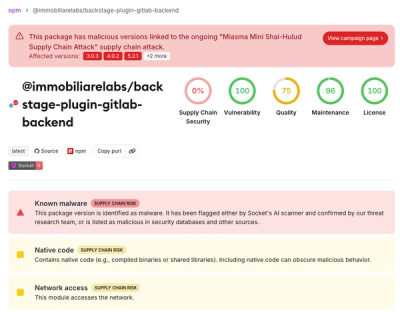
Miasma Mini Shai-Hulud Hits ImmobiliareLabs npm Packages
Miasma Mini Shai-Hulud hits @immobiliarelabs Backstage plugins, targeting GitLab and LDAP auth packages on npm.
By Socket Research Team - Jun 26, 2026
@52css/json-form
Advanced tools
开发中台大部分都是和表单交互,如何通过简单、通用配置得到易交互的表单呢?
目前市面上的UI框架很多,例如 element-plus、ant-design-vue、arco-design、tdesign,各自有相应的api,如何通用的?
所有的属性我们使用html标签已有特有属性,我们主要符合html标准,再各自统一就可以达到我们的目的。 映射太复杂,直接type是相应组件。例如 t-input-number 对应的 type 就是 input-number
我们目前常用有3个场景
以下表单元素fields 命名成 inputs
inputField 增加 value 为默认值select 常见不单提交value,还有label 或 其他属性?可以inputField 增加 outputsinputField 定义成数组还是对象?对象只要不是“数字”是可以排序的,目前提交都不是数字,可以使用对象test.id , 可以对key兼容处理支持 test.id: field配置必填,可以设置 label 后面加 *,也可以inputField 增加 required 属性inputField 支持 stringgetter 函数,对于 inputs 就是普通函数,如果数据是异步获取, 可以修改成异步函数slot,优先级高于定义类型通过以上考虑,可以定义类型
export type CommonValue = string | number | boolean;

export interface CommonField {
  required?: boolean;
  disabled?: boolean;
  readonly?: boolean;
  label?: string;
  outputs?: Record<string, any>;
}

export interface CommonOption {
  label: string;
  value: CommonValue;
}

export interface TextField extends CommonField {
  type: "text";
  placeholder?: string;
  maxlength?: number;
  clearable?: boolean;
  value?: CommonValue;
}

export interface CheckboxField extends CommonField {
  type: "checkbox";
  options: CommonOption[];
  value?: CommonValue[];
}

export type Inputs = Record<string, string | TextField | CheckboxField>;

export interface JsonFormProps {
  inputs: Inputs;
  request: Request;
  model?: Record<string, any>;
}

const inputs: Inputs = {
  input1: "普通输入框",
  input2: "支持必填*",
  input3: {
    type: "input",
    label: "通过type生成",
  },
  input4: {
    type: "input",
    label: "支持默认值",
    value: "默认值",
  },
  input5: {
    type: "input",
    label: "支持禁用",
    disabled: true,
  },
  input6: {
    type: "input",
    label: "禁用是同步函数",
    disabled: () => !!disabled.value,
  },
  input7: {
    type: "input",
    label: "禁用是异步函数",
    disabled: async () => !!disabled.value,
  },
  input8: '自定义插槽',
  "obj.input9": {
    type: "input",
    label: "支持对象属性",
  },
};
layout 布局, 可设置horizontal, vertical, inlinenone 插入到页面dialog 插入到弹窗drawer 插入到抽屉if, 控制显示隐藏字符串,转换成input对象label,带星号必填,其他转换成label*
stringfunction转换成getter functionasync function 转换成 响应式数据tabs,嵌套表单,支持错误校验on,支持事件绑定, 支持的(model: Model, ...args) => void 其他默认参数
onBluronChangeonClearonClickonCompositionendonCompositionstartonEnteronFocusonKeydownonKeypressonKeyuponMouseenteronMouseleaveonPasteonValidateonWheeloutputs控制输出转换
string,例如配置 label, 即输出选中项的label值到model的outputs的key上function,例如配置 (_m: Model, _val: string, content:any) => content.option.label, 即输出选中项的content.option.label值到model的outputs的key上title实现标题steps,步骤表单request
request, 提交调用request, 成功提示操作成功request + model, 渲染页面,调用数据接口设置model,提交调用request, 成功提示操作成果request + columns,渲染表格card 分组表单| 属性 | tdesign | element-plus | ant-design | acro-design |
|---|---|---|---|---|
| 绑定数据(model) | data | model | model | model |
| 对齐方式(layout-horizontal) | label-align(right) + layout(vertical) | label-position(right) + inline(false) | layout(horizontal) | layout(horizontal) |
| 对齐方式(layout-vertical) | label-align(top) + layout(vertical) | label-position(top) + inline(false) | layout(vertical) | layout(vertical) |
| 对齐方式(layout-inline) | label-align(right) + layout(inline) | label-position(right) + inline(true) | layout(inline) | layout(inline) |
| 属性 | tdesign | element-plus | ant-design | acro-design |
|---|---|---|---|---|
| 绑定属性 | data | prop | name | field |
| 属性 | tdesign | element-plus | ant-design | acro-design |
|---|---|---|---|---|
| prefix属性 | label | prefix | prefix | prefix |
| 属性 | tdesign | element-plus | ant-design | acro-design |
|---|---|---|---|---|
| placement属性 | placement | tab-position | - | - |
FAQs
The npm package @52css/json-form receives a total of 0 weekly downloads. As such, @52css/json-form popularity was classified as not popular.
We found that @52css/json-form demonstrated a not healthy version release cadence and project activity because the last version was released a year ago. It has 1 open source maintainer collaborating on the project.
Did you know?

Socket for GitHub automatically highlights issues in each pull request and monitors the health of all your open source dependencies. Discover the contents of your packages and block harmful activity before you install or update your dependencies.
Research
/Security News
Miasma Mini Shai-Hulud hits @immobiliarelabs Backstage plugins, targeting GitLab and LDAP auth packages on npm.

Security News
Rolldown paused Rust React Compiler integration after a 5MB binary size increase raised concerns about shipping React-specific code to all Vite users.

Security News
/Research
Mini Shai-Hulud expands into the Go ecosystem after hitting LeoPlatform npm packages and targeting GitHub Actions workflows.