Carousel Universal
- To add the component in your project, just use npm or yarn as follows
yarn add @acctglobal/carousel-universal
yarn add @acctglobal/carousel-universal
How to use
- To use compontes follows the steps.
Import
import Carousel from '@acctglobal/carousel-universal
Declaration component
<div>
 <Carousel>
 </Carousel>
</div>
observation: As the divs that are in the carousel are not random, this usage avoids bugs
in the calculation that defines the elements that will be rendered from it.
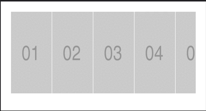
1. Adding Components in to Carousel
<div>
 <Carousel>
    <img src="https://via.placeholder.com/200x400.png?text=01"></img>
    <img src="https://via.placeholder.com/200x400.png?text=02"></img>
    <img src="https://via.placeholder.com/200x400.png?text=03"></img>
    <img src="https://via.placeholder.com/200x400.png?text=04"></img>
    <img src="https://via.placeholder.com/200x400.png?text=05"></img>
    <img src="https://via.placeholder.com/200x400.png?text=06"></img>
    <img src="https://via.placeholder.com/200x400.png?text=07"></img>
    <img src="https://via.placeholder.com/200x400.png?text=08"></img>
    <img src="https://via.placeholder.com/200x400.png?text=09"></img>
    <img src="https://via.placeholder.com/200x400.png?text=10"></img>
 </Carousel>
</div>
1. Result
Props
arrow | Object
The arrow prop is responsible to style and visibility of lateral navigation buttons
isVisible | Boolean | Arrows is visible. Optional |
iconColor | String | Arrow icon color. Optional |
style | Object | Style for arrow button. Optional |
Use
 <Carousel arrow={{isVisible:true,iconColor:"#ffff",style:{backgroundColor:"#005fd7"}}} >
    <img src="https://via.placeholder.com/200x400.png?text=01"></img>
    <img src="https://via.placeholder.com/200x400.png?text=02"></img>
    <img src="https://via.placeholder.com/200x400.png?text=03"></img>
    <img src="https://via.placeholder.com/200x400.png?text=04"></img>
    <img src="https://via.placeholder.com/200x400.png?text=05"></img>
    <img src="https://via.placeholder.com/200x400.png?text=06"></img>
    <img src="https://via.placeholder.com/200x400.png?text=07"></img>
    <img src="https://via.placeholder.com/200x400.png?text=08"></img>
    <img src="https://via.placeholder.com/200x400.png?text=09"></img>
    <img src="https://via.placeholder.com/200x400.png?text=10"></img>
  </Carousel>
Result

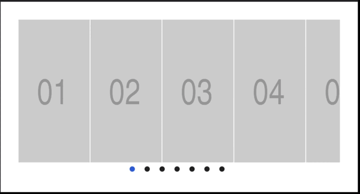
bullet | Object
The bullet prop is responsible to style and visibility of bottom navigation buttons
isVisible | Boolean | Arrows is visible. Optional |
bulletDisableColor | String | Bullet disable color. Optional |
bulletEnableColor | String | Bullet enable color. Optional |
style | Object | Style for bullets button. Optional |
Use
<Carousel  bullet={{isVisible:true,bulletDisableColor:"#202124",
 bulletEnableColor:"#005fd7",style:{marginRight:"20px"}}}
>
    <img src="https://via.placeholder.com/200x400.png?text=01"></img>
    <img src="https://via.placeholder.com/200x400.png?text=02"></img>
    <img src="https://via.placeholder.com/200x400.png?text=03"></img>
    <img src="https://via.placeholder.com/200x400.png?text=04"></img>
    <img src="https://via.placeholder.com/200x400.png?text=05"></img>
    <img src="https://via.placeholder.com/200x400.png?text=06"></img>
    <img src="https://via.placeholder.com/200x400.png?text=07"></img>
    <img src="https://via.placeholder.com/200x400.png?text=08"></img>
    <img src="https://via.placeholder.com/200x400.png?text=09"></img>
    <img src="https://via.placeholder.com/200x400.png?text=10"></img>
  </Carousel>
Result
General props
gapItems | Number | Define spacing entry the elements. Optional |
qtyItems | Number | Define the quantity of elements show in the screen. Optional |


