
Product
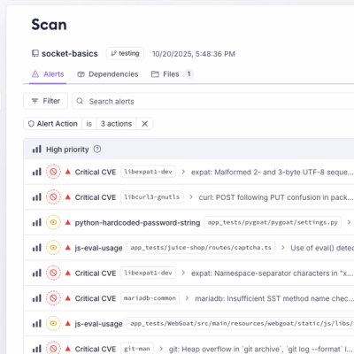
Introducing Webhook Events for Pull Request Scans
Add real-time Socket webhook events to your workflows to automatically receive pull request scan results and security alerts in real time.
By Jeppe Hasseriis - Oct 22, 2025
@ant-design/icons
Advanced tools
[](https://npmjs.org/package/@ant-design/icons) [](https://npmjs.org/package/@ant-design/icons)
yarn add @ant-design/icons
You can import it directly or destructure from @ant-design/icons when tree-shaking enabled.
import SmileOutlined from '@ant-design/icons/SmileOutlined';
import { SmileOutlined } from '@ant-design/icons';

import SmileFilled from '@ant-design/icons/SmileFilled';
import SmileTwoTone from '@ant-design/icons/SmileTwoTone';
import { SmileFilled, SmileTwoTone } from '@ant-design/icons';
interface AntdIconProps {
  className?: string;
  onClick?: React.MouseEventHandler<SVGSVGElement>;
  style?: React.CSSProperties;
}
npm run generate
npm run compile
npm publish
React-icons provides a large set of icons from various icon libraries (FontAwesome, Ionicons, MaterialDesign, etc.) for React applications. Unlike @ant-design/icons, which is tailored for Ant Design, react-icons offers a broader selection from multiple sources, making it versatile for different design systems.
Font Awesome is a popular icon library that can be used in web projects. It provides icons as fonts and CSS. While it's not a React-specific package like @ant-design/icons, it's widely used across web development for adding icons due to its extensive collection and ease of use.
FAQs
[](https://npmjs.org/package/@ant-design/icons) [](https://npmjs.org/package/@ant-design/icons)
The npm package @ant-design/icons receives a total of 1,538,056 weekly downloads. As such, @ant-design/icons popularity was classified as popular.
We found that @ant-design/icons demonstrated a healthy version release cadence and project activity because the last version was released less than a year ago. It has 7 open source maintainers collaborating on the project.
Did you know?

Socket for GitHub automatically highlights issues in each pull request and monitors the health of all your open source dependencies. Discover the contents of your packages and block harmful activity before you install or update your dependencies.
Product
Add real-time Socket webhook events to your workflows to automatically receive pull request scan results and security alerts in real time.

Research
The Socket Threat Research Team uncovered malicious NuGet packages typosquatting the popular Nethereum project to steal wallet keys.
Product
A single platform for static analysis, secrets detection, container scanning, and CVE checks—built on trusted open source tools, ready to run out of the box.