

Product
PHP and Composer Support Is Now in Beta
Socket’s PHP and Composer support is now in Beta for all customers, with PHP reachability analysis generally available.
By Trevor Norris, Benjamin Barslev - Aug 21, 2026
@aspicio/elements
Advanced tools
Framework-neutral web components for the
Aspicio DXF viewer.
One implementation of the embed UI, consumable from plain HTML, Vue,
Svelte — with React, Vue, and Svelte veneers (@aspicio/react,
@aspicio/vue, @aspicio/svelte) layered on top.
npm install @aspicio/elements three # @aspicio/core and lit come along; three (>=0.184) is a peer
<aspicio-embed> — batteries included: layer list + interactive preview
in one tag.<aspicio-preview> — the embeddable canvas alone: pan/zoom/rotate
(mouse and multi-touch), animated fit, batched WebGL rendering. No
chrome. Set the hover-pick attribute to hit-test the layer under the
cursor.<aspicio-layer-panel> — the ready-made layer list, identical to the
demo app: header with layer count, visibility checkboxes,
effective-color swatches, entity counts, hover-to-highlight,
double-click-to-solo (with a banner), and a gesture-hints footer.
theme="none" renders a minimal list.<script type="module">
import "@aspicio/elements"; // registers the elements
</script>
<aspicio-embed src-url="/drawing.dxf" style="height: 480px"></aspicio-embed>
Attributes: src-url, panel (left | right | none), theme
(aspicio | none), no-download, shortcuts. Rich data goes through
properties: src (DXF text | File | Blob | ArrayBuffer), options
(viewer options), panelStyle (style object applied to the inner
panel). The readonly viewer property exposes the full DxfViewer.
Events (all CustomEvents dispatched on the element):
| Event | detail | Fires |
|---|---|---|
loaded | { layers, stats } | after each successful load |
load-error | { error } | when a load fails |
viewer-change | { viewer } | when the viewer is created (null on disconnect) |
hover-layer | { layer } | layer under the cursor, or null (hover-pick) |
For idiomatic props and typed emits, use
@aspicio/vue — thin Vue 3 components over these elements.
Consuming the elements natively works too: tell the compiler about the
aspicio- tags (Vue docs)
and use them directly:
// vite.config.js
export default {
  plugins: [
    vue({
      template: {
        compilerOptions: { isCustomElement: (tag) => tag.startsWith("aspicio-") },
      },
    }),
  ],
};
<script setup>
import "@aspicio/elements";
const onLoaded = (e) => console.log(e.detail.stats);
</script>

<template>
  <aspicio-embed src-url="/drawing.dxf" style="height: 480px" @loaded="onLoaded" />
</template>
Vue binds attributes for primitives and DOM properties for rich values
automatically — :src="file" and :options="{ background: 0x16181d }"
just work.
For typed callback props, use @aspicio/svelte — the same
three components as raw Svelte 5 source. Consuming the elements natively
works too:
<script>
  import "@aspicio/elements";
</script>

<aspicio-embed
  src-url="/drawing.dxf"
  style="height: 480px"
  onloaded={(e) => console.log(e.detail.stats)}
></aspicio-embed>
The elements render in shadow DOM, so host-page CSS can't accidentally restyle their internals — and every integration looks pixel-identical. Deliberate theming has two hooks:
Design tokens as CSS custom properties (they inherit, so set them on the element or any ancestor):
aspicio-embed {
  --aspicio-crease: #ff5c8a; /* accent */
  --aspicio-panel: #101216;
}
The full token list ships as the aspicioTokens export.
Parts for structural styling: ::part(panel), ::part(header),
::part(row), ::part(checkbox), ::part(swatch), ::part(name),
::part(count), ::part(hints), ::part(solo-banner),
::part(canvas-host), ::part(download).
The theme uses IBM Plex font stacks but never loads webfonts itself (no surprise network requests from a library). Load IBM Plex Sans/Mono in your page for the exact demo typography; otherwise system faces are used.
viewer property (also delivered by viewer-change) is the full
@aspicio/core API — fitView, zoomBy, resetRotation,
setLayerVisible, setLayerHighlight, pickLayer, view, stats,
toSVG, toPNG.src / src-url loads the new document; the most recently
set source wins (if both are set at creation, src-url does), and
stale in-flight loads are ignored.shortcuts keys are scoped to the focused embed (click it first):
F fit, +/- zoom, R reset rotation, A show all layers —
multiple embeds on a page don't collide.apps/elements-example for a full
setup.FAQs
Framework-neutral web components for the Aspicio DXF and PDF viewer.
The npm package @aspicio/elements receives a total of 41 weekly downloads. As such, @aspicio/elements popularity was classified as not popular.
We found that @aspicio/elements demonstrated a healthy version release cadence and project activity because the last version was released less than a year ago. It has 1 open source maintainer collaborating on the project.
Product
Socket’s PHP and Composer support is now in Beta for all customers, with PHP reachability analysis generally available.
Product
Socket is bringing experimental protection to Firefox, scanning 97,000+ extensions in Mozilla's official directory for malware and risky updates.
Research
/Security News
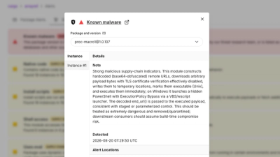
Three compromised Rust crates pulled in a malicious dependency that downloaded and executed cross-platform malware during Cargo builds.