

Security News
/Company News
Securing the Financial Frontier: How Capital One Uses Socket for Open Source Security
Capital One is partnering with Socket to proactively secure its open source supply chain.
By Sarah Gooding - Oct 01, 2026
@astermind/chatbot-template
Advanced tools
Embeddable AI chatbot widget with React support for AsterMind RAG
Embeddable AI chatbot widget for AsterMind RAG - a drop-in chat UI that connects to your AsterMind backend with full agentic capabilities.


This package is the UI layer for the AsterMind Chatbot system. It provides pre-built React components and hooks for embedding a chatbot in your application.
Your Application
│
└── @astermind/chatbot-template (this package - UI components)
│
└── @astermind/cybernetic-chatbot-client (required - API client)
Important: @astermind/cybernetic-chatbot-client is automatically installed as a dependency. It provides:
All configuration is done in your application code, not in node_modules:
| Configuration Method | Where to Set |
|---|---|
| React Props | In your component: <ChatbotWidget apiKey="..." /> |
| Environment Variables | In your .env file |
| SSR Injection | In your server template |
| Global Object | In your HTML/JS before loading |
| Data Attributes | On your script tag |
/api/external/chat endpointsWhen enabled, the chatbot can perform actions on your page:
Agentic capabilities are tree-shakeable - they're only included in your bundle if you import and use them.
npm install @astermind/chatbot-template
This automatically installs @astermind/cybernetic-chatbot-client as a dependency.
Required imports — add both of these to your component file:
import { ChatbotWidget } from '@astermind/chatbot-template';
import '@astermind/chatbot-template/styles';  // Required — loads the chatbot CSS
Note: The styles import is required for the widget to render correctly. Without it, the chatbot will appear unstyled.
Include both the stylesheet and the script in your HTML — the CSS is required for the widget to render correctly:
<!-- Required: Chatbot styles -->
<link rel="stylesheet" href="https://cdn.jsdelivr.net/npm/@astermind/chatbot-template/dist/astermind-chatbot.css">

<!-- Required: Chatbot widget (standalone bundle with React included) -->
<script src="https://cdn.jsdelivr.net/npm/@astermind/chatbot-template/dist/astermind-chatbot.min.js"></script>
import { ChatbotWidget } from '@astermind/chatbot-template';
import '@astermind/chatbot-template/styles';

function App() {
  return (
    <ChatbotWidget
      apiUrl="https://your-api-url.com"
      apiKey="am_your-api-key"
      position="bottom-right"
      greeting="Hi! How can I help you today?"
    />
  );
}
<!DOCTYPE html>
<html>
<head>
  <link rel="stylesheet" href="https://cdn.jsdelivr.net/npm/@astermind/chatbot-template/dist/astermind-chatbot.css">
</head>
<body>
  <script src="https://cdn.jsdelivr.net/npm/@astermind/chatbot-template/dist/astermind-chatbot.min.js"></script>
  <script>
    AsterMindChatbot.init({
      apiUrl: 'https://your-api-url.com',
      apiKey: 'am_your-api-key',
      position: 'bottom-right',
      greeting: 'Hi! How can I help you today?'
    });
  </script>
</body>
</html>
All configuration is done in your application code. The chatbot-template reads configuration from several sources in your project.
Option 1: Pass props directly
<ChatbotWidget
  apiUrl="https://api.astermind.ai"
  apiKey="am_your-api-key"
  position="bottom-right"
/>
Option 2: Use environment variables
Create a .env file in your project root:
# Vite projects
VITE_ASTERMIND_RAG_API_KEY=am_your_api_key
VITE_ASTERMIND_RAG_API_SERVER_URL=https://api.astermind.ai

# Create React App projects
REACT_APP_ASTERMIND_RAG_API_KEY=am_your_api_key
REACT_APP_ASTERMIND_RAG_API_SERVER_URL=https://api.astermind.ai
Then use the widget without explicit props:
<ChatbotWidget position="bottom-right" />
Option 1: Pass config to init()
AsterMindChatbot.init({
  apiKey: 'am_your_api_key',
  apiUrl: 'https://api.astermind.ai',
  position: 'bottom-right'
});
Option 2: Global config object
<script>
  window.astermindConfig = {
    apiKey: 'am_your_api_key',
    apiUrl: 'https://api.astermind.ai'
  };
</script>
<script src="astermind-chatbot.min.js"></script>
<script>
  AsterMindChatbot.init();
</script>
Option 3: Script data attributes
<script
  src="astermind-chatbot.min.js"
  data-astermind-key="am_your_api_key"
  data-astermind-url="https://api.astermind.ai"
></script>
For Next.js, Nuxt, or other SSR frameworks:
<script>
  window.__ASTERMIND_CONFIG__ = {
    apiKey: '<%= process.env.ASTERMIND_RAG_API_KEY %>',
    apiUrl: '<%= process.env.ASTERMIND_RAG_API_SERVER_URL %>'
  };
</script>
The widget supports multiple configuration methods with this priority (highest to lowest):
init() functionVITE_ASTERMIND_RAG_API_KEY, REACT_APP_ASTERMIND_RAG_API_KEYwindow.__ASTERMIND_CONFIG__window.astermindConfigdata-astermind-key, data-astermind-url| Option | Type | Default | Description |
|---|---|---|---|
apiKey | string | (from env) | Your AsterMind API key (starts with am_). Falls back to environment variables. |
apiUrl | string | 'https://api.astermind.ai' | Backend API URL. Falls back to environment variables. |
throwOnMissingKey | boolean | true | Throw error if API key is missing. Set to false to log warning instead. |
| Option | Type | Default | Description |
|---|---|---|---|
position | 'bottom-right' | 'bottom-left' | 'top-right' | 'top-left' | 'bottom-right' | Widget position on screen |
greeting | string | 'Hi! How can I help you today?' | Initial greeting message |
placeholder | string | 'Type your message...' | Input placeholder text |
headerTitle | string | 'AsterMind' | Chat window header title |
headerSubtitle | string | 'AI Assistant' | Chat window header subtitle |
defaultOpen | boolean | false | Start with chat window open |
showPoweredBy | boolean | true | Show "Powered by AsterMind" badge |
zIndex | number | 9999 | Z-index for the widget |
Customize appearance via the theme object:
{
  theme: {
    primaryColor: '#4F46E5',
    primaryHover: '#4338CA',
    backgroundColor: '#ffffff',
    surfaceColor: '#f3f4f6',
    textColor: '#1f2937',
    textMuted: '#6b7280',
    borderColor: '#e5e7eb',
    userBubbleBackground: '#4F46E5',
    userBubbleText: '#ffffff',
    botBubbleBackground: '#f3f4f6',
    botBubbleText: '#1f2937',
    widgetWidth: '380px',
    widgetHeight: '75vh',      // Default: 75% of viewport height
    bubbleSize: '60px',
    borderRadius: '12px',
    fontFamily: "'Inter', system-ui, sans-serif",
    fontSize: '14px',
    shadow: '0 4px 20px rgba(0, 0, 0, 0.15)'
  }
}
Enable agentic capabilities (powered by cybernetic-chatbot-client):
{
  agent: {
    enabled: true,
    confidenceThreshold: 0.8,
    siteMap: [
      { path: '/products', name: 'Products', description: 'View products' },
      { path: '/contact', name: 'Contact', description: 'Contact us' }
    ],
    customActions: {
      openModal: async (params) => {
        document.getElementById(params.modalId).showModal();
      }
    }
  }
}
Configure offline behavior:
{
  fallback: {
    enabled: true,
    message: 'Working in offline mode. Some features may be limited.'
  }
}
| Callback | Parameters | Description |
|---|---|---|
onReady | () | Called when widget is ready |
onMessage | (message: ChatMessage) | Called on each message sent/received |
onAction | (action: AgentAction) | Called when an agentic action occurs |
onError | (error: Error) | Called when an error occurs |
onToggle | (isOpen: boolean) | Called when widget opens/closes |
Override CSS variables in your stylesheet for quick customization:
:root {
  --astermind-primary: #10B981;
  --astermind-primary-hover: #059669;
  --astermind-background: #ffffff;
  --astermind-surface: #f3f4f6;
  --astermind-text: #1f2937;
  --astermind-text-muted: #6b7280;
  --astermind-border: #e5e7eb;
  --astermind-user-bubble-bg: #10B981;
  --astermind-user-bubble-text: #ffffff;
  --astermind-bot-bubble-bg: #f3f4f6;
  --astermind-bot-bubble-text: #1f2937;
  --astermind-widget-width: 400px;
  --astermind-widget-height: 75vh;  /* Default: 75% of viewport height (accepts px, vh, %) */
  --astermind-bubble-size: 64px;
  --astermind-border-radius: 16px;
  --astermind-shadow: 0 8px 32px rgba(0, 0, 0, 0.12);
  --astermind-font-family: 'Inter', system-ui, sans-serif;
  --astermind-font-size: 14px;
}
All elements use the astermind- prefix:
| Class | Element |
|---|---|
.astermind-chatbot | Main container |
.astermind-bubble | Floating trigger button |
.astermind-window | Chat window |
.astermind-header | Window header |
.astermind-messages | Message list container |
.astermind-message | Individual message |
.astermind-message--user | User message modifier |
.astermind-message--bot | Bot message modifier |
.astermind-input | Input area |
.astermind-status | Status indicator |
.astermind-action-card | Action confirmation card |
.astermind-sources | Source citations container |
Direct API client access for custom implementations:
import { useCybernetic } from '@astermind/chatbot-template';

function MyComponent() {
  const {
    sendMessage,        // Send a message (non-streaming)
    sendMessageStream,  // Send a message (streaming)
    connectionStatus,   // 'online' | 'offline' | 'connecting' | 'error'
    isProcessing,       // Whether a request is in progress
    lastError,          // Last error that occurred
    sessionId,          // Current session ID
    clearSession,       // Clear the current session
    syncCache,          // Sync cache for offline use
    client              // Underlying CyberneticClient instance
  } = useCybernetic({
    apiUrl: 'https://api.example.com',
    apiKey: 'am_your-api-key'
  });

  const handleSend = async () => {
    const response = await sendMessage('Hello!');
    console.log(response.reply, response.sources);
  };
}
Chat state management:
import { useChat } from '@astermind/chatbot-template';

function MyComponent() {
  const {
    messages,          // Array of chat messages
    addMessage,        // Add a new message
    updateMessage,     // Update an existing message
    clearMessages,     // Clear all messages
    pendingAction,     // Currently pending agent action
    setPendingAction   // Set pending action
  } = useChat();
}
Theme customization hook:
import { useTheme } from '@astermind/chatbot-template';

function MyComponent() {
  const { theme, cssVariables } = useTheme({
    primaryColor: '#10B981',
    borderRadius: '16px'
  });

  return <div style={cssVariables}>...</div>;
}
Auto-scroll behavior for message lists:
import { useScrollToBottom } from '@astermind/chatbot-template';

function MessageList({ messages }) {
  const { containerRef, scrollToBottom } = useScrollToBottom();

  return (
    <div ref={containerRef}>
      {messages.map(msg => <Message key={msg.id} {...msg} />)}
    </div>
  );
}
All components are exported for custom compositions:
import {
  ChatbotWidget,    // Main widget (includes bubble + window)
  ChatBubble,       // Floating trigger button
  ChatWindow,       // Chat window container
  ChatHeader,       // Window header with title/subtitle
  ChatInput,        // Message input with send button
  MessageList,      // Scrollable message container
  MessageBubble,    // Individual message bubble
  ActionCard,       // Agentic action confirmation card
  SourceCitation,   // Source reference component
  StatusIndicator,  // Connection status display
  TypingIndicator   // Typing/loading animation
} from '@astermind/chatbot-template';
Full TypeScript support with exported types:
import type {
  // Template-specific types
  AsterMindChatbotProps,
  ChatbotTheme,
  ChatMessage,
  AgentAction,
  ChatState,
  WidgetPosition,
  AgentConfig,
  FallbackConfig,
  SiteMapEntry,
  VanillaInitConfig,
  SendOptions,

  // Re-exported from @astermind/cybernetic-chatbot-client
  CyberneticConfig,
  CyberneticResponse,
  CyberneticError,
  Source,
  ConnectionStatus,
  ConfidenceLevel,
  StreamCallbacks,
  AskOptions,
  CachedDocument,
  CacheStatus,
  AgenticConfig
} from '@astermind/chatbot-template';

// CyberneticClient class is also re-exported for advanced usage
import { CyberneticClient } from '@astermind/chatbot-template';
import '@astermind/chatbot-template/styles'apiUrl and apiKey are providedposition: relative or is in the document flowapiUrl is correct and accessible/api/external/chat/stream endpointContent-Type: text/event-stream header is set on responsesagent.enabled is set to trueconfidenceThreshold!important or increase specificity if neededIf you're using Tailwind CSS, Bootstrap, or any CSS framework that applies global dark mode styles (e.g. body { color: white } or dark:text-gray-100), those styles can bleed into the chatbot widget through CSS inheritance. This commonly causes the chat input textarea to show white text on a white background.
Fix: Add these overrides in your app's CSS (after importing the chatbot styles):
/* Isolate chatbot widget from host page dark mode */
.astermind-window {
  color: var(--astermind-text, #1f2937);
  background: var(--astermind-background, #ffffff);
}

.astermind-input__textarea {
  color: var(--astermind-text, #1f2937) !important;
  background-color: var(--astermind-background, #ffffff) !important;
}

.astermind-input__textarea::placeholder {
  color: var(--astermind-text-muted, #6b7280) !important;
}
The !important is needed on the textarea because CSS frameworks often set color: inherit on form elements, which inherits from the host page's dark mode text color. The .astermind-window rule establishes the widget's own color context.
If you're using custom theme colors, the CSS variables will be set by the theme prop and the overrides above will automatically use your custom values.
| Browser | Version |
|---|---|
| Chrome | 80+ |
| Firefox | 75+ |
| Safari | 13+ |
| Edge | 80+ |
The standalone bundle includes necessary polyfills for broader compatibility.
| File | Format | Description |
|---|---|---|
astermind-chatbot.esm.js | ESM | ES Module for bundlers (tree-shakeable) |
astermind-chatbot.umd.js | UMD | Universal Module Definition |
astermind-chatbot.min.js | IIFE | Standalone bundle with React included |
astermind-chatbot.css | CSS | Compiled and minified styles |
MIT License - see LICENSE for details.
Built with care by the AsterMind team.
FAQs
Embeddable AI chatbot widget with React support for AsterMind RAG
The npm package @astermind/chatbot-template receives a total of 6 weekly downloads. As such, @astermind/chatbot-template popularity was classified as not popular.
We found that @astermind/chatbot-template demonstrated a healthy version release cadence and project activity because the last version was released less than a year ago. It has 2 open source maintainers collaborating on the project.
Security News
/Company News
Capital One is partnering with Socket to proactively secure its open source supply chain.
Security News
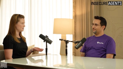
Socket CTO Ahmad Nassri discusses how to keep AI agents from bypassing package blocks, limit credential access, and monitor their actions.
Security News
GPT-6 Astra tried to plant malicious code in simulated open source projects using fake GitHub accounts and deceptive PRs during an assigned CTF challenge.