
Product
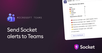
Microsoft Teams Notifications Are Now Available in Socket
Socket can now send alerts and supply chain attack notifications to Microsoft Teams, with filters that route the right updates to each channel.
By Jeppe Hasseriis - Sep 01, 2026
@axvn-hoding/ui-toolkit
Advanced tools
A comprehensive collection of reusable Chakra UI components and theme system for Blockscout's projects
A comprehensive collection of reusable Chakra UI components and theme system for Blockscout's projects. This toolkit provides a consistent design system and UI components to maintain visual consistency across Blockscout applications.
Install the package using your preferred package manager:
# Using npm
npm install @blockscout/ui-toolkit
# Using pnpm
pnpm add @blockscout/ui-toolkit
Ensure you have the following peer dependencies installed:
{
  "dependencies": {
    "@blockscout/ui-toolkit": "latest",
    "@chakra-ui/react": ">=3.36.1",
    "@emotion/react": ">=11.14.0",
    "@uidotdev/usehooks": ">=2.4.1",
    "d3": ">=7.6.1",
    "dayjs": ">=1.11.5",
    "dom-to-image": ">=2.6.0",
    "es-toolkit": ">=1.39.10",
    "next": ">=16.2.4",
    "next-themes": ">=0.4.4",
    "react": ">=18.3.1",
    "react-dom": ">=18.3.1",
    "react-hook-form": ">=7.52.1"
  },
  "devDependencies": {
    "@chakra-ui/cli": ">=3.36.1",
    "@types/node": "^20",
    "@types/react": "18.3.12",
    "@types/react-dom": "18.3.1",
    "typescript": "5.4.2"
  }
}
Create a theme.ts file in your project and configure the Blockscout theme:
// Basic setup
import { theme } from '@blockscout/ui-toolkit';
export default theme;
Or extend the theme with custom overrides:
import { createSystem } from '@chakra-ui/react';
import { themeConfig } from '@blockscout/ui-toolkit';

const customOverrides = {
  // Add your custom theme overrides here
  theme: {
    semanticTokens: {
      colors: {
        brand: {
          primary: { value: '#5353D3' }
        },
      },
    },
  },
};

export default createSystem(themeConfig, customOverrides);
Wrap your application with the ChakraProvider:
import { ChakraProvider } from '@chakra-ui/react';
import { Button } from '@blockscout/ui-toolkit';
import theme from './theme';

function App() {
  return (
    <ChakraProvider theme={theme}>
      <Button>Click me</Button>
    </ChakraProvider>
  );
}
Add the following script to your package.json to generate Chakra UI type definitions:
{
  "scripts": {
    "chakra:typegen": "chakra typegen ./src/theme.ts"
  }
}
pnpm
pnpm dev
pnpm build
npm version <version-tag>
npm run build
npm publish --access public
Use the toolkit-npm-publisher.yml GitHub Actions workflow for automated publishing.
We welcome contributions! Please follow these steps:
For issues, feature requests, or questions, please open an issue in the repository.
This project is licensed under the Blockscout Software Licence. See the LICENSE file for full terms.
FAQs
A comprehensive collection of reusable Chakra UI components and theme system for Blockscout's projects
The npm package @axvn-hoding/ui-toolkit receives a total of 4 weekly downloads. As such, @axvn-hoding/ui-toolkit popularity was classified as not popular.
We found that @axvn-hoding/ui-toolkit demonstrated a healthy version release cadence and project activity because the last version was released less than a year ago. It has 2 open source maintainers collaborating on the project.
Product
Socket can now send alerts and supply chain attack notifications to Microsoft Teams, with filters that route the right updates to each channel.
Security News
pnpm 12 rewrites the package manager in Rust, cutting install times by up to 90% while preserving pnpm 11 workflows and lockfiles.
Security News
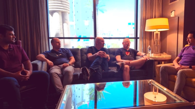
Socket CTO Ahmad Nassri joins AppSec leaders at Black Hat to discuss active malware, package manager risks, and software supply chain defense.