Security News
PyPI’s New Archival Feature Closes a Major Security Gap
PyPI now allows maintainers to archive projects, improving security and helping users make informed decisions about their dependencies.
@bsonntag/react-tabs
Advanced tools
Flexible tab components for react.
Using npm:
$ npm install --save @bsonntag/react-tabs
Using yarn:
$ yarn add @bsonntag/react-tabs
This module uses react's createContext API,
so make sure you have at least version 16.3.0 installed.
import { Tab, TabPanel, Tabs } from '@bsonntag/react-tabs';
import React, { Component } from 'react';

class App extends Component {

  state = {
    selectedTab: 0
  };

  handleSelect = selectedTab => this.setState({ selectedTab });

  render() {
    return (
      <Tabs
        onSelect={this.handleSelect}
        selectedTab={this.state.selectedTab}
      >
        <ul>
          <Tab tab={0}>
            {({ select }) => (
              <li onClick={select}>
                {'First tab'}
              </li>
            )}
          </Tab>

          <Tab tab={1}>
            {({ select }) => (
              <li onClick={select}>
                {'Second tab'}
              </li>
            )}
          </Tab>
        </ul>

        <TabPanel tab={0}>
          {isSelected => isSelected && (
            <div>
              {'First tab content'}
            </div>
          )}
        </TabPanel>

        <TabPanel tab={1}>
          {isSelected => isSelected && (
            <div>
              {'Second tab content'}
            </div>
          )}
        </TabPanel>
      </Tabs>
    );
  }

}
This module contains three components.
Works mainly as a provider. It only renders its children.
This is a controlled component, so you'll have to save the selected tab on another component's state.
React$NodeThis component only renders its children.
(tab: string | number) => voidThe event handler that is called when a tab is selected. This is called with the selected tab.
string | numberThe currently selected tab.
(args: { isSelected: boolean, select: () => void }) => React$NodeThis component receives a function as its children. It calls the children function with an object with two properties:
isSelected: this will be true if the tab is selected.select: a function to call when this tab is selected.This component will render the result of calling its children.
string | numberThis tab's identifier.
(isSelected: boolean) => React$NodeThis component receives a function as its children. It calls the children function with an a boolean that will be true if the tab is selected.
This component will render the result of calling its children.
string | numberThis tab's identifier.
Please feel free to submit any issues or pull requests.
MIT
FAQs
Flexible tab components for react
The npm package @bsonntag/react-tabs receives a total of 2 weekly downloads. As such, @bsonntag/react-tabs popularity was classified as not popular.
We found that @bsonntag/react-tabs demonstrated a not healthy version release cadence and project activity because the last version was released a year ago. It has 1 open source maintainer collaborating on the project.
Did you know?

Socket for GitHub automatically highlights issues in each pull request and monitors the health of all your open source dependencies. Discover the contents of your packages and block harmful activity before you install or update your dependencies.

Security News
PyPI now allows maintainers to archive projects, improving security and helping users make informed decisions about their dependencies.

Research
Security News
Malicious npm package postcss-optimizer delivers BeaverTail malware, targeting developer systems; similarities to past campaigns suggest a North Korean connection.

Security News
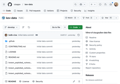
CISA's KEV data is now on GitHub, offering easier access, API integration, commit history tracking, and automated updates for security teams and researchers.