Install
npm i --save @choc-ui/chakra-autocomplete
yarn add @choc-ui/chakra-autocomplete
Preview
With Mouse

With Keyboard

Usage
Basic Usage
import { Flex, FormControl, FormHelperText, FormLabel } from "@chakra-ui/react";
import * as React from "react";
import {
AutoComplete,
AutoCompleteInput,
AutoCompleteItem,
AutoCompleteList,
} from "@choc-ui/chakra-autocomplete";
function App() {
const countries = [
"nigeria",
"japan",
"india",
"united states",
"south korea",
];
return (
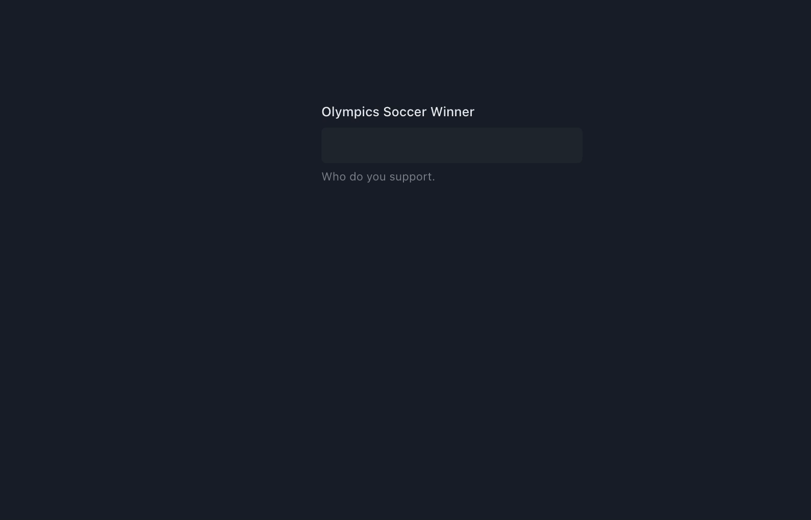
<Flex pt="48" justify="center" align="center" w="full">
<FormControl w="60">
<FormLabel>Olympics Soccer Winner</FormLabel>
<AutoComplete openOnFocus>
<AutoCompleteInput variant="filled" />
<AutoCompleteList>
{countries.map((country, cid) => (
<AutoCompleteItem
key={`option-${cid}`}
value={country}
textTransform="capitalize"
>
{country}
</AutoCompleteItem>
))}
</AutoCompleteList>
</AutoComplete>
<FormHelperText>Who do you support.</FormHelperText>
</FormControl>
</Flex>
);
}
export default App;

Creating Groups
You can create groups with the AutoCompleteGroup Component, and add a title with the AutoCompleteGroupTitle component.
import { Flex, FormControl, FormHelperText, FormLabel } from "@chakra-ui/react";
import * as React from "react";
import {
  AutoComplete,
  AutoCompleteGroup,
  AutoCompleteGroupTitle,
  AutoCompleteInput,
  AutoCompleteItem,
  AutoCompleteList,
} from "@choc-ui/chakra-autocomplete";

function App() {
  const continents = {
    africa: ["nigeria", "south africa"],
    asia: ["japan", "south korea"],
    europe: ["united kingdom", "russia"],
  };

  return (
    <Flex pt="48" justify="center" align="center" w="full">
      <FormControl w="60">
        <FormLabel>Olympics Soccer Winner</FormLabel>
        <AutoComplete openOnFocus>
          <AutoCompleteInput variant="filled" />
          <AutoCompleteList>
            {Object.entries(continents).map(([continent, countries], co_id) => (
              <AutoCompleteGroup key={co_id} showDivider>
                <AutoCompleteGroupTitle textTransform="capitalize">
                  {continent}
                </AutoCompleteGroupTitle>
                {countries.map((country, c_id) => (
                  <AutoCompleteItem
                    key={c_id}
                    value={country}
                    textTransform="capitalize"
                  >
                    {country}
                  </AutoCompleteItem>
                ))}
              </AutoCompleteGroup>
            ))}
          </AutoCompleteList>
        </AutoComplete>
        <FormHelperText>Who do you support.</FormHelperText>
      </FormControl>
    </Flex>
  );
}

export default App;

Accessing the internal state
To access the internal state of the AutoComplete, use a function as children (commonly known as a render prop). You'll get access to the internal state isOpen, with the onOpen and onClose methods.
import {
  Flex,
  FormControl,
  FormHelperText,
  FormLabel,
  Icon,
  InputGroup,
  InputRightElement,
} from "@chakra-ui/react";
import * as React from "react";
import {
  AutoComplete,
  AutoCompleteInput,
  AutoCompleteItem,
  AutoCompleteList,
} from "@choc-ui/chakra-autocomplete";
import { FiChevronRight, FiChevronDown } from "react-icons/fi";

function App() {
  const countries = [
    "nigeria",
    "japan",
    "india",
    "united states",
    "south korea",
  ];

  return (
    <Flex pt="48" justify="center" align="center" w="full">
      <FormControl w="60">
        <FormLabel>Olympics Soccer Winner</FormLabel>
        <AutoComplete openOnFocus>
          {({ isOpen }) => (
            <>
              <InputGroup>
                <AutoCompleteInput variant="filled" placeholder="Search..." />
                <InputRightElement
                  children={
                    <Icon as={isOpen ? FiChevronRight : FiChevronDown} />
                  }
                />
              </InputGroup>
              <AutoCompleteList>
                {countries.map((country, cid) => (
                  <AutoCompleteItem
                    key={`option-${cid}`}
                    value={country}
                    textTransform="capitalize"
                  >
                    {country}
                  </AutoCompleteItem>
                ))}
              </AutoCompleteList>
            </>
          )}
        </AutoComplete>
        <FormHelperText>Who do you support.</FormHelperText>
      </FormControl>
    </Flex>
  );
}

export default App;

Custom Rendering
You can Render whatever you want. The AutoComplete Items are regular Chakra Boxes.
import {
  Avatar,
  Flex,
  FormControl,
  FormHelperText,
  FormLabel,
  Text,
} from "@chakra-ui/react";
import * as React from "react";
import {
  AutoComplete,
  AutoCompleteInput,
  AutoCompleteItem,
  AutoCompleteList,
} from "@choc-ui/chakra-autocomplete";

function App() {
  const people = [
    { name: "Dan Abramov", image: "https://bit.ly/dan-abramov" },
    { name: "Kent Dodds", image: "https://bit.ly/kent-c-dodds" },
    { name: "Segun Adebayo", image: "https://bit.ly/sage-adebayo" },
    { name: "Prosper Otemuyiwa", image: "https://bit.ly/prosper-baba" },
    { name: "Ryan Florence", image: "https://bit.ly/ryan-florence" },
  ];

  return (
    <Flex pt="48" justify="center" align="center" w="full" direction="column">
      <FormControl id="email" w="60">
        <FormLabel>Olympics Soccer Winner</FormLabel>
        <AutoComplete openOnFocus>
          <AutoCompleteInput variant="filled" />
          <AutoCompleteList>
            {people.map((person, oid) => (
              <AutoCompleteItem
                key={`option-${oid}`}
                value={person.name}
                textTransform="capitalize"
                align="center"
              >
                <Avatar size="sm" name={person.name} src={person.image} />
                <Text ml="4">{person.name}</Text>
              </AutoCompleteItem>
            ))}
          </AutoCompleteList>
        </AutoComplete>
        <FormHelperText>Who do you support.</FormHelperText>
      </FormControl>
    </Flex>
  );
}

export default App;

Multi Select with Tags
Add the multiple prop to AutoComplete component, the AutoCompleteInput will now expose the tags in it's children function.
The onChange prop now returns an array of the chosen values
Now you can map the tags with the AutoCompleteTag component or any other component of your choice. The label and the onRemove method are now exposed.
import { Flex, FormControl, FormHelperText, FormLabel } from "@chakra-ui/react";
import * as React from "react";
import {
  AutoComplete,
  AutoCompleteInput,
  AutoCompleteItem,
  AutoCompleteList,
  AutoCompleteTag,
} from "@choc-ui/chakra-autocomplete";

function App() {
  const countries = [
    "nigeria",
    "japan",
    "india",
    "united states",
    "south korea",
  ];

  return (
    <Flex pt="48" justify="center" align="center" w="full" direction="column">
      <FormControl id="email" w="60">
        <FormLabel>Olympics Soccer Winner</FormLabel>
        <AutoComplete openOnFocus multiple onChange={vals => console.log(vals)}>
          <AutoCompleteInput variant="filled">
            {({ tags }) =>
              tags.map((tag, tid) => (
                <AutoCompleteTag
                  key={tid}
                  label={tag.label}
                  onRemove={tag.onRemove}
                />
              ))
            }
          </AutoCompleteInput>
          <AutoCompleteList>
            {countries.map((country, cid) => (
              <AutoCompleteItem
                key={`option-${cid}`}
                value={country}
                textTransform="capitalize"
                _selected={{ bg: "whiteAlpha.50" }}
                _focus={{ bg: "whiteAlpha.100" }}
              >
                {country}
              </AutoCompleteItem>
            ))}
          </AutoCompleteList>
        </AutoComplete>
        <FormHelperText>Who do you support.</FormHelperText>
      </FormControl>
    </Flex>
  );
}

export default App;
Creatable Items
I know that title hardly expresses the point, but yeah, naming is tough. You might want your users to be able to add extra items when their options are not available in the provided options. e.g. adding a new tag to your Polywork profile.
First add the creatable prop to the AutoComplete component.
Then add the AutoCompleteCreatable component to the bottom of the list. Refer to the references for more info on this component.

Loading State
Need to pull data from API, but don't want your users to see a blank screen? You can enable the loading state by passing the isLoading prop to AutoComplete. By doing this, 2 other props will be enabled
-
loadingIcon on AutoCompleteInput will display some sort of loading icon on the right side of the input. By default, a Spinner will be displayed, but you can pass in any custom element to be rendered
-
loadingState on AutoCompleteList can display custom loading content when isLoading is true. All content will be rendered in the center of the list. By default, a Spinner will be displayed, but you can pass in any custom element to be rendered.
Best practice is to combine setTimeout and useEffect to create a debounce effect. This will prevent un-necessary API calls if your user types relatively quickly.
A working code demo can be found here
Integration with Form Libraries
It is relatively easy to integrate with form libaries such as React Hook Form, Formik, and others. Working examples can be found in the demos folder of this repo. See the Contributing section of this doc on how to clone and set it up for testing.
Does your favorite form library not have a working example? Submit a PR to get it added and help others using this library quickly get up and running.
Autocomplete methods
Assign a ref to the AutoComplete component and call the available methods with:
ref.current?.resetItems();
ref.current?.removeItem(itemValue);
Codesandbox Link Here
API Reference
NB: Feel free to request any additional Prop in Issues.
AutoComplete
Wrapper and Provider for AutoCompleteInput and AutoCompleteList
AutoComplete composes Box so you can pass all Box props to change its style.
NB: None of the props passed to it are required.
| Prop | Type | Description | Default |
| closeOnBlur | boolean | close suggestions when input is blurred | true |
| closeOnSelect | boolean | close suggestions when a suggestions is selected | true when multiple=false, false when multiple=true |
| creatable | boolean | Allow addition of arbitrary values not present in suggestions | false |
| defaultIsOpen | boolean | Suggestions list is open by default | false |
| prefocusFirstItem | boolean | Should prefocus first item intially, on query change, on open, and on filter out of current focused item | true |
| defaultValues | Array | Used to predefine tags, or value for the autocomplete component. Just pass an array of the values | ——— |
| disableFilter | boolean | disables filtering when set to true | false |
| emphasize | boolean | SystemStyleObject | Highlight matching characters in suggestions, you can pass the styles - false | false |
| emptyState |
boolean | MaybeRenderProp<{ value: Item["value"] }>
| render message when no suggestions match query | true |
| filter |
(query: string, optionValue: Item["value"], optionLabel: Item["label"]) =>
  boolean;
| custom filter function | ——— |
| focusInputOnSelect | boolean | focus input after a suggestion is selected | true |
| freeSolo | boolean | allow entering of any arbitrary values | false |
| isReadOnly | boolean | Make the component read-only | false |
| isLoading | boolean | Display loading animation on both the input and list elements | false |
| listAllValuesOnFocus | boolean | Show all suggestions when user focuses the input, while it's not empty. | false |
| maxSelections | number | limit possible number of tag selections in multiple mode | ——— |
| maxSuggestions | number | limit number of suggestions in list | ——— |
| multiple | boolean | allow tags multi selection | false |
| onChange |
(value: string | Item["value"][], item: Item| Item[]) => void
| function to run whenever autocomplete value(s) changes | ——— |
| onSelectOption |
(params: {
    item: Item;
    selectMethod: "mouse" | "keyboard" | null;
    isNewInput: boolean;
  }) => boolean | void
| method to call whenever a suggestion is selected | ——— |
| onOptionFocus |
(params: {
    item: Item;
    focusMethod: "mouse" | "keyboard" | null;
    isNewInput: boolean;
  }) => boolean | void
| method to call whenever a suggestion is focused | ——— |
| onReady |
(props:{tags:ItemTag[]}) => void
| method that exposes variables used in component | ——— |
| onTagRemoved |
(removedTag: Item["value"],item: Item, tags: Item["value"][]) => void
| method to call whenever a tag is removed | ——— |
| openOnFocus | boolean | open suggestions when input is focuses | false |
| placement | PlacementWithLogical | where autocomplete list will display. Accepts any valid value from Popover component | bottom |
| restoreOnBlurIfEmpty | boolean | if false, clearing the value of the input field will also clear the selected option | true |
| rollNavigation | boolean | allow keyboard navigation to switch to alternate ends when one end is reached | false |
| selectOnFocus | boolean | select the text in input when it's focused | false |
| shouldRenderSuggestions |
(value: string) => boolean
| function to decide if suggestions should render, e.g. show suggestions only if there are at least two characters in the query value | ——— |
| submitKeys;
|
string[]
| A list of KeyboardEvent: key values, except for the "Enter" key, that trigger the click event of the currently selected Item. | ——— |
| suggestWhenEmpty | boolean | show suggestions when input value is empty | false |
| value | any | value of the component in the controlled state | --- |
AutoCompleteTag
Tags for multiple mode
AutoCompleteTag composes Tag so you can pass all Tag props to change its style.
Prop
| Type | Description | Required | Default |
|---|
| disabled |
string
| In the event that you need to lock certain tag so that they can't be removed in the interface, you can set the tags disabled. | No
| ——— |
| label |
string
| Label that is displayed on the tag | Yes
| ——— |
| onRemove |
() => void
| Method to remove the tag from selected values | Yes
| ——— |
AutoCompleteInput
Input for AutoComplete value.
AutoCompleteInput composes Input so you can pass all Input props to change its style.
Prop
| Type | Description | Required | Default |
|---|
| children |
type children = MaybeRenderProp<{
  tags: Item & { onRemove: () => void }[];
}>;
|
callback that returns ReactNode and is provided with tags in multiple mode
e.g.
<AutoCompleteInput variant="filled">
  {({ tags }) =>
    tags.map((tag, tid) => (
      <AutoCompleteTag key={tid} label={tag.label} onRemove={tag.onRemove} />
    ))
  }
</AutoCompleteInput>
| No
| ——— |
| ref |
RefObject<HTMLInputElement>
| provides a ref to the input element so the value can be referenced in additional contexts | No
| ——— |
| hidePlaceholder | boolean | hides the placeholder when children is not an empty array. intended usage for
<AutoComplete multiple creatable />
| No
| false |
| loadingIcon |
React.ReactNode | JSX
| Element that will be displayed when isLoading is true | No | Spinner from Chakra-UI |
AutoCompleteList
Wrapper for AutoCompleteGroup and AutoCompleteItem
AutoCompleteList composes Box so you can pass all Box props to change its style.
Prop
| Type | Description | Required | Default |
|---|
| loadingState | React.ReactNode | JSX | Content displayed in list while isLoading is true. Content will be centered | No | Spinner from Chakra-UI with an md size |
AutoCompleteGroup
Wrapper for collections of AutoCompleteItems
AutoCompleteGroup composes Box so you can pass all Box props to change its style.
Prop
| Type | Description | Required | Default |
|---|
| showDivider | boolean | If true, a divider is shown | No | false |
| dividerColor | string | Color for divider, if present | No | inherit |
AutoCompleteItem
This Composes your suggestions
AutoCompleteItem composes Flex so you can pass all Flex props to change its style.
Prop
| Type | Description | Required | Default |
|---|
| getValue | (value:any) => any | A method used to determine the key that holds the value, when the value prop is an object | no
|
val => val;
|
| label | string | The label for the Option | no
| ——— |
| value | string or Object | The value of the Option | yes
| ——— |
| fixed |
boolean
| Make an item visible at all times, regardless of filtering or maxSuggestions | No | ——— |
| _fixed | SystemStyleObject | Styles for fixed Itemm | No |
{
  fontWeight: 'extrabold',
}
|
| value | string | The value of the Option | yes
| ——— |
| disabled |
boolean
| Make an item disabled, so it cannot be selected | No | ——— |
| _disabled | SystemStyleObject | Styles for disabled Item(s) | No |
{
  fontWeight: 'extrabold',
}
|
| _selected | SystemStyleObject | Styles for selected Item(s) | No |
{
  fontWeight: 'extrabold',
}
|
| _focus | SystemStyleObject | Styles for focused Item | No |
{
  fontWeight: 'extrabold',
}
|
AutoCompleteCreatable
Used with the AutoComplete component's creatable prop, to allow users enter arbitrary values, not available in the provided options.
AutoCompleteCreatable composes Flex so you can pass all Flex props to change its style.
It also accepts a function as its children prop which is provided with the current inputValue.
Prop
| Type | Description | Required | Default |
|---|
| children |
type children = MaybeRenderProp<{ value: any }>;
|
ReactNode or callback that returns ReactNode
e.g.
<AutoCompleteCreatable>
  {({ value }) => <span>Add {value} to List</span>}
</AutoCompleteCreatable>
| No
| ——— |
| alwaysDisplay |
boolean;
|
When true, AutoCompleteCreatable is shown even when the AutoCompleteInput is empty
| No
| ——— |
Contribute
git clone https://github.com/anubra266/choc-autocomplete.git
- Install all dependencies (with yarn)
yarn
- Install package example dependencies (with yarn)
cd example
yarn
Start the package server, and the example server
yarn start
yarn dev
Thanks goes to these wonderful people (emoji key):

Contributors ✨
Thanks goes to these wonderful people (emoji key):
This project follows the all-contributors specification. Contributions of any kind welcome!