Storybook Addon Visual Tests
Visual Testing addon with Chromatic
Development scripts
yarn start runs babel in watch mode and starts Storybookyarn build build and package your addon code
Switch from TypeScript to JavaScript
Don't want to use TypeScript? We offer a handy eject command: yarn eject-ts
This will convert all code to JS. It is a destructive process, so we recommended running this before you start writing any code.
What's included?
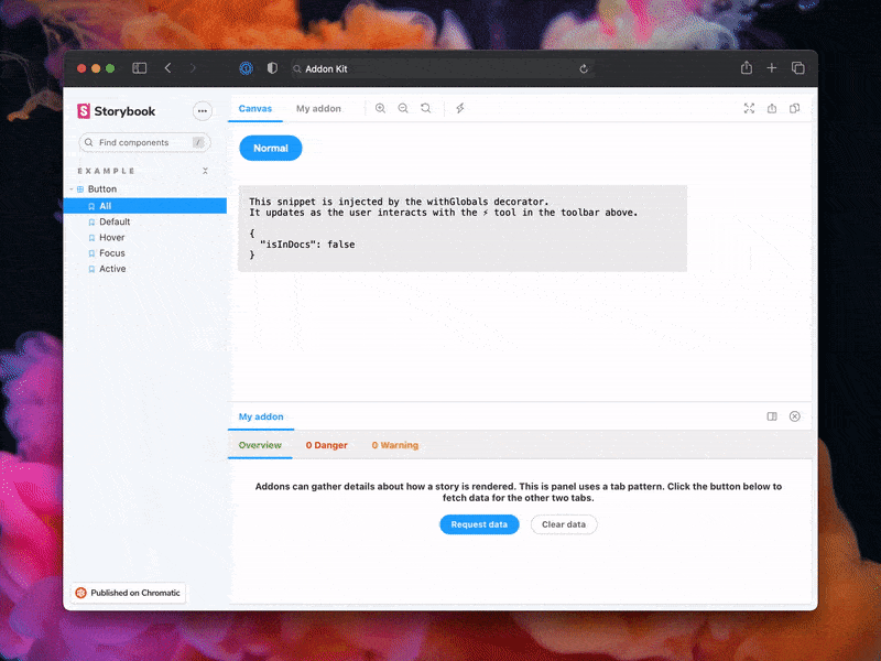
The addon code lives in src. It demonstrates all core addon related concepts. The three UI paradigms
src/Tool.tsxsrc/Panel.tsxsrc/Tab.tsx
Which, along with the addon itself, are registered in src/manager.ts.
Managing State and interacting with a story:
src/withGlobals.ts & src/Tool.tsx demonstrates how to use useGlobals to manage global state and modify the contents of a Story.src/withRoundTrip.ts & src/Panel.tsx demonstrates two-way communication using channels.src/Tab.tsx demonstrates how to use useParameter to access the current story's parameters.
Your addon might use one or more of these patterns. Feel free to delete unused code. Update src/manager.ts and src/preview.ts accordingly.
Lastly, configure you addon name in src/constants.ts.
Metadata
Storybook addons are listed in the catalog and distributed via npm. The catalog is populated by querying npm's registry for Storybook-specific metadata in package.json. This project has been configured with sample data. Learn more about available options in the Addon metadata docs.
Release Management
Setup
This project is configured to use auto for release management. It generates a changelog and pushes it to both GitHub and npm. Therefore, you need to configure access to both:
NPM_TOKEN Create a token with both Read and Publish permissions.GH_TOKEN Create a token with the repo scope.
Then open your package.json and edit the following fields:
Local
To use auto locally create a .env file at the root of your project and add your tokens to it:
GH_TOKEN=<value you just got from GitHub>
NPM_TOKEN=<value you just got from npm>
Lastly, create labels on GitHub. You’ll use these labels in the future when making changes to the package.
npx auto create-labels
If you check on GitHub, you’ll now see a set of labels that auto would like you to use. Use these to tag future pull requests.
GitHub Actions
This template comes with GitHub actions already set up to publish your addon anytime someone pushes to your repository.
Go to Settings > Secrets, click New repository secret, and add your NPM_TOKEN.
Creating a release
To create a release locally you can run the following command, otherwise the GitHub action will make the release for you.
yarn release
That will:
- Build and package the addon code
- Bump the version
- Push a release to GitHub and npm
- Push a changelog to GitHub


