Security News
PyPI’s New Archival Feature Closes a Major Security Gap
PyPI now allows maintainers to archive projects, improving security and helping users make informed decisions about their dependencies.
@cloudideaas/ngx-accordion
Advanced tools
Simple accordion control for your angular applications using bootstrap.
This repository is for demonstration purposes of how it can be implemented in Angular and is not maintaned. Please fork and maintain your own version of this repository.
Simple accordion control for your angular applications using bootstrap. Does not depend of jquery. If you don't want to use it without bootstrap - simply create proper css classes. Please star a project if you liked it, or create an issue if you have problems with it.

Install npm module:
npm install ngx-accordion --save
If you are using system.js you may want to add this into map and package config:
{
    "map": {
        "ngx-accordion": "node_modules/ngx-accordion"
    },
    "packages": {
        "ngx-accordion": { "main": "index.js", "defaultExtension": "js" }
    }
}
Import AccordionModule in your app and start using component:
<accordion [showArrows]="true" [closeOthers]="false" [expandAll]="true">
    <accordion-group heading="Accordion heading">
        <accordion-heading>
            Or <b>custom</b> <accordion-toggle>heading with clickable zone.</accordion-toggle>
        </accordion-heading>
        Accordion group contents.
    </accordion-group>
    ...
</accordion>
<accordion>:
Contains accordion groups.
[showArrows]="true|false" Indicates if arrows should be shown or not. Default is false[closeOthers]="true|false" Indicates if other opened groups should be automatically closed when you open a new group. Default is true[expandAll]="true|false" Indicates if all panels should be expanded by default. Default is false. If expandAll is set to true, then the closeOthers option has no effect, since all panels are opened.<accordion-group>:
Used inside <accordion> and represents a single collapsible panel.
heading="Group heading" Simple text group heading[disabled]="true|false" Indicates if this group is disabled or not (expandable or not)(onOpen)="doSomethingOnOpen()" Calls function when this accordion-group is opened(onClose)="doSomethingOnClose()" Calls function when this accordion-group is closed(onToggle)="doSomethingOnToggle(isOpened)" Calls function when this accordion-group is toggled<accordion-heading> Content zone where you can put custom headings<accordion-toggle>:
Used inside <accordion-group> to provide a custom clickable zone for the accordion heading.
This is usable when you have clickable controls in your header (for example checkbox) and you don't want
accordion to be opened/closed on click of this controls.
import {Component} from "@angular/core";
import {AccordionModule} from "ngx-accordion";

@Component({
    selector: "app",
    template: `
<div class="container">

    <!-- regular accordion -->
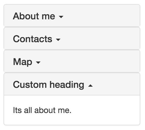
    <accordion>
        <accordion-group heading="About me">
            Its all about me.
        </accordion-group>
        <accordion-group heading="Contacts">
            This is content of the contacts
        </accordion-group>
        <accordion-group heading="Map">
            Content of the Map
        </accordion-group>
        <accordion-group>
            <accordion-heading>
                Custom heading
            </accordion-heading>
            Its all about me.
        </accordion-group>
    </accordion>

    <!-- regular accordion with first opened group -->
    <accordion>
        <accordion-group heading="About me" [isOpened]="true">
            Its all about me.
        </accordion-group>
        <accordion-group heading="Contacts">
            This is content of the contacts
        </accordion-group>
        <accordion-group heading="Map">
            Content of the Map
        </accordion-group>
        <accordion-group>
            <accordion-heading>
                <b>Custom</b> <i style="color: deeppink">heading</i>
            </accordion-heading>
            Its all about me.
        </accordion-group>
    </accordion>

    <!-- accordion with arrows -->
    <accordion [showArrows]="true">
        <accordion-group heading="About me">
            Its all about me.
        </accordion-group>
        <accordion-group heading="Contacts">
            This is content of the contacts
        </accordion-group>
        <accordion-group heading="Map">
            Content of the Map
        </accordion-group>
        <accordion-group>
            <accordion-heading>
                Custom heading
            </accordion-heading>
            Its all about me.
        </accordion-group>
    </accordion>

    <!-- accordion where you can close multiple groups -->
    <accordion [closeOthers]="false">
        <accordion-group heading="About me">
            Its all about me.
        </accordion-group>
        <accordion-group heading="Contacts">
            This is content of the contacts
        </accordion-group>
        <accordion-group heading="Map">
            Content of the Map
        </accordion-group>
        <accordion-group>
            <accordion-heading>
                Custom heading
            </accordion-heading>
            Its all about me.
        </accordion-group>
    </accordion>

    <!-- accordion where all items are expanded by default -->
    <accordion [expandAll]="true">
        <accordion-group heading="About me">
            Its all about me.
        </accordion-group>
        <accordion-group heading="Contacts">
            This is content of the contacts
        </accordion-group>
        <accordion-group heading="Map">
            Content of the Map
        </accordion-group>
        <accordion-group>
            <accordion-heading>
                Custom heading
            </accordion-heading>
            Its all about me.
        </accordion-group>
    </accordion>

    <!-- accordion with custom "clickable zone" -->
    <accordion>
        <accordion-group heading="About me">
            Its all about me.
        </accordion-group>
        <accordion-group heading="Contacts">
            This is content of the contacts
        </accordion-group>
        <accordion-group heading="Map">
            Content of the Map
        </accordion-group>
        <accordion-group>
            <accordion-heading>
                <input type="checkbox"> <accordion-toggle>Custom clickable heading</accordion-toggle>
            </accordion-heading>
            Its all about me.
        </accordion-group>
    </accordion>

</div>
`
})
export class App {

}

@NgModule({
    imports: [
        // ...
        AccordionModule
    ],
    declarations: [
        App
    ],
    bootstrap: [
        App
    ]
})
export class AppModule {

}
Take a look on samples in ./sample for more examples of usages.
0.0.13
0.0.12
0.0.9
0.0.8
0.0.7
FAQs
Simple accordion control for your angular applications using bootstrap.
The npm package @cloudideaas/ngx-accordion receives a total of 4 weekly downloads. As such, @cloudideaas/ngx-accordion popularity was classified as not popular.
We found that @cloudideaas/ngx-accordion demonstrated a healthy version release cadence and project activity because the last version was released less than a year ago. It has 1 open source maintainer collaborating on the project.
Did you know?

Socket for GitHub automatically highlights issues in each pull request and monitors the health of all your open source dependencies. Discover the contents of your packages and block harmful activity before you install or update your dependencies.

Security News
PyPI now allows maintainers to archive projects, improving security and helping users make informed decisions about their dependencies.

Research
Security News
Malicious npm package postcss-optimizer delivers BeaverTail malware, targeting developer systems; similarities to past campaigns suggest a North Korean connection.

Security News
CISA's KEV data is now on GitHub, offering easier access, API integration, commit history tracking, and automated updates for security teams and researchers.