Product
Introducing License Enforcement in Socket
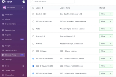
Ensure open-source compliance with Socket’s License Enforcement Beta. Set up your License Policy and secure your software!
@contentful/f36-avatar
Advanced tools
Avatar can be used to visually represent users and apps.
import { Avatar, Size, Variant } from '@contentful/f36-avatar';
The Avatar can be rendered in different variants:
The Avatar can be rendered in different sizes:
The Avatar can be rendered with outline colors, the color is determined by the position of the Avatar. There are 6 different colors: green, red, yellow, orange, purple and gray
The Avatar can be rendered with a special color border reserved for the current user
This property modifies the opacity of the Avatar component when it is not active
An Avatar can display an icon on top of the image
In some cases a user or an app will have no avatar to display. Instead, a fallback can be rendered when the src property is undefined (or an empty string "") and the loading state is not true.
When the avatar image is loading, a loading skeleton will be shown automatically. You can also force the loading state with the isLoading prop.
Make sure to pass a fitting alt property, especially if the avatar is used by itself without the user's name next to it.
FAQs
Forma 36: Avatar component
The npm package @contentful/f36-avatar receives a total of 5,703 weekly downloads. As such, @contentful/f36-avatar popularity was classified as popular.
We found that @contentful/f36-avatar demonstrated a healthy version release cadence and project activity because the last version was released less than a year ago. It has 0 open source maintainers collaborating on the project.
Did you know?

Socket for GitHub automatically highlights issues in each pull request and monitors the health of all your open source dependencies. Discover the contents of your packages and block harmful activity before you install or update your dependencies.

Product
Ensure open-source compliance with Socket’s License Enforcement Beta. Set up your License Policy and secure your software!

Product
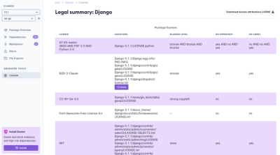
We're launching a new set of license analysis and compliance features for analyzing, managing, and complying with licenses across a range of supported languages and ecosystems.

Product
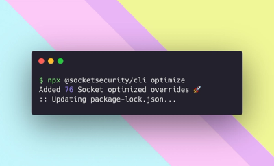
We're excited to introduce Socket Optimize, a powerful CLI command to secure open source dependencies with tested, optimized package overrides.