Product
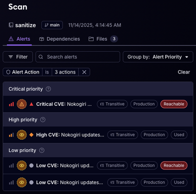
Reachability for Ruby Now in Beta
Reachability analysis for Ruby is now in beta, helping teams identify which vulnerabilities are truly exploitable in their applications.
@domoinc/bar-gauge
Advanced tools
Bar gauge with label and value
Type: color
Default: "#333333"
Color of the number value when outside of the gauge
Type: color
Default: "#73B0D7"
Color of the gauge
Type: number
Default: 0
Sets starting pos after labels for left-alinging bars
Type: number
Default: 5
Units: px
Padding between edge of bar and text
Type: string
Default: "BarGauge"
Name of chart for reporting
Type: number
Default: 30
Height of the gauge
Type: boolean
Default: false
If true, it signals to the widget that it is running on a mobile device. Should be called before draw and then NEVER changed.
Type: boolean
Default: true
Labels will be at the start of the bar, false means it will be at the end of the bar
Type: color
Default: "#8A8D8E"
Type: number
Default: 14
Units: px
Styles for all bar labels showing values
Type: boolean
Default: true
Bar transitions left to right, false means transitions right to left
Type: number
Default: null
Max width of all bar gauges if more than one is called
Type: string
Default: ""
String to be appended before the value number
Type: boolean
Default: true
Flag for turning off data validation
Type: string
Default: ""
String to be appended after the value number
Type: string
Default: "Open Sans"
Type: boolean
Default: true
Flag for turning off the mimic of illustrator's scale functionality
Type: color
Default: "#333333"
Color of the number value
Type: number
Default: 14
Units: px
Text size of the number indicators inside and outside of the gauge
Type: number
Default: 100
Width of the gauge
Type: string
Default validate:
function (d) { return this.accessor(d) !== undefined; }
Default accessor:
function (line) { return line[0] === undefined ? undefined : String(line[0]); }
Type: number
Default validate:
function (d) { return !isNaN(this.accessor(d)); }
Default accessor:
function (line) { return Number(line[1]); }
dispatch:mouseover
dispatch:mouseout
external:mouseover
external:mouseout
//Setup some fake data
var data = [
  ['PUSHED', 200]
];

//Initialze the widget
var chart = d3.select('#vis')
  .append('svg')
  .attr('height', '500px')
  .attr('width', '500px')
  .append('g')
  .attr('transform', 'translate(0,0)')
  .chart('BarGauge')
  .c({
    width: 400,
    height: 50,
    barStartPos: 75,
    // min: 50,
    // labelTextColor: 'red'
  });

//Render the chart with data
chart._notifier.showMessage(false);
chart.draw(data);
FAQs
BarGauge - Domo Widget
We found that @domoinc/bar-gauge demonstrated a not healthy version release cadence and project activity because the last version was released a year ago. It has 17 open source maintainers collaborating on the project.
Did you know?

Socket for GitHub automatically highlights issues in each pull request and monitors the health of all your open source dependencies. Discover the contents of your packages and block harmful activity before you install or update your dependencies.

Product
Reachability analysis for Ruby is now in beta, helping teams identify which vulnerabilities are truly exploitable in their applications.

Research
/Security News
Malicious npm packages use Adspect cloaking and fake CAPTCHAs to fingerprint visitors and redirect victims to crypto-themed scam sites.

Security News
Recent coverage mislabels the latest TEA protocol spam as a worm. Here’s what’s actually happening.