React Native Swipe Item
A swipe item for react-native. Support both iOS and Android.
Fix error
SwipeProvider breaks on type checking, all the component becomes red and types are not compatible
Example
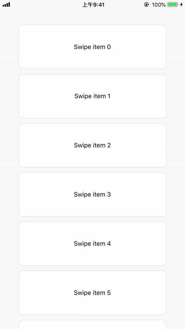
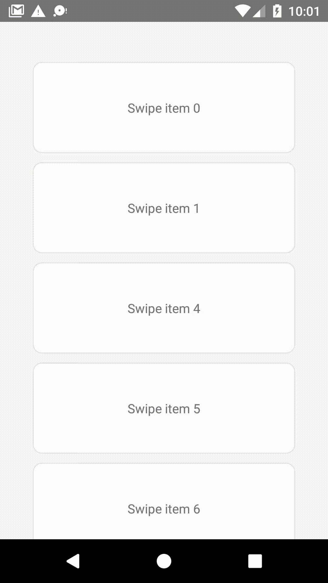
See react-native-swipe-item-demo.
Installation
npm i --save @faisolp/react-native-swipe-item
- if you use react-native 0.62.0 or newer version, please install
0.5.0.
Usage
You can use the SwipeButtonsContainer to wrap buttons that you want to show when users swipe the item, and pass it to props.
import { SwipeItem, SwipeButtonsContainer, SwipeProvider } from '@faisolp/react-native-swipe-item';

export default function SwipeButtonCustom() {

    const leftButton = (
        <SwipeButtonsContainer
            style={{
                alignSelf: 'center',
                aspectRatio: 1,
                flexDirection: 'column',
                padding: 10,
            }}

        >
            <TouchableOpacity
                onPress={() => console.log('left button clicked')}
            >
                <Text>Click me !</Text>
            </TouchableOpacity>
        </SwipeButtonsContainer>
    );

    return (
        <SwipeProvider>
            <SwipeItem
                style={styles.button}
                swipeContainerStyle={styles.swipeContentContainerStyle}
                leftButtons={leftButton}
            >
                <Text>
                    Swipe me!
                </Text>
            </SwipeItem>
            <SwipeItem>
                ...
            </SwipeItem>
        </SwipeProvider>
    );
}

const styles = StyleSheet.create({
    button: {
        width: '80%',
        height: 100,
        alignSelf: 'center',
        marginVertical: 5,
    },
    swipeContentContainerStyle: {
        justifyContent: 'center',
        alignItems: 'center',
        backgroundColor: '#ffffff',
        borderRadius: 10,
        borderColor: '#e3e3e3',
        borderWidth: 1,
    }
});
Components
SwipeProvider Props
mode
Swipe items mode, default is single.
| TYPE | REQUIRED |
|---|
single | multiple | No |
-
single: only allow one swipe item to be opened. The opened swipe item would be automatically closed when the new swipe item triggers the close event. (see the closeTrigger prop for more detail.)
-
multiple: allow multiple swipe items to be opened.
closeTrigger
The trigger for automatically closed swipe item , only works when the mode prop is single, default is onItemMoved.
| TYPE | REQUIRED |
|---|
onItemMoved | onButtonShowed | No |
-
onItemMoved: when the swipe item is moved, the opened one will be closed.
-
onButtonShowed: when the swipe item button is showing, the opened one will be closed.
SwipeItem Props
style
These styles will be applied to the swipe item layout.
swipeContainerStyle
These styles will be applied to the swipe item container which user swipe.
Example:
return (
        <SwipeItem swipeContainerStyle={styles.swipeContentContainerStyle} >
        </SwipeItem>
    );
}

const styles = StyleSheet.create({
    swipeContentContainerStyle: {
        justifyContent: 'center',
        alignItems: 'center',
        backgroundColor: '#ffffff',
        borderRadius: 10,
        borderColor: '#e3e3e3',
        borderWidth: 1,
    }
});
leftButtons
Buttons that want to show on the left when the item swiped to right.
| TYPE | REQUIRED |
|---|
SwipeButtonsContainer | No |
rightButtons
Buttons that want to show on the right when the item swiped to left.
| TYPE | REQUIRED |
|---|
SwipeButtonsContainer | No |
containerView
The component for the swipe item.
- Before RN 0.57.0, the child view would be clipped by parent view when the child view layout out of the parent. Recommend to use ViewOverflow plugin to solve this problem.
Example:
import ViewOverflow from 'react-native-view-overflow';
...
...
export default function SwipeButtonCustom() {
    return (
        <SwipeItem
            style={styles.button}
            swipeContainerStyle={styles.swipeContentContainerStyle}
            containerView={ViewOverflow}
        >
            <Text>
                Swipe me!
            </Text>
        </SwipeItem>
    );
}
...
| TYPE | REQUIRED | PLATFORM |
|---|
ViewOverflow | Yes | Android |
onSwipeInitial
This prop will be called when the item started swipe from the origin position, and the SwipeItem reference passed as an argument.
onLeftButtonsShowed
This prop will be called when left buttons showed, and the SwipeItem reference passed as an argument.
onRightButtonsShowed
This prop will be called when right buttons showed, and the SwipeItem reference passed as an argument.
onMovedToOrigin
This prop will be called when the item moved to the origin, and the SwipeItem reference passed as an argument.
disableSwipeIfNoButton
since v0.4
Disable the swipe feature when there are no buttons.
swipeThreshold
since v0.7
The swipe item will be opened automatically when the position pass the threshold, and you can set the left and right buttons separately.
| TYPE | REQUIRED |
|---|
{ left?: number, right?: number } | No |
disableButtonScale
since v0.7
You can disabled left or right or both button scale when swiping.
| TYPE | REQUIRED |
|---|
{ left?: boolean, right?: boolean } | No |
SwipeItem Ref Methods
close
Close the swipe item.
Example:
const itemRef = useRef(null);
...
itemRef.current.close();
...
<SwipeItem ref={itemRef} >
    ...
</SwipeItem>
SwipeButtonsContainer Props
This component extends react-native View props.
License
MIT


