
Research
Security News
Malicious npm Package Targets Solana Developers and Hijacks Funds
A malicious npm package targets Solana developers, rerouting funds in 2% of transactions to a hardcoded address.
By Socket Research Team - Dec 02, 2024
@finastra/textfield
Advanced tools
Text fields let users enter and edit text.
The fds-textfield extends Material web's mwc-textfield-base.
npm i @finastra/textfield
import '@finastra/textfield';
...
<fds-textfield label="Field me in"></fds-textfield>
Date pickers and Time pickers allow selecting a value from a standard format.
The TextField support date type="date", time type="time" and date&time type="datetime-local" pickers. See MDN web docs for more information about the different input types.
<fds-textfield type="date" iconTrailing="calendar_today"></fds-textfield>
| Property | Attribute | Modifiers | Type | Default | Description |
|---|---|---|---|---|---|
autoValidate | boolean | ||||
autocapitalize | string | ||||
charCounter | boolean | "external" | "internal" | ||||
dense | dense | boolean | false | ||
disabled | boolean | Disabled state for the component. When disabled is set to true, thecomponent will not be added to form submission. | |||
endAligned | boolean | ||||
helper | string | ||||
helperPersistent | boolean | true | |||
icon | string | ||||
iconTrailing | string | ||||
inputMode | TextFieldInputMode | ||||
label | string | ||||
labelInside | labelInside | boolean | false | ||
max | string | number | ||||
maxLength | number | ||||
min | string | number | ||||
minLength | number | ||||
name | string | ||||
outlined | boolean | true | |||
override | |||||
pattern | string | ||||
placeholder | string | ||||
prefix | string | ||||
readOnly | boolean | ||||
required | boolean | ||||
ripple | readonly | Promise<RippleInterface | null> | undefined | Implement ripple getter for Ripple integration with mwc-formfield | ||
selectionEnd | readonly | number | null | |||
selectionStart | readonly | number | null | |||
showActionButton | showActionButton | boolean | false | ||
size | number | null | ||||
step | number | "any" | null | step can be a number or the keyword "any". Use String typing to pass down the value as a string and let the nativeinput cast internally as needed. | |||
suffix | string | ||||
type | TextFieldType | ||||
validateOnInitialRender | boolean | ||||
validationMessage | string | ||||
validity | readonly | ValidityState | |||
validityTransform | ((value: string, nativeValidity: ValidityState) => Partial<ValidityState>) | null | ||||
value | string | ||||
willValidate | readonly | boolean |
| Method | Type |
|---|---|
blur | (): void |
checkValidity | (): boolean |
click | (): void |
focus | (): void |
layout | (): Promise<void> |
renderOutline | (): string | TemplateResult<ResultType> |
reportValidity | (): boolean |
select | (): void |
setCustomValidity | (message: string): void |
setSelectionRange | (selectionStart: number, selectionEnd: number, selectionDirection?: "forward" | "backward" | "none" | undefined): void |
| Property | Attribute | Modifiers | Type | Default | Description |
|---|---|---|---|---|---|
autoValidate | boolean | ||||
autocapitalize | string | ||||
charCounter | boolean | "external" | "internal" | ||||
dense | dense | boolean | false | Smaller text field size. | |
disabled | disabled | boolean | false | Disabled state for the component. When disabled is set to true, thecomponent will not be added to form submission. | |
endAligned | boolean | ||||
helper | helper | string | "" | Helper text to display below the input. | |
helperPersistent | boolean | true | |||
icon | icon | string | "" | Leading icon to display in input. See fds-icon. | |
iconTrailing | iconTrailing | string | "" | Leading icon to display in input. See fds-icon. | |
inputMode | TextFieldInputMode | ||||
label | label | string | "textfield" | Sets floating label value. | |
labelInside | labelInside | boolean | false | Is the label included in the text field. | |
max | string | number | ||||
maxLength | number | ||||
min | string | number | ||||
minLength | number | ||||
name | string | ||||
outlined | boolean | true | |||
override | |||||
pattern | pattern | string | "" | A JavaScript regular expression. The textfield value must match this pattern. | |
placeholder | placeholder | string | "textfield" | Sets placeholder value displayed when input is empty. | |
prefix | string | ||||
readOnly | boolean | ||||
required | required | boolean | false | Displays error state if value is empty and input is blurred. | |
ripple | readonly | Promise<RippleInterface | null> | undefined | Implement ripple getter for Ripple integration with mwc-formfield | ||
selectionEnd | readonly | number | null | |||
selectionStart | readonly | number | null | |||
showActionButton | showActionButton | boolean | false | Enable the use of a the actionButton slot. | |
size | number | null | ||||
step | number | "any" | null | step can be a number or the keyword "any". Use String typing to pass down the value as a string and let the nativeinput cast internally as needed. | |||
styles | CSSResult[] | ["styles"] | |||
suffix | string | ||||
type | type | TextFieldType | "" | A string specifying the type of control to render. | |
validateOnInitialRender | boolean | ||||
validationMessage | validationMessage | string | "" | Message to show in the error color when the textfield is invalid. (Helper text will not be visible) | |
validity | readonly | ValidityState | |||
validityTransform | ((value: string, nativeValidity: ValidityState) => Partial<ValidityState>) | null | ||||
value | string | ||||
willValidate | readonly | boolean |
| Method | Type |
|---|---|
blur | (): void |
checkValidity | (): boolean |
click | (): void |
focus | (): void |
layout | (): Promise<void> |
renderOutline | (): string | TemplateResult<ResultType> |
reportValidity | (): boolean |
select | (): void |
setCustomValidity | (message: string): void |
setSelectionRange | (selectionStart: number, selectionEnd: number, selectionDirection?: "forward" | "backward" | "none" | undefined): void |
| Name | Description |
|---|---|
actionButton | Slot to replace iconTrailing with an action button. |
| Property | Type | Default | Description |
|---|---|---|---|
--fds-icon-color | color | "#694ED6" | Icon color. |
--fds-icon-trailing-color | color | "#694ED6" | Icon trailing color. |
--fds-primary | color | "#694ED6" | TextField color |
--fds-text-field-radius | text | "4px" | Border radius of the outline. |
FAQs
TextField Web Component
We found that @finastra/textfield demonstrated a not healthy version release cadence and project activity because the last version was released a year ago. It has 3 open source maintainers collaborating on the project.
Did you know?

Socket for GitHub automatically highlights issues in each pull request and monitors the health of all your open source dependencies. Discover the contents of your packages and block harmful activity before you install or update your dependencies.
Research
Security News
A malicious npm package targets Solana developers, rerouting funds in 2% of transactions to a hardcoded address.

Security News
Research
Socket researchers have discovered malicious npm packages targeting crypto developers, stealing credentials and wallet data using spyware delivered through typosquats of popular cryptographic libraries.
Security News
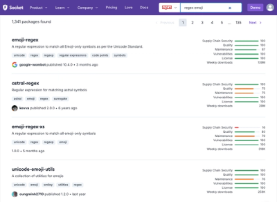
Socket's package search now displays weekly downloads for npm packages, helping developers quickly assess popularity and make more informed decisions.