

Security News
upm Launches as a Fast, Tiny Package Manager Written in TypeScript
upm uses Node.js to deliver fast npm installs in about 250 KB, with a JavaScript API and security defaults.
By Sarah Gooding - Sep 29, 2026
@framingui/ui
Advanced tools
React components for FramingUI.
Use this package when you want FramingUI components directly in an app, whether you install them manually or through @framingui/mcp-server init.
pnpm add @framingui/ui
Import the shared styles when your app uses the FramingUI-native style contract:
import '@framingui/ui/styles';
import '@framingui/ui/styles';
import { Button, Card, CardContent, CardHeader, CardTitle, Input } from '@framingui/ui';

export function SignupCard() {
  return (
    <Card>
      <CardHeader>
        <CardTitle>Create account</CardTitle>
      </CardHeader>
      <CardContent>
        <Input type="email" placeholder="Email" />
        <Button>Create account</Button>
      </CardContent>
    </Card>
  );
}
Button, Input, Card, Badge, Avatar, and SelectDialog, Tabs, Table, and PopoverSidebar, NavigationMenu, and CalendarIf you are using FramingUI through MCP, do not guess component APIs. Use:
list-componentspreview-componentvalidate-environmentMIT
FAQs
FramingUI Reference Component Library
The npm package @framingui/ui receives a total of 0 weekly downloads. As such, @framingui/ui popularity was classified as not popular.
We found that @framingui/ui demonstrated a healthy version release cadence and project activity because the last version was released less than a year ago. It has 1 open source maintainer collaborating on the project.
Security News
upm uses Node.js to deliver fast npm installs in about 250 KB, with a JavaScript API and security defaults.

Company News
Socket is joining the OpenJS Security Stewardship Program to fund Node.js vulnerability research, maintainer remediation, and security releases.
Security News
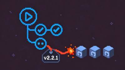
Two compromised GitHub Actions were re-enabled with malicious tags intact, exposing thousands of downstream repositories to Mini Shai-Hulud.