
Security News
Federal Audit Finds NIST Wasted Funds With No Plan to Clear NVD Backlog
Federal audit finds NIST lacked a plan to clear the NVD backlog, wasted funds on duplicate work, and delayed use of CISA data.
By Sarah Gooding - Jun 03, 2026
@freakycoder/react-native-header-view
Advanced tools
Fully customizable Header View with multiple design options for React Native.


Add the dependency:
npm i @freakycoder/react-native-header-view
"react": ">= 16.x",
"react-native": ">= 0.55.x",
"react-native-iphone-x-helper": ">= 1.x.x",
"react-native-dynamic-vector-icons": ">= x.x.x"
<ModernHeader />
<ModernHeader
  text="Profile"
  rightIconType="Ionicons"
  rightIconName="ios-settings"
  rightIconColor={colors.light.primary}
  leftIconOnPress={() => NavigationService.back()}
/>
<ClassicHeader
  headerTitle="Header"
  rightComponentDisable
  leftComponentOnPress={() => {}}
  hitSlops={
    top: 30,
    bottom: 30,
    left: 30,
    right: 30
  }
/>
<ClassicHeader
  headerTitle="Header"
  leftComponent={
    <TouchableOpacity
      onPress={() => {}}>
      <Icon name="ios-arrow-back" type="Ionicons" size={30} color="blue" />
    </TouchableOpacity>
  }
  rightComponent={
    <TouchableOpacity
      onPress={() => {}}>
      <Icon name="github" type="AntDesign" size={30} color="purple" />
    </TouchableOpacity>
  }
/>
| Property | Type | Default | Description |
|---|---|---|---|
| styles | styles | styles | use this to change main style of the header |
| text | string | "Header Title" | set the header's title |
| textStyle | style | style | set your own style for the header's text |
| left | number | 16 | use this to set left icon's align |
| right | number | 16 | use this to set right icon's align |
| leftIconName | string | ios-arrow-back | change the left icon depends on the React Native Vector Icons |
| leftIconType | string | Ionicons | change the left icon's type |
| leftIconSize | number | 25 | change the left icon's size |
| leftIconColor | color | #bbbabe | change the left icon's color |
| rightIconName | string | heart | change the right icon depends on the React Native Vector Icons |
| rightIconType | string | Entypo | change the right icon's type |
| rightIconSize | number | 25 | change the right icon's size |
| rightIconColor | color | #23c4c1 | change the right icon's color |
| leftIconComponent | component | Icon | use your own component instead of the integrated Icon component |
| rightIconComponent | component | Icon | use your own component instead of the integrated Icon component |
| leftIconOnPress | function | function | set the function for left icon's onPress |
| rightIconOnPress | function | function | set the function for right icon's onPress |
| leftDisable | boolean | false | disable the left icon component |
| rightDisable | boolean | false | disable the right icon component |
| Property | Type | Default | Description |
|---|---|---|---|
| styles | styles | styles | use this to change main style of the header |
| height | number | 50 | use this to change the header's height |
| width | number | 100% | use this to change the header's width |
| statusBarHidden | boolean | false | use this to let Header Component itself re-arrange depends on the status bar |
| hitSlops | object | object: 30 | use this to change the header's left and right components' hitSlots |
| bottomStick | boolean | false | stick the header to bottom side |
| headerTitle | string | "" | use this to set header's title |
| backgroundColor | color | #ffffff | use this to change the header's background color |
| leftComponent | component | Icon | set the left component |
| leftComponentStyle | style | style | set the left component's style |
| leftComponentDisable | boolean | false | disable the left component |
| leftComponentOnPress | function | null | set the left component's onPress function |
| rightComponent | component | Icon | set the right component |
| rightComponentStyle | style | style | set the right component's style |
| rightComponentDisable | boolean | false | disable the right component |
| rightComponentOnPress | function | null | set the right component's onPress function |
| centerComponent | component | Icon | set the center component |
| centerComponentStyle | style | style | set the center component's style |
⚠️ BREAKING CHANGE ON WHOLE LIBRARY ! PLEASE READ !
🚀Now, It has two Header which are :
Usage is not changed however import method is changed. Please check the example ✌️
Merged pull requests:
* This Change Log was automatically generated by github_changelog_generator
FreakyCoder, kurayogun@gmail.com
React Native Header View Library is available under the MIT license. See the LICENSE file for more info.
FAQs
Collection of Header Views for React Native.
The npm package @freakycoder/react-native-header-view receives a total of 12 weekly downloads. As such, @freakycoder/react-native-header-view popularity was classified as not popular.
We found that @freakycoder/react-native-header-view demonstrated a not healthy version release cadence and project activity because the last version was released a year ago. It has 1 open source maintainer collaborating on the project.
Did you know?

Socket for GitHub automatically highlights issues in each pull request and monitors the health of all your open source dependencies. Discover the contents of your packages and block harmful activity before you install or update your dependencies.
Security News
Federal audit finds NIST lacked a plan to clear the NVD backlog, wasted funds on duplicate work, and delayed use of CISA data.
Research
/Security News
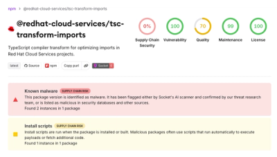
A mini Shai-Hulud campaign compromised Red Hat Cloud Services npm packages to steal developer and CI/CD secrets during installation.

Research
/Security News
The North Korean malware loader hides in a Packagist-listed package and its GitHub branch to fetch and execute remote code in a likely Contagious Interview-style lure.