
Storybook Addon Badges
Using @geometricpanda/storybook-addon-badges you're able to add badges to
your Storybook app.
Installation
NPM:
npm install @geometricpanda/storybook-addon-badges --save
Yarn:
yarn add @geometricpanda/storybook-addon-badges
Configuration
In your .storybook/main.js you'll need to load @geometricpanda/storybook-addon-badges into Storybook:
module.exports = {
stories: [],
addons: ['@geometricpanda/storybook-addon-badges'],
};
Optionally, you can define custom badge styles in .storybook/preview.js.
import { addParameters } from '@storybook/react';
addParameters({
badgesConfig: {
beta: {
styles: {
backgroundColor: '#FFF',
borderColor: '#018786',
color: '#018786',
},
title: 'Beta',
},
deprecated: {
styles: {
backgroundColor: '#FFF',
borderColor: '#6200EE',
color: '#6200EE',
},
title: 'Deprecated',
},
},
});
Tooltips
Optionally, you can define more complex tooltips for any of your badges.
addParameters({
badgesConfig: {
beta: {
...betaConfig,
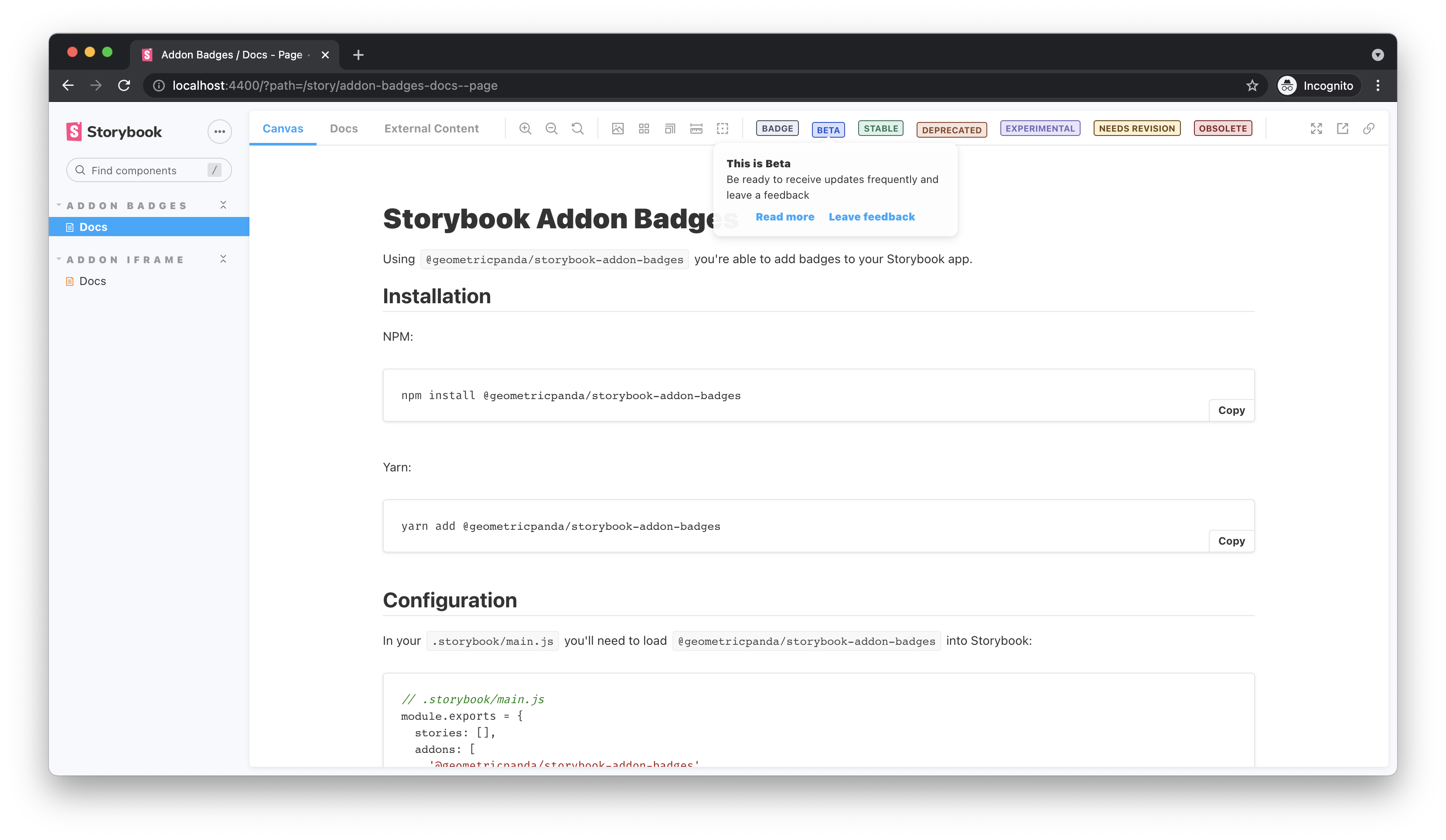
tooltip: {
title: 'This is Beta',
desc: 'Be ready to receive updates frequently and leave a feedback',
links: [
{ title: 'Read more', href: 'http://path/to/your/docs' },
{
title: 'Leave feedback',
onClick: () => {
alert('thanks for the feedback');
},
},
],
},
},
deprecated: {
...deprecatedConfig,
tooltip: 'This component is deprecated, please avoid using it.',
},
},
});
The key for each badge will be what's used throughout storybook to invoke that badge.
I tend to define each key as an enum when using TypeScript, or even an Object in plain JavaScript
to avoid using magic strings.
Don't worry if you haven't defined a badge which you use later, any badges which aren't recognised fall
back to the default preconfigured grey.
Tip: If you prefer, instead of using the addParameters function, you can also
export const parameters containing a full parameters object.
export enum BADGES {
STATUS = 'status',
}
import { addParameters } from '@storybook/react';
addParameters({
badgesConfig: {
[BADGES.STATUS]: {
styles: {
backgroundColor: '#FFF',
borderColor: '#018786',
color: '#018786',
},
title: 'Status',
},
},
});
Preconfigured badges
You can import a collection of preconfigured badges using the following import:
import { BADGE } from '@geometricpanda/storybook-addon-badges';
You can then use these badges by passing in the following enum values:
BADGE.DEFAULTBADGE.BETABADGE.STABLEBADGE.DEPRECATEDBADGE.EXPERIMENTALBADGE.NEEDS_REVISIONBADGE.OBSOLETE
Should you wish to override these styles you can do by configuring a badge with the same key:
import { addParameters } from '@storybook/react';
addParameters({
badgesConfig: {
[BADGES.STATUS]: {
styles: {
backgroundColor: '#FFF',
borderColor: '#018786',
color: '#018786',
},
title: 'Status',
},
},
});
Valid options for the styles configuration are:
backgroundColorborderColorborderRadiusborderStyleborderWidthcolorfontSizefontFamilyfontWeightlineHeighttextTransformpaddingInlinepaddingBlock
Breaking Changes
The previous color and contrast properties have been deprecated and have now been removed.
Please migrate to the styles property.
Component Story Format (CSF)
All Stories
The following will apply the badges to all components within your Story:
import { BADGE } from '@geometricpanda/storybook-addon-badges';

export default {
  title: 'Path/To/MyComponent',
  parameters: {
    badges: [BADGE.DEPRECATED, BADGE.OBSOLETE],
  },
};

const Template = () => <h1>Hello World</h1>;

export const FirstComponent = Template.bind({});
export const SecondComponent = Template.bind({});
export const ThirdComponent = Template.bind({});
Individual Stories
You can also selectively add badges to each Story:
import { BADGE } from '@geometricpanda/storybook-addon-badges';

export default {
  title: 'Path/To/MyComponent',
};

const Template = () => <h1>Hello World</h1>;

export const FirstComponent = Template.bind({});
FirstComponent.parameters = {
  badges: [BADGE.DEPRECATED],
};

export const SecondComponent = Template.bind({});
SecondComponent.parameters = {
  badges: [BADGE.STABLE],
};

export const ThirdComponent = Template.bind({});
ThirdComponent.parameters = {
  badges: [BADGE.OBSOLETE],
};
Removing Badges from Stories
When applying Badges to all Stories you can selectively remove them too:
import { BADGE } from '@geometricpanda/storybook-addon-badges';

export default {
  title: 'Path/To/MyComponent',
  parameters: {
    badges: [BADGE.BETA],
  },
};

const Template = () => <h1>Hello World</h1>;

export const FirstComponent = Template.bind({});
export const SecondComponent = Template.bind({});

export const ThirdComponent = Template.bind({});
ThirdComponent.parameters = {
  badges: [],
};
MDX
In your mdx documentation you can add badges to your stories
using the <Meta> component.
import { Meta } from '@storybook/addon-docs/blocks';
import { BADGE } from '@geometricpanda/storybook-addon-badges';

<Meta title="Path/To/MyComponent" parameters={{ badges: [BADGE.BETA] }} />;


