Product
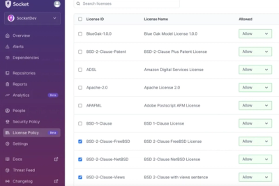
Introducing License Enforcement in Socket
Ensure open-source compliance with Socket’s License Enforcement Beta. Set up your License Policy and secure your software!
@gluestack-ui/alert-dialog
Advanced tools
A universal headless alert-dialog component for React Native, Next.js & React
@gluestack-ui/alert-dialogAlertDialog effectively interrupts a user's flow and prompts them to take a specific action. It's commonly used for mandatory confirmations or call-to-actions.
To install the component, run the following command in your terminal. This will add the component to your project's dependencies and allow you to use it in your project.
npx gluestack-ui@latest add alert-dialog
Default styling of all these components can be found in the components/core/Default styling of all these components can be found in the components/core/alert-dialog file. For reference, you can view the source code of the styled AlertDialog components.
// import the styles
import {
  Root,
  Content,
  CloseButton,
  Header,
  Footer,
  Body,
  Backdrop,
} from '../components/core/alert-dialog/styled-components';

// import the createAlertDialog function
import { createAlertDialog } from '@gluestack-ui/alert-dialog';

// Understanding the API
const AlertDialog = createAlertDialog({
  Root,
  Content,
  CloseButton,
  Header,
  Footer,
  Body,
  Backdrop,
});

// Using the alert-dialog component
export default () => (
  <AlertDialog>
    <AlertDialogBackdrop />
    <AlertDialogContent>
      <AlertDialogHeader>
        <Heading>Confirm your request</Heading>
        <AlertDialogCloseButton>
          <CloseIcon />
        </AlertDialogCloseButton>
      </AlertDialogHeader>
      <AlertDialogBody>
        <Text>AlertDialog Body</Text>
      </AlertDialogBody>
      <AlertDialogFooter>
        <Button>
          <ButtonText></ButtonText>
        </Button>
        <Button>
          <ButtonText></ButtonText>
        </Button>
      </AlertDialogFooter>
    </AlertDialogContent>
  </AlertDialog>
);
More guides on how to get started are available here.
FAQs
A universal headless alert-dialog component for React Native, Next.js & React
We found that @gluestack-ui/alert-dialog demonstrated a healthy version release cadence and project activity because the last version was released less than a year ago. It has 16 open source maintainers collaborating on the project.
Did you know?

Socket for GitHub automatically highlights issues in each pull request and monitors the health of all your open source dependencies. Discover the contents of your packages and block harmful activity before you install or update your dependencies.

Product
Ensure open-source compliance with Socket’s License Enforcement Beta. Set up your License Policy and secure your software!

Product
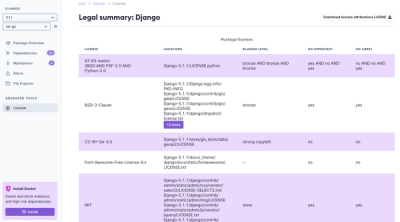
We're launching a new set of license analysis and compliance features for analyzing, managing, and complying with licenses across a range of supported languages and ecosystems.

Product
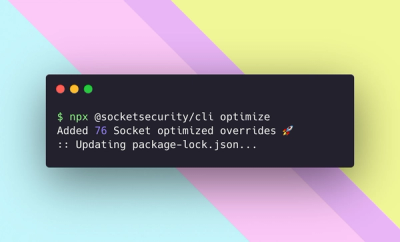
We're excited to introduce Socket Optimize, a powerful CLI command to secure open source dependencies with tested, optimized package overrides.