Security News
PyPI’s New Archival Feature Closes a Major Security Gap
PyPI now allows maintainers to archive projects, improving security and helping users make informed decisions about their dependencies.
@gyldendal/kobber-icons
Advanced tools
Icons can be used as react components or as web components. TypeScript definitions are included.
Icons can be used as react components or as web components.
TypeScript definitions are included.
Run one of the following commands to add @gyldendal/kobber-icons to your project:
npm install @gyldendal/kobber-icons
yarn add @gyldendal/kobber-icons
Depending on you usage, you might need to to install the optional peerDependencies.
Icons can be imported as react components, as web components, or as an SVG sprite.
Each icon component is prefixed with icon-, to simplify understanding what kind of component is used.
As a react component:
import { IconArrowRight } from "@gyldendal/kobber-icons/react";
const App = () => <IconArrowRight />;
As a custom element:
<script>
  import "@gyldendal/kobber-icons/web-components";
</script>
<icon-arrow_right />
Or include the sprite @gyldendal/kobber-icons/symbols/kobber-icons.svg in your html, and reference its symbols.
The file @gyldendal/kobber-icons/symbols/kobber-icons-lists.ts contains a list of all icons and a type declaration, which can be useful.
(Note that such ID references do not currenly work across the shadow dom barrier.)
<svg role="presentation" aria-hidden="true">
  <use href="#arrow_right" />
</svg>
kobber/packages/kobber-icons/src/assets/svgs.yarn build./
└── chunks/
│ └── chunk.js
└── react/
│ ├── index.js
│ └── index.d.ts
└── symbols/
│ ├── kobber-icons.svg
│ └── kobber-icons-lists.ts
└── web-components/
│ ├── index.js
│ └── index.d.ts
└── svg-sprite-config.json
└── tsup.config.ts
First, the package svg-sprite makes the sprite ./symbols/kobber-icons.svg from all icons in src/assets/svgs. svg-sprite uses ./svg-sprite-config.json to make the sprite contain symbols, and ensure each symbol uses currentcolor as fill color.
In ./tsup.config.ts, the sprite is used as input for making ./symbols/kobber-icons-lists.ts, the all icon components and their story files.
All files in folders (chunks, react, symbols and web-components) are auto generated and should never be edited manually.
FAQs
Icons can be used as react components or as web components. TypeScript definitions are included.
The npm package @gyldendal/kobber-icons receives a total of 113 weekly downloads. As such, @gyldendal/kobber-icons popularity was classified as not popular.
We found that @gyldendal/kobber-icons demonstrated a healthy version release cadence and project activity because the last version was released less than a year ago. It has 0 open source maintainers collaborating on the project.
Did you know?

Socket for GitHub automatically highlights issues in each pull request and monitors the health of all your open source dependencies. Discover the contents of your packages and block harmful activity before you install or update your dependencies.

Security News
PyPI now allows maintainers to archive projects, improving security and helping users make informed decisions about their dependencies.

Research
Security News
Malicious npm package postcss-optimizer delivers BeaverTail malware, targeting developer systems; similarities to past campaigns suggest a North Korean connection.

Security News
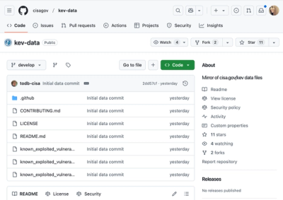
CISA's KEV data is now on GitHub, offering easier access, API integration, commit history tracking, and automated updates for security teams and researchers.