Product
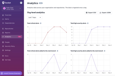
Introducing Dashboard Analytics
We're introducing a new Analytics feature in the Socket dashboard so you can view changes in your organization's and repositories' alerts over time.
By Charlie Gerard - Sep 05, 2024
@headlessui/react
Advanced tools
A set of completely unstyled, fully accessible UI components for React, designed to integrate beautifully with Tailwind CSS.
The @headlessui/react package provides a set of completely unstyled, fully accessible UI components, designed to integrate beautifully with Tailwind CSS, for React projects. It allows developers to build fully accessible UI components without having to design the visual part from scratch, focusing instead on functionality and accessibility.
Dropdown Menu
This feature allows developers to create a dropdown menu with accessible interactions. The example shows a basic dropdown menu with two options, highlighting the active option.
import { Menu } from '@headlessui/react';
<Menu>
<Menu.Button>More</Menu.Button>
<Menu.Items>
<Menu.Item>
{({ active }) => (
<a
className={`${active ? 'bg-blue-500 text-white' : 'text-gray-900'}`}
href="/account-settings"
>
Account settings
</a>
)}
</Menu.Item>
<Menu.Item>
{({ active }) => (
<a
className={`${active ? 'bg-blue-500 text-white' : 'text-gray-900'}`}
href="/sign-out"
>
Sign out
</a>
)}
</Menu.Item>
</Menu.Items>
</Menu>Dialog (Modal)
This feature enables the creation of a dialog (modal) component. The example demonstrates how to use the Dialog component to create a modal that can be opened, closed, and contains accessible titles and descriptions.
import { Dialog } from '@headlessui/react';
import { useState } from 'react';

function MyDialog() {
  let [isOpen, setIsOpen] = useState(false);

  return (
    <>
      <button onClick={() => setIsOpen(true)}>Open Dialog</button>

      <Dialog open={isOpen} onClose={() => setIsOpen(false)}>
        <Dialog.Overlay />

        <Dialog.Title>Deactivate account</Dialog.Title>
        <Dialog.Description>
          This will permanently deactivate your account
        </Dialog.Description>

        <button onClick={() => setIsOpen(false)}>Deactivate</button>
        <button onClick={() => setIsOpen(false)}>Cancel</button>
      </Dialog>
    </>
  );
}React Bootstrap offers a set of accessible components that can be styled using Bootstrap's utility classes. While it provides similar functionality in terms of creating UI components, it's tightly coupled with Bootstrap's design system, unlike @headlessui/react which is unstyled and more flexible with styling.
Material-UI is a popular React component library that follows Google's Material Design guidelines. It offers a wide range of pre-styled components that are accessible. Compared to @headlessui/react, Material-UI components come with a default styling inspired by Material Design, making it less flexible if you're aiming for a different design system.
Chakra UI is a simple, modular and accessible component library that gives you the building blocks to build your React applications. Similar to @headlessui/react, it focuses on accessibility and flexibility but comes with default styling that can be easily customized using style props.
A set of completely unstyled, fully accessible UI components for React, designed to integrate beautifully with Tailwind CSS.


npm install @headlessui/react
For full documentation, visit headlessui.dev.
For help, discussion about best practices, or any other conversation that would benefit from being searchable:
For casual chit-chat with others using the library:
FAQs
A set of completely unstyled, fully accessible UI components for React, designed to integrate beautifully with Tailwind CSS.
The npm package @headlessui/react receives a total of 1,556,907 weekly downloads. As such, @headlessui/react popularity was classified as popular.
We found that @headlessui/react demonstrated a healthy version release cadence and project activity because the last version was released less than a year ago. It has 4 open source maintainers collaborating on the project.
Did you know?

Socket for GitHub automatically highlights issues in each pull request and monitors the health of all your open source dependencies. Discover the contents of your packages and block harmful activity before you install or update your dependencies.
Product
We're introducing a new Analytics feature in the Socket dashboard so you can view changes in your organization's and repositories' alerts over time.
Security News
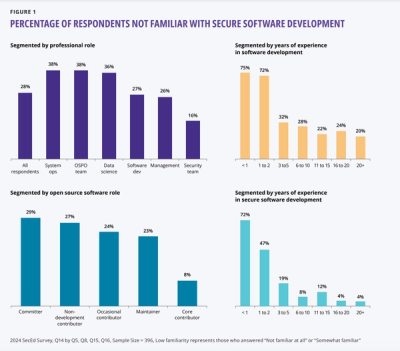
A new OpenSSF report uncovers critical gaps in secure software training, with 75% of new developers unfamiliar with secure practices, highlighting urgent educational needs.

Security News
The 2023 Python Developers Survey reveals key trends in packaging, web frameworks, and developer demographics, highlighting a shift toward innovative tools as the Python community diversifies and grows among less experienced developers.