Product
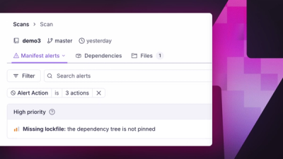
Introducing Manifest Alerts
Socket now detects supply chain risks in project manifests, starting with missing lockfiles that can make dependency installs non-reproducible.
By André Staltz, Trevor Norris - Jun 16, 2026
@howells/stacksheet
Advanced tools
Typed, animated sheet stack system. Zustand store + Motion animations with Apple-style depth stacking.
Typed, animated sheet stacking for React.
Stacksheet gives you a provider and a hook for opening, pushing, replacing, and navigating sheet panels from anywhere in your app. It handles the motion, layering, focus management, scroll locking, and mobile/desktop presentation details for you.
npm install @howells/stacksheet
Peer dependencies: react >= 18, react-dom >= 18.
open(Component, props)open("user-profile", "u1", data)open, push, replace, swap, navigate, pop, closeSheet.* partsCreate a sheet instance once and use it across your app:
import { createStacksheet } from "@howells/stacksheet";
import "@howells/stacksheet/styles.css";

export const { StacksheetProvider, useSheet } = createStacksheet();
Wrap your app:
import { StacksheetProvider } from "./sheets";

export function App() {
  return (
    <StacksheetProvider>
      <YourRoutes />
    </StacksheetProvider>
  );
}
Open a sheet from any component:
import { useSheet } from "./sheets";

function UserProfile({ userId }: { userId: string }) {
  const { close } = useSheet();

  return (
    <div>
      <h2>User {userId}</h2>
      <button onClick={close}>Done</button>
    </div>
  );
}

function ViewProfileButton() {
  const { open } = useSheet();

  return (
    <button onClick={() => open(UserProfile, { userId: "u_abc" })}>
      View profile
    </button>
  );
}
If your app has a fixed set of known sheet types, you can pre-register them for string-keyed, compile-time checked actions:
import { createStacksheet } from "@howells/stacksheet";

const { StacksheetProvider, useSheet } = createStacksheet<{
  "user-profile": { userId: string };
  settings: { tab?: string };
}>();

function UserProfile({ userId }: { userId: string }) {
  return <div>User {userId}</div>;
}

function Settings({ tab }: { tab?: string }) {
  return <div>Settings: {tab}</div>;
}

function App() {
  return (
    <StacksheetProvider
      sheets={{
        "user-profile": UserProfile,
        settings: Settings,
      }}
    >
      <YourRoutes />
    </StacksheetProvider>
  );
}

function OpenSettingsButton() {
  const { open } = useSheet();
  return (
    <button onClick={() => open("settings", "settings-root", { tab: "billing" })}>
      Open settings
    </button>
  );
}
Classic mode is the default: Stacksheet renders the panel chrome and header for you.
If you want full control over the panel structure, use layout="composable" and build the panel with exported parts:
import { Sheet } from "@howells/stacksheet";

function App() {
  return (
    <StacksheetProvider layout="composable">
      <YourRoutes />
    </StacksheetProvider>
  );
}

function SettingsSheet() {
  return (
    <>
      <Sheet.Handle />
      <Sheet.Header>
        <Sheet.Back />
        <Sheet.Title>Settings</Sheet.Title>
        <Sheet.Close />
      </Sheet.Header>
      <Sheet.Body>
        <div className="p-4">Panel content</div>
      </Sheet.Body>
    </>
  );
}
For custom controls and panel metadata inside a sheet, use useSheetPanel().
The default panel is rendered as a dialog with focus management, keyboard navigation, and focus restoration built in.
You can set a global label:
createStacksheet({ ariaLabel: "Settings panel" });
Or override it per sheet:
const { open } = useSheet();

open(UserProfile, { userId: "u_abc" }, { ariaLabel: "User profile for Jane" });
In composable mode, use Sheet.Title and Sheet.Description so the panel gets aria-labelledby and aria-describedby automatically.
Full docs, interactive playground, and API reference:
MIT
FAQs
Typed, animated sheet stack system. Zustand store + Motion animations with Apple-style depth stacking.
The npm package @howells/stacksheet receives a total of 14 weekly downloads. As such, @howells/stacksheet popularity was classified as not popular.
We found that @howells/stacksheet demonstrated a healthy version release cadence and project activity because the last version was released less than a year ago. It has 1 open source maintainer collaborating on the project.
Did you know?

Socket for GitHub automatically highlights issues in each pull request and monitors the health of all your open source dependencies. Discover the contents of your packages and block harmful activity before you install or update your dependencies.
Product
Socket now detects supply chain risks in project manifests, starting with missing lockfiles that can make dependency installs non-reproducible.

Research
/Security News
The trojanized extensions use TinyGo-compiled WebAssembly and Solana transaction memos to resolve command-and-control infrastructure.

Security News
Anthropic says the directive cited national security concerns over a narrow jailbreak, but offered no specific technical details.