
Product
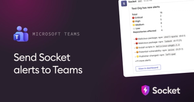
Microsoft Teams Notifications Are Now Available in Socket
Socket can now send alerts and supply chain attack notifications to Microsoft Teams, with filters that route the right updates to each channel.
By Jeppe Hasseriis - Sep 01, 2026
@inquirer/password
Advanced tools
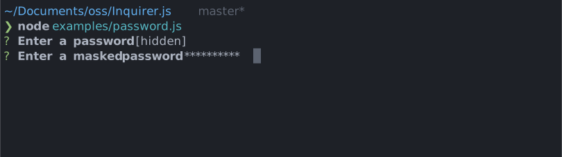
@inquirer/passwordInteractive password input component for command line interfaces. Supports input validation and masked or transparent modes.
| npm | yarn |
|---|---|
|
|
| Or | |
|
|
import { password } from '@inquirer/prompts';
// Or
// import password from '@inquirer/password';

const answer = await password({ message: 'Enter your name' });
| Property | Type | Required | Description |
|---|---|---|---|
| message | string | yes | The question to ask |
| mask | boolean | string | no | Show a * mask over the input, use a custom mask character, or keep it transparent. |
| toggleMask | boolean | no | Allow the user to press ctrl+t to temporarily reveal the typed value. Defaults to true; set to false to disable both the shortcut and its help line. |
| validate | string => boolean | string | Promise<boolean | string> | no | On submit, validate the filtered answered content. When returning a string, it'll be used as the error message displayed to the user. Note: returning a rejected promise, we'll assume a code error happened and crash. |
| theme | See Theming | no | Customize look of the prompt. |
You can theme a prompt by passing a theme object option. The theme object only need to includes the keys you wish to modify, we'll fallback on the defaults for the rest.
type Theme = {
  prefix: string | { idle: string; done: string };
  spinner: {
    interval: number;
    frames: string[];
  };
  style: {
    answer: (text: string) => string;
    message: (text: string, status: 'idle' | 'done' | 'loading') => string;
    error: (text: string) => string;
    help: (text: string) => string;
    maskedText: string;
    keysHelpTip: (keys: [key: string, action: string][]) => string | undefined;
  };
};
maskedText is the inline tip shown when mask is off and the value is hidden (default: [input is masked]).
theme.style.keysHelpTipThis function customizes the keyboard shortcut help displayed on the line below the prompt. It receives [['ctrl+t', 'toggle visibility']] while the value is hidden. Use it to change the formatting or localize the action, or return undefined to hide the help line entirely.
theme: {
  style: {
    keysHelpTip: (keys) =>
      keys.map(([key, action]) => `${key}: ${action}`).join(' | '),
  },
}
Copyright (c) 2023 Simon Boudrias (twitter: @vaxilart)
Licensed under the MIT license.
FAQs
Inquirer password prompt
The npm package @inquirer/password receives a total of 28,125,425 weekly downloads. As such, @inquirer/password popularity was classified as popular.
We found that @inquirer/password demonstrated a healthy version release cadence and project activity because the last version was released less than a year ago. It has 2 open source maintainers collaborating on the project.
Product
Socket can now send alerts and supply chain attack notifications to Microsoft Teams, with filters that route the right updates to each channel.
Security News
pnpm 12 rewrites the package manager in Rust, cutting install times by up to 90% while preserving pnpm 11 workflows and lockfiles.
Security News
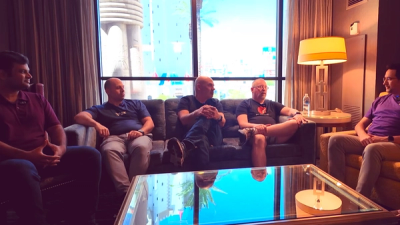
Socket CTO Ahmad Nassri joins AppSec leaders at Black Hat to discuss active malware, package manager risks, and software supply chain defense.